
Tutorial: Build a Hacker News App with Layerz
Design an app wired to a real API without writing a line of code. We build a Hacker News client end to end — OpenAPI import, Action Flows, data binding, and reusable components.
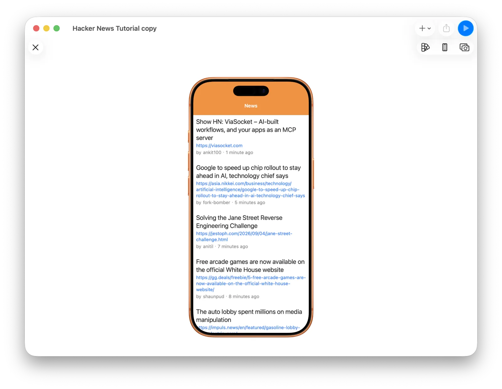
This tutorial requires Layerz App Designer v3.9.0 or later.
Want the finished project? Download Hacker-News.zip and open it in Layerz — useful to explore before you start, or to compare against as you go.
Hacker News is the tech news community run by Y Combinator. It publishes a free API for reading stories and comments. There's no API for accounts or posting, but the read-only side is more than enough to prototype an app.
By the end of this tutorial you'll have an app design that actually runs.
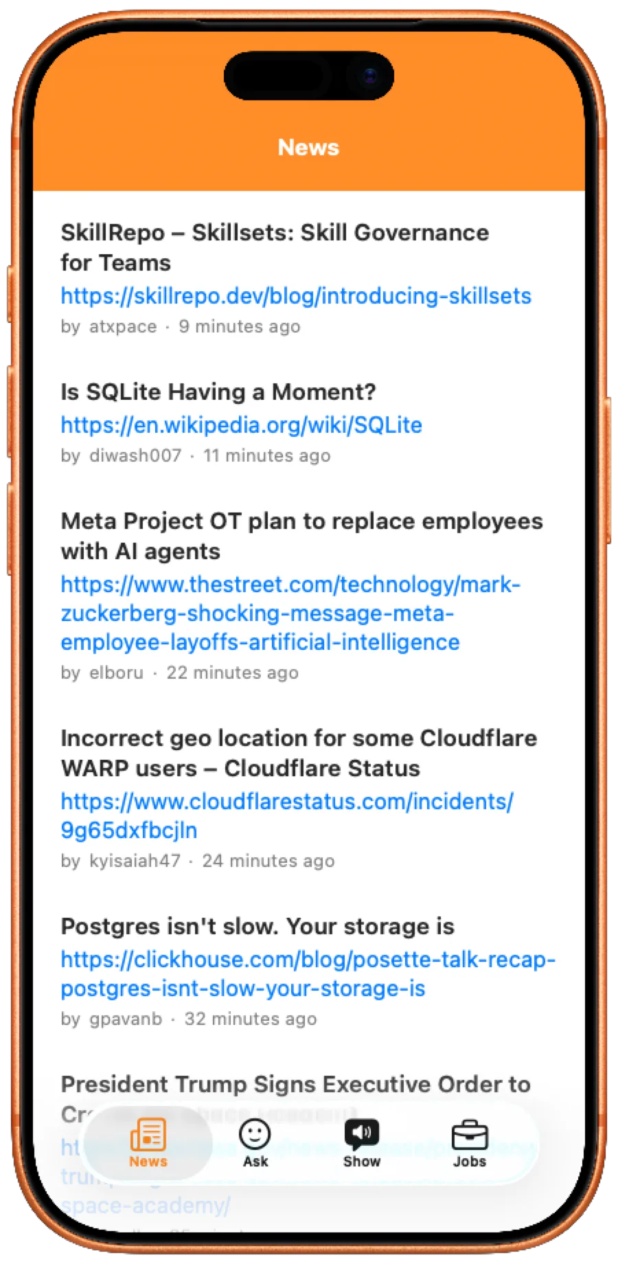
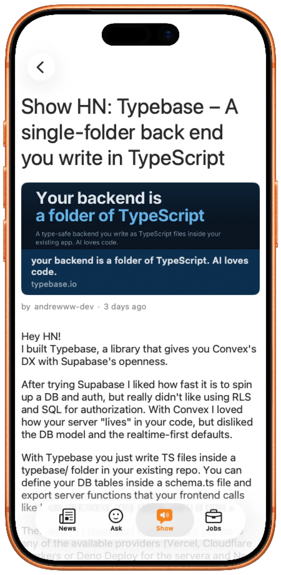
Both screenshots were captured from the Layerz Preview window using the Export menu.
The finished design has four tabs — News, Ask, Show, Jobs — each showing a list of stories, and tapping a story opens a detail screen with the URL link, the body text, and comments. In this post we build the News tab all the way through; the remaining tabs and the tab bar come in the next one.
Before you start
Launch Layerz and press New Project to begin a project. If you don't see New Project, you can start one with Start for free instead. Either way, everything Layerz can do is available inside the project, with no restrictions.
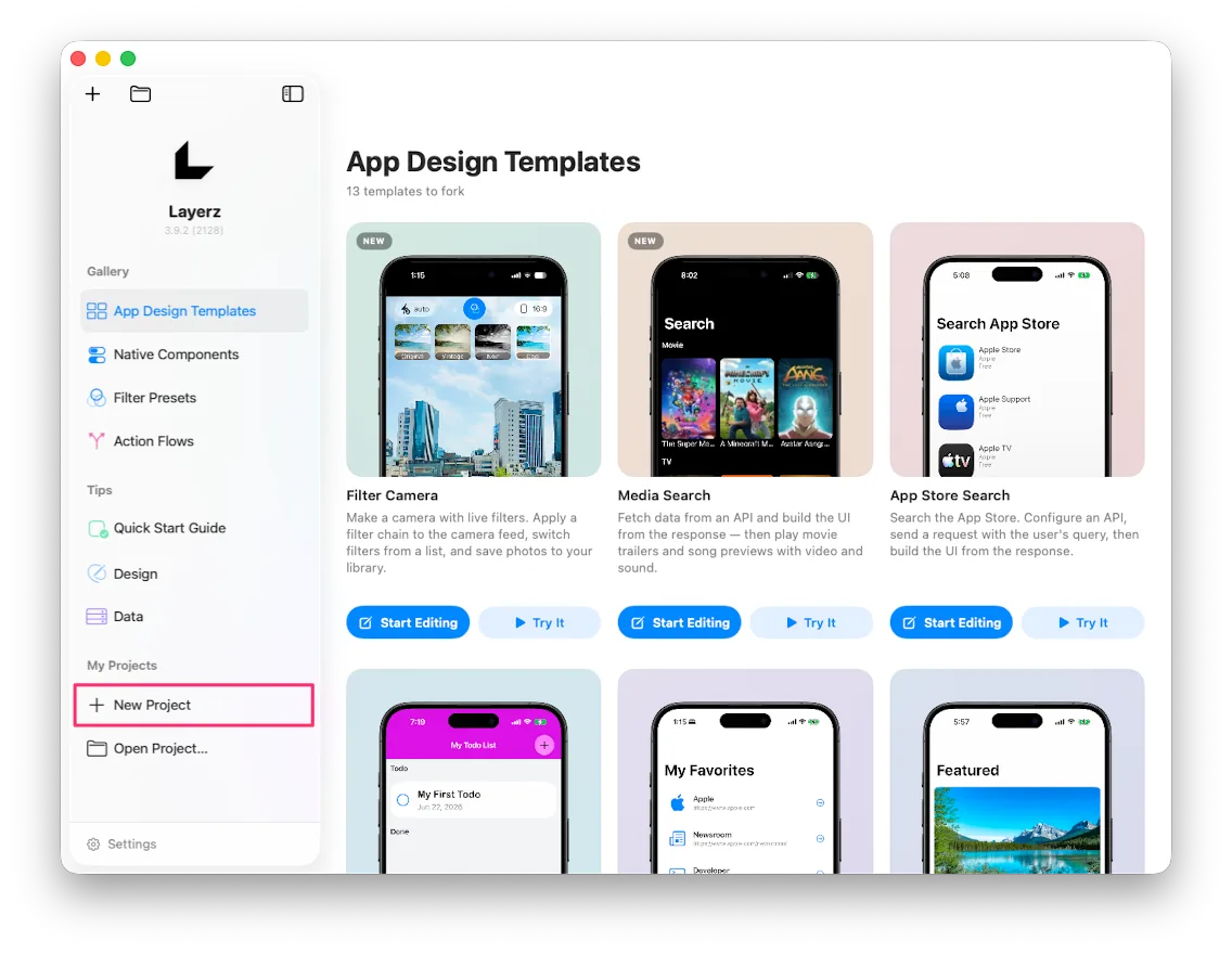 New Project under My Projects in the start screen sidebar
Open the project and you'll see the main features down the left side of the editor:
App Info · Screens · Design System · Assets · Data · Data Schema · API · Services · Action Flows
Each one is configured independently. When you're designing, you think about design. When you're defining data, you think about data. The pieces you build separately get combined exactly where they need to be — in Binding and in Action Flows.
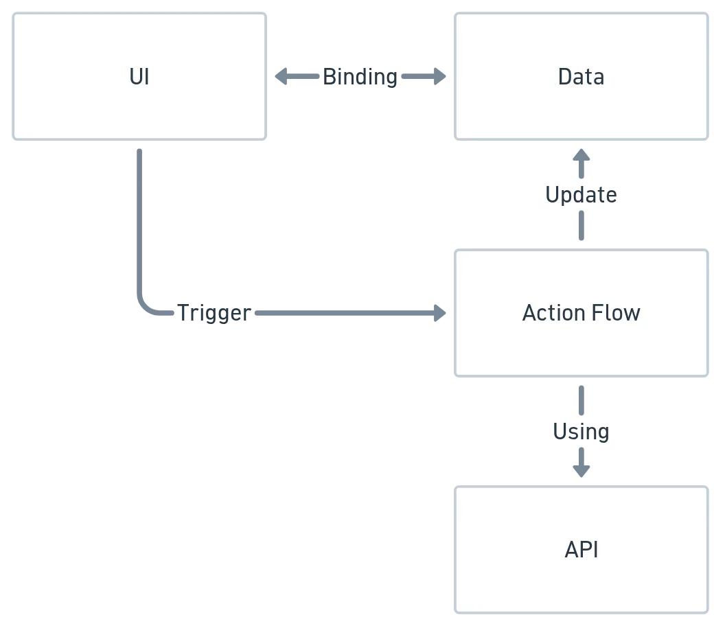 How UI, Data, Action Flow, and API fit together
Here's what this app needs, in four parts:
- [API] Define the API calls that fetch data from the server.
- [Data] Create somewhere to store the story list we receive.
- [UI] Show the story list.
- [UI] Show the story detail.
You can start anywhere, but since we already have a well-defined API, we'll start there.
1. Defining the API
The Hacker News API docs live at github.com/HackerNews/API.
Go to the API tab and you get two ways to add one:
- Add API Call — adds a single API.
- Add API Collection — groups several APIs together.
APIs usually share a base server address, so the normal pattern is to create a Collection first and add the individual calls underneath it. That also lets you register multiple Servers on the Collection and switch between them whenever you need to. The whole structure follows OpenAPI.
You can add each call by hand from the docs, but if an OpenAPI spec exists, it's far faster. A quick search turns up one for the Hacker News API — andenacitelli/hacker-news-api-openapi.
Choose Import OpenAPI from URL… from the menu and paste this address:
https://raw.githubusercontent.com/andenacitelli/hacker-news-api-openapi/main/exports/api.yaml
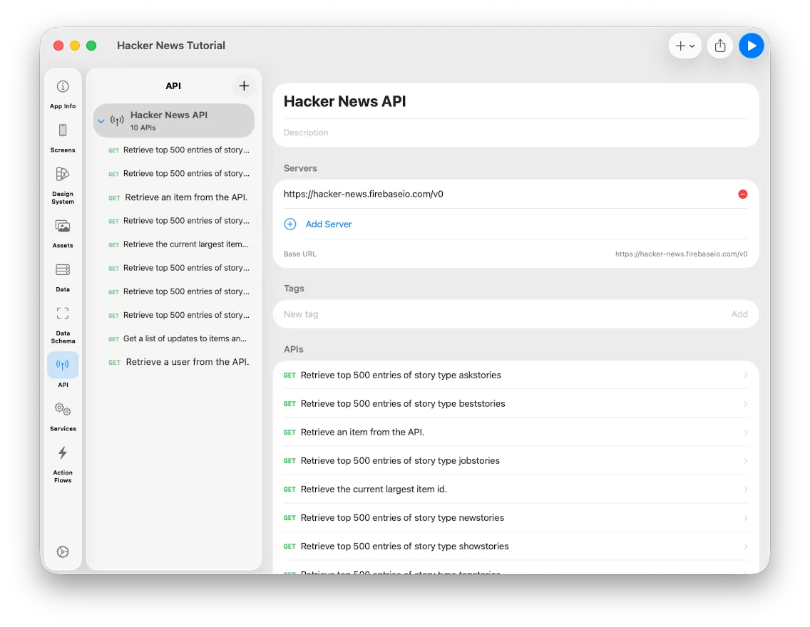 The imported Hacker News API collection
Everything comes in neatly organized. The Collection defines
https://hacker-news.firebaseio.com/v0 as its server, and each call underneath only
has to add its own path.
A look at the story list API
Select Retrieve top 500 entries of story type newstories from the list.
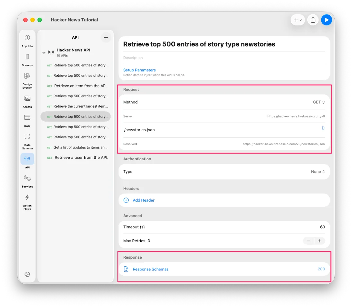 The newstories API definition
The Request shows GET /newstories.json, and the Resolved field shows the final URL
with the server address applied.
The part that matters most is at the bottom: Response. This is where the shape of the data you'll receive gets defined.
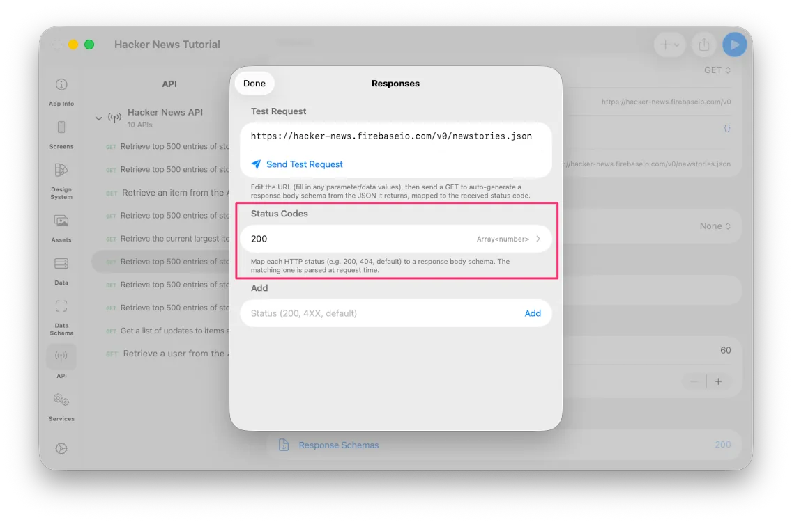 The Response area
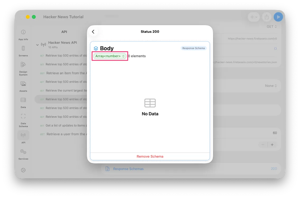 The response type is an array of numbers
Just as the API docs describe, calling this returns an array of numbers. Ask, Show, and Jobs each have an equivalent call.
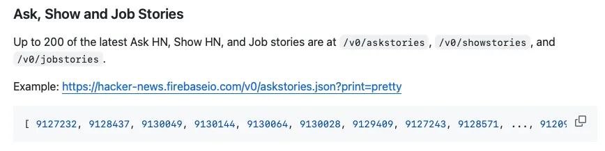 The Ask, Show, and Job story APIs
A look at the item API
For a different kind of Response, select Retrieve an item from the API.
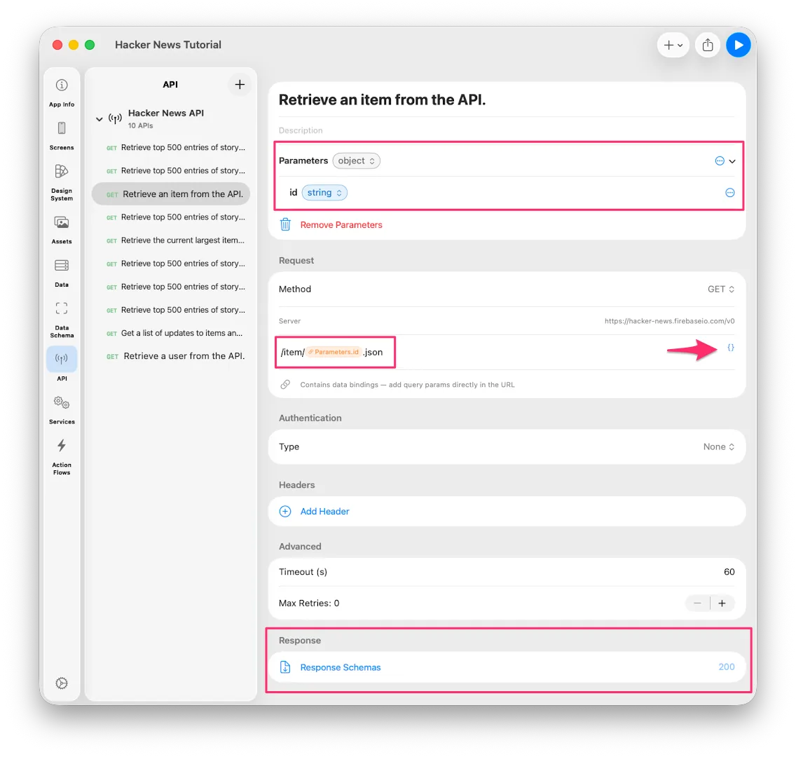 The Retrieve an item API
This one fetches the details of a single item, so it needs an id to know which item
you mean. Since that value changes on every call, it's defined as a Parameter.
Whatever calls the API fills that Parameter in.
While editing the Request path, press the {} button on the right to see everything
you can bind; picking one inserts it at the cursor.
Now the Response:
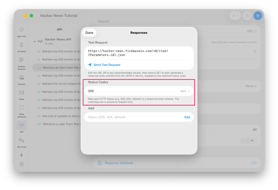 The Item response
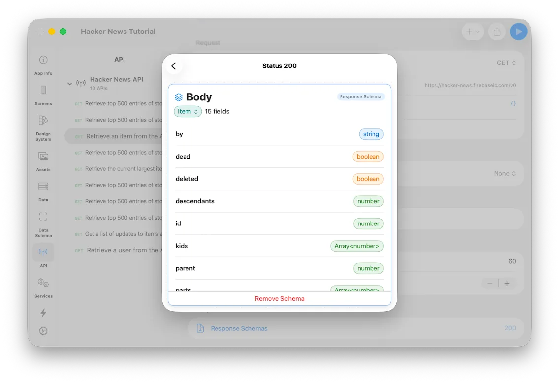 The fields on Item
You can edit a Response structure by hand from scratch, but real API responses tend to be complicated. So Layerz gives you two shortcuts:
- Import an OpenAPI spec — what we're doing here.
- Send Test Request — fires a real request and builds the structure automatically from what comes back. When the call has bindable values, as this one does, fill them with something reasonable and run it.
Notice the Response Body's type is Item. Custom types like this are generated
automatically, and you'll find them in the Data Schema tab — the Item type along
with Type, the enum defined inside it.
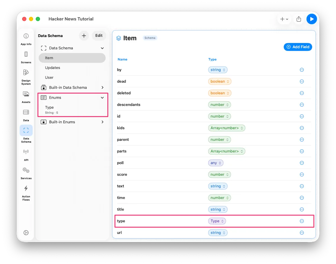 The generated Item type in Data Schema
That was a long explanation for what is, in practice, one action: if you have an OpenAPI spec, a single Import finishes your API setup.
2. Defining the data store
To use what the API returns, you need somewhere to put it. That's the Data tab.
Go to Data and choose Add Data to create an empty store.
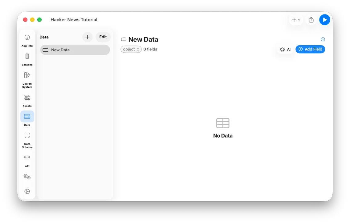 Adding a new Data store
Rename it to New Stories and set its Root Data Type to Array<Item>.
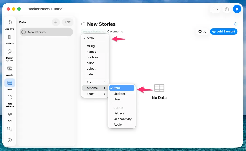 Setting New Stories to an array of Item
That's all it takes. The API response gets stored in New Stories, and binding
New Stories to the UI puts it on screen.
3. Fetching data with an Action Flow
To call an API and do something with the result, you use an Action Flow.
With a typical API you'd call it and store the Response into a Data store of the same type. The Hacker News API works a little differently: you first get an array of ids, then call the item API once per id to get the actual content.
In the Action Flows tab, press Add Action Flow and name it Get New Stories.
Here's the sequence we're building:
- API Call — fetch the list of New Stories ids.
- Guard — continue only if the call succeeded.
- For Each — walk the ids, fetch each Item, and append it to the
Array<Item>.
Adding the API call
Press Add first action and choose Network > API Call.
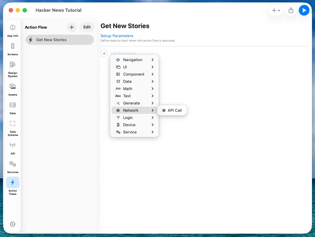 Choosing Network > API Call
Pick the API you want to call.
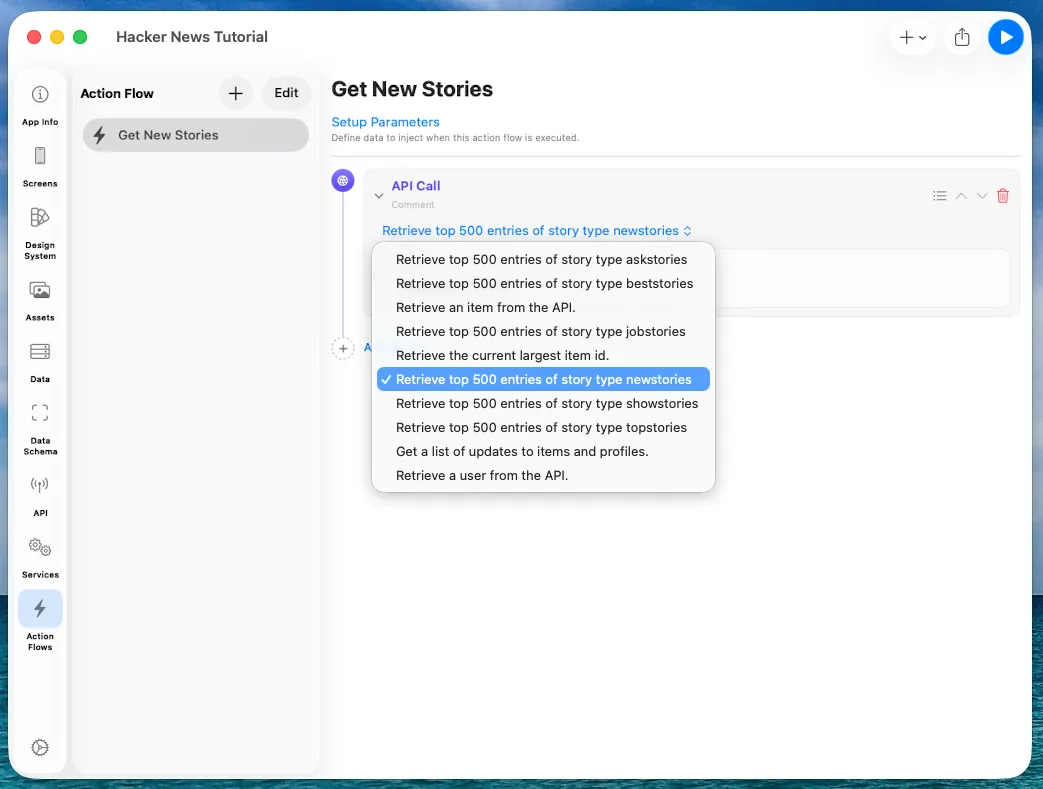 Selecting the newstories API
Once selected, the Output shows what the call will return. Here it tells you that a successful call (200) hands back an array of numbers.
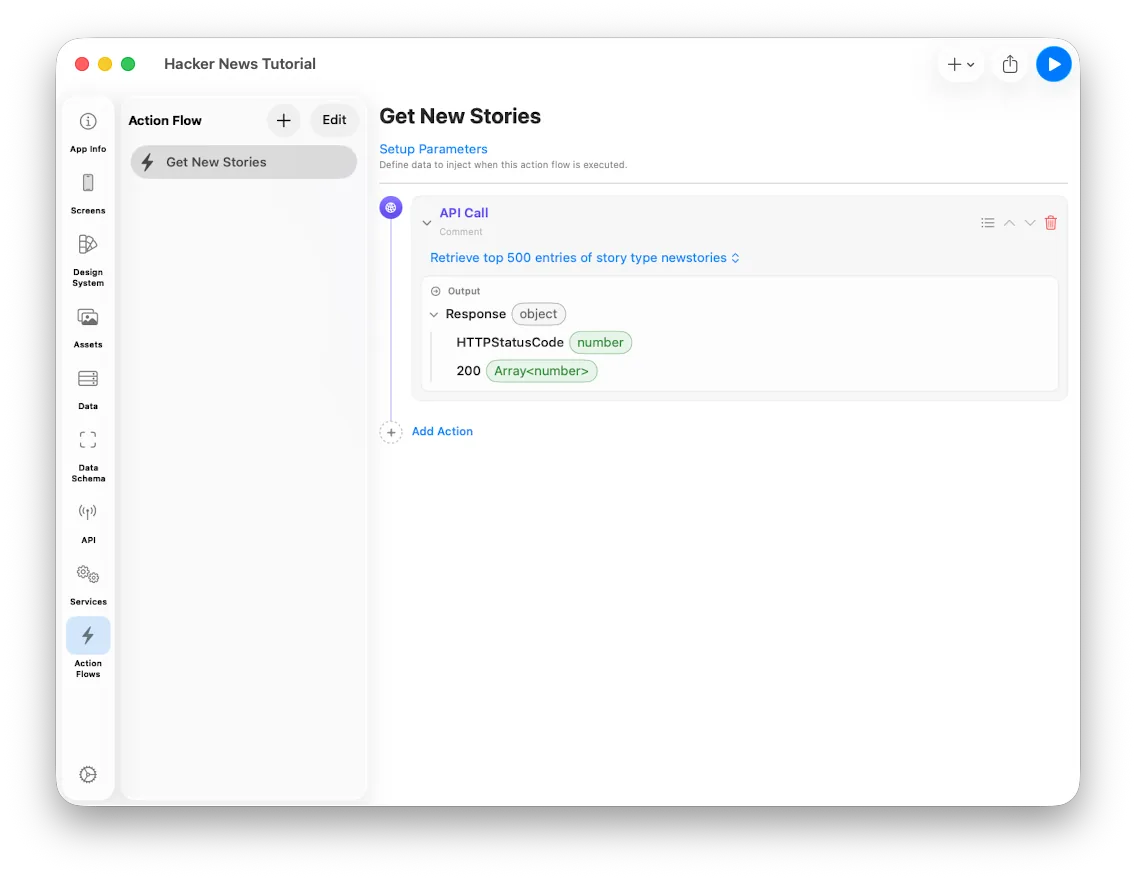 The API call's Output
Guarding on success
Choose Add Action > Logic > Guard, and for its Binding pick API Call > Response > HTTPStatusCode.
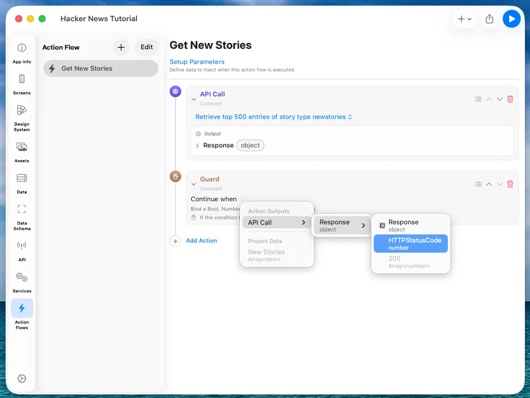 Setting up a Guard on the HTTP status code
The condition is set to 2xx. From now on, the flow only moves past this point when
the request succeeded.
Looping with For Each
Choose Add Action > Logic > For Each.
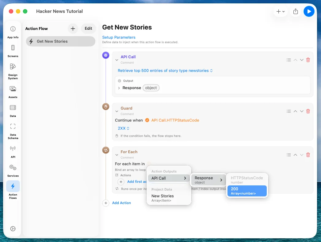 Adding a For Each
Press the orange button on For each item in and select API Call > Response > 200 so the loop walks the array we just received. Actions inside the loop can now use the index and the value.
One small change to the API first. Open Retrieve an item from the API and change
Parameters > id from string to number — we're feeding it numbers straight from
the previous call.
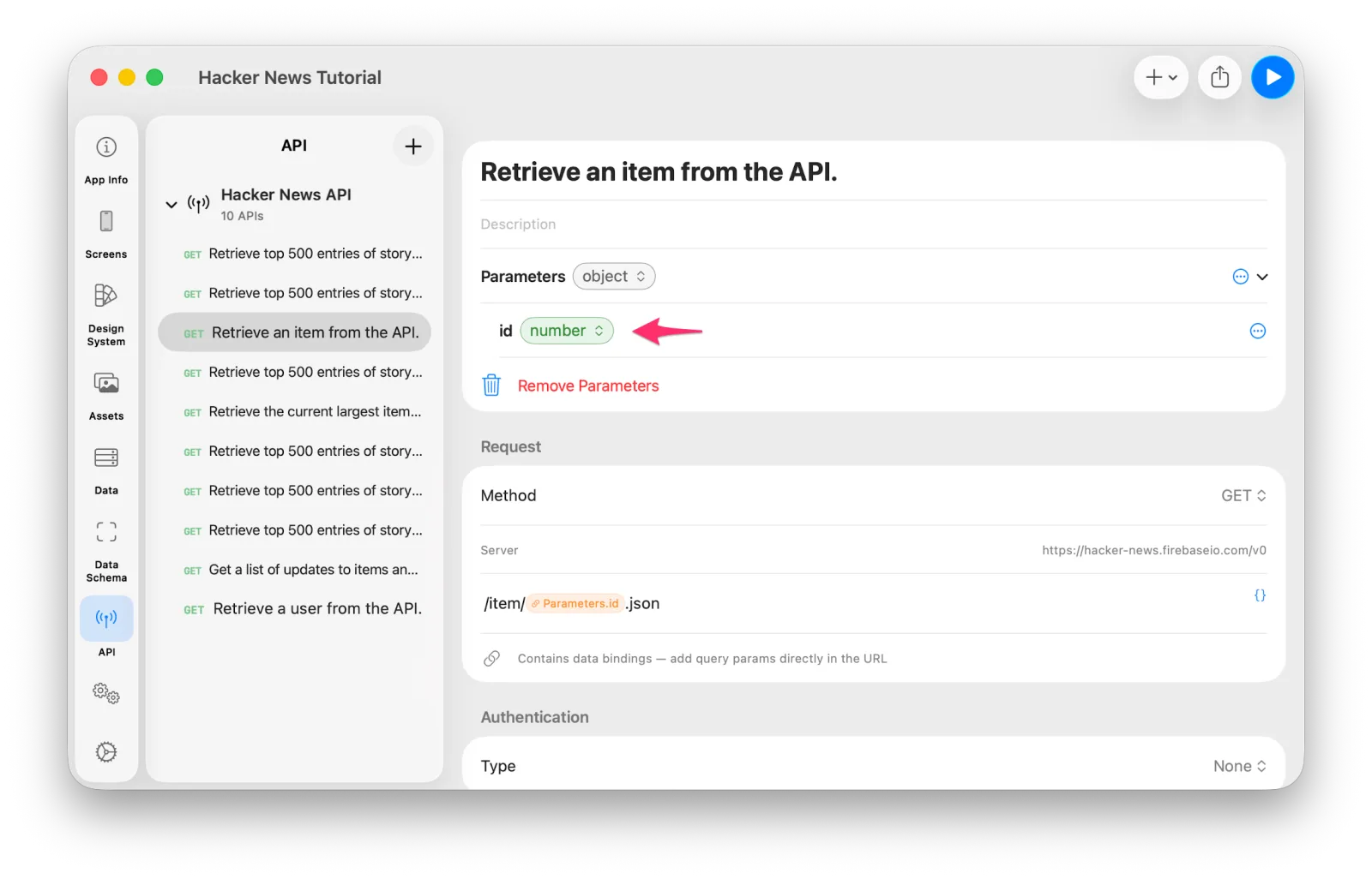 Changing the id parameter to number
Inside the For Each, press Add first action, choose API Call, and select
Retrieve an item from the API. The UI shows it takes id: number as Input and
gives back an Item as Output.
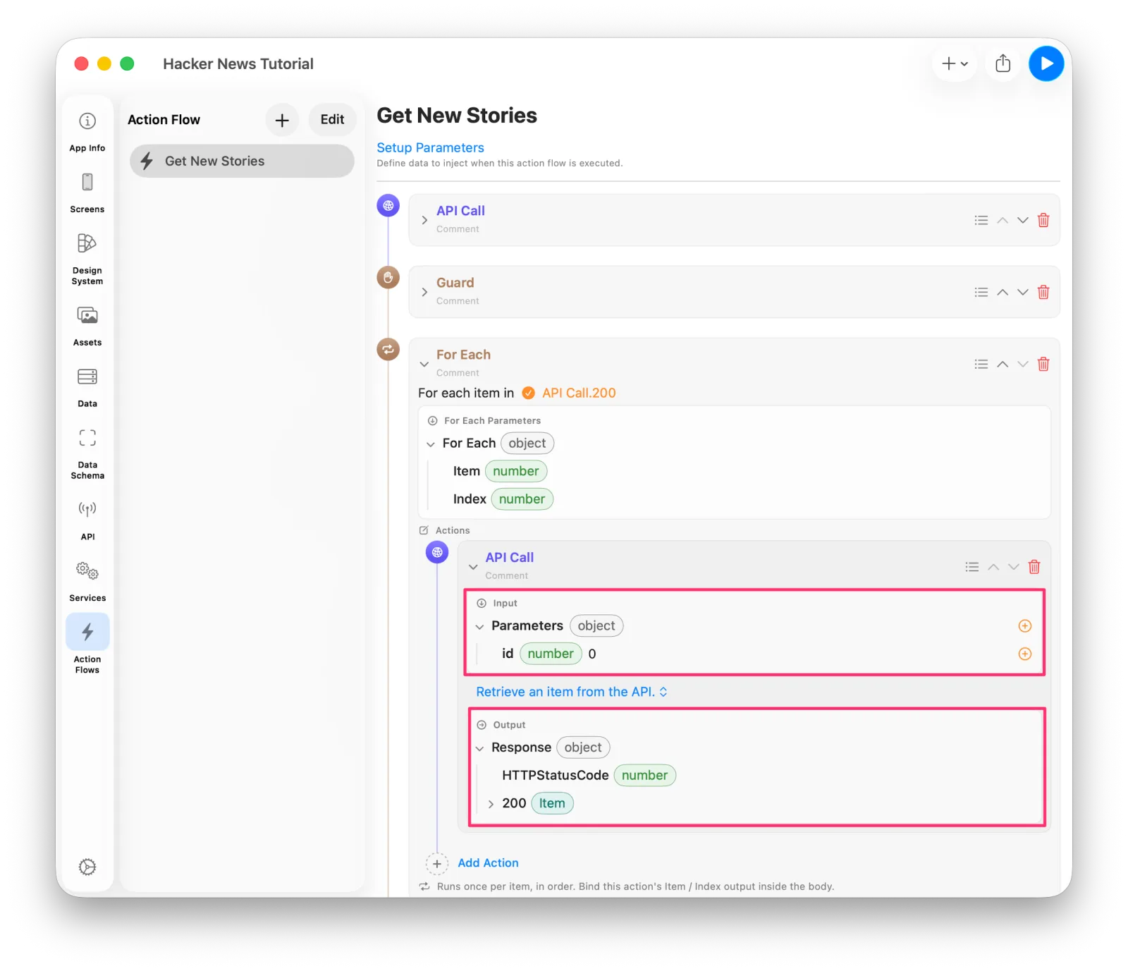 The API call inside the For Each
Bind the loop's Item: number to the id.
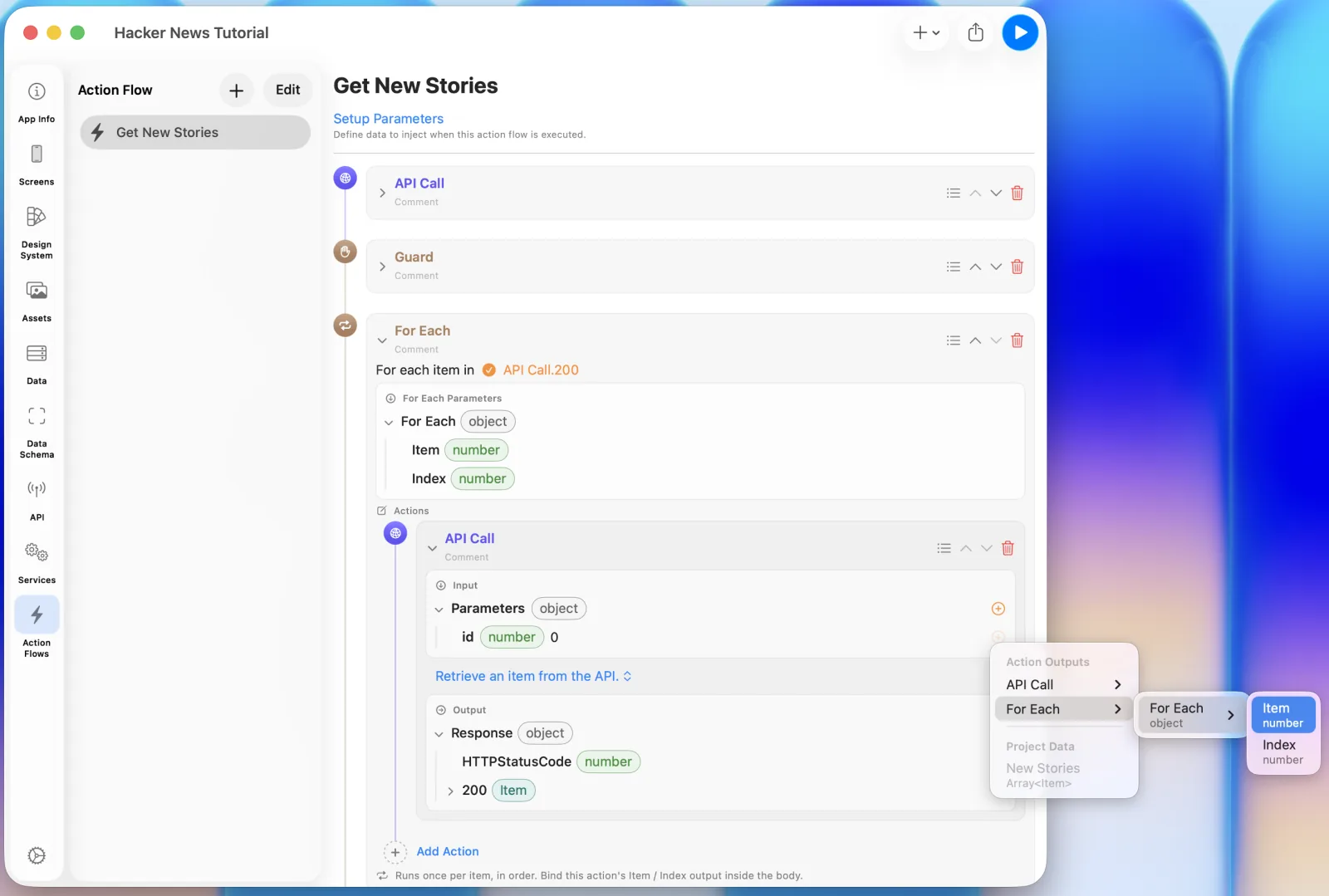 Binding the loop value to id
Storing each item
Choose Add Action > Data > Update Data. It takes a Source (the data to store) and a Destination (where to store it). Only destinations whose type is compatible with the Source are selectable.
For Source, pick the Item output of the API call you just added. Two API calls appear
in the list, in the order you created them, so choose the lower one.
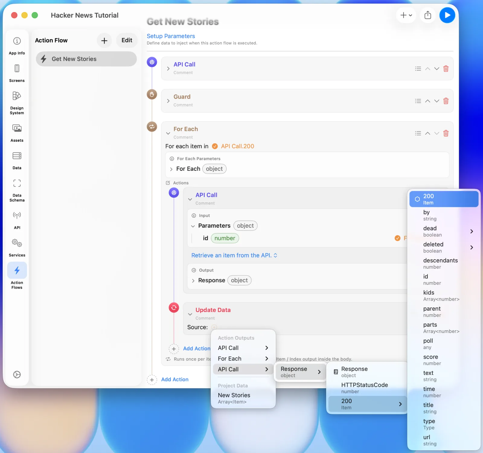 Setting Item as the Source
For Destination, choose Project Data > New Stories.
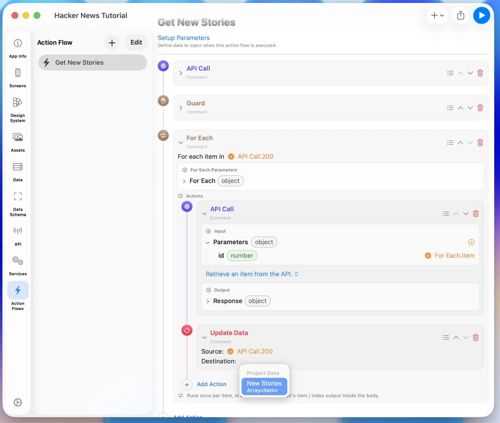 Setting New Stories as the Destination
Picking a Destination reveals an Append / Replace option. Choose Append so each
story the loop fetches piles up in New Stories.
4. Building the News screen
Run that Action Flow and New Stories fills up. Let's build UI to see it. Two things
to do:
- List UI — build a cell that shows a story, and bind
New Storiesto it. - Run the Action Flow — trigger it from the screen's Event.
Select Screens and you'll see an empty screen.
The basic way to build UI is to drag a Component from the Library to where you want it; Auto Layout gets configured for you based on where it lands. Or you can select the component you want to build on and simply pick a new one from the Library — that also adds it, with Auto Layout set to Center or Fill automatically.
Lists usually fill the screen. Select the empty Screen, choose List from the Library, and you get a full-screen List right away.
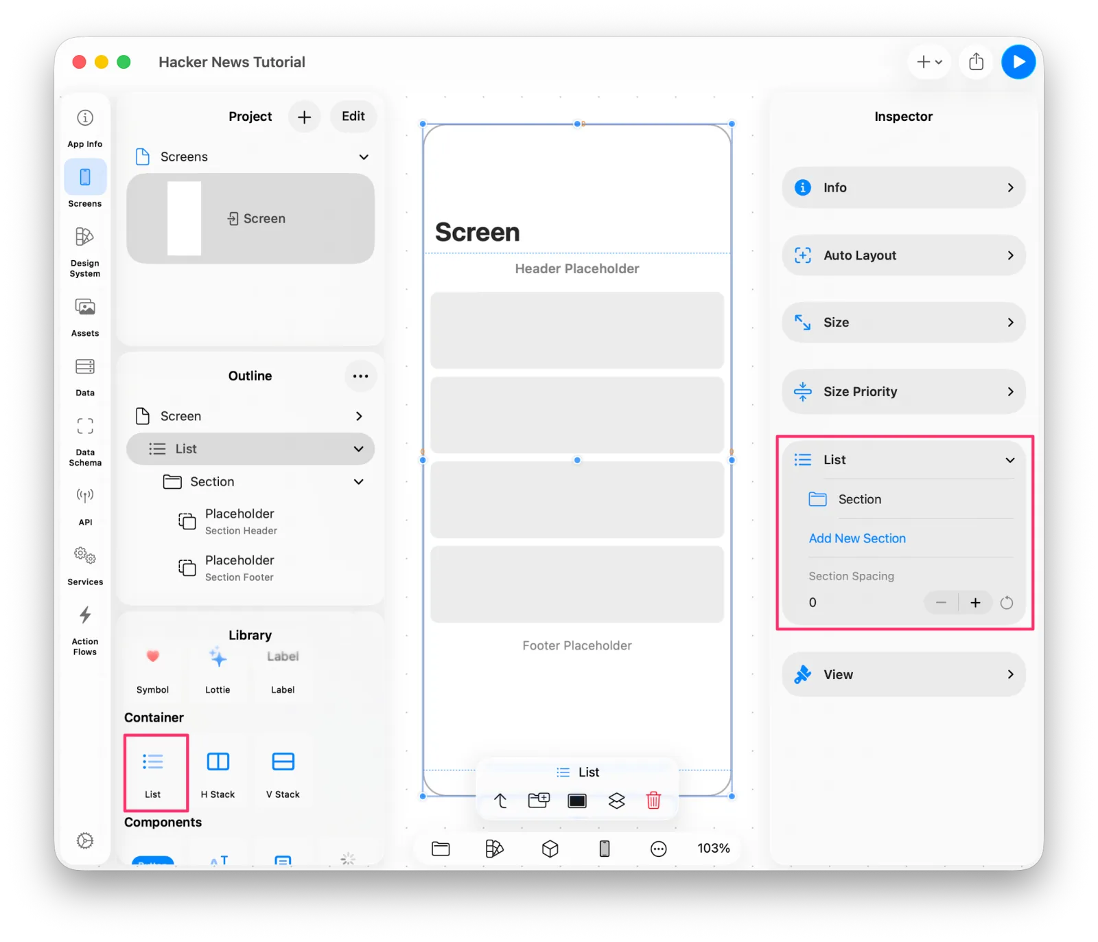 Adding a List to the screen
The List is there, but nothing has been set as its content yet, so what you see in the editor is a placeholder.
Sections and cells
A List is made of Sections. With the List selected, use Add New Section from the Inspector or the Component Toolbar.
Each Section can have its own layout — the first one scrolling horizontally, the second a vertical list, whatever you need. This tutorial only needs one.
The Cell — the List's content — goes inside a Section. You can drag any view component into a Section at the position you want, or select the Section and pick a component to add it there.
First, a quick check that the data is arriving. Select the Section and choose Label from the Library; it gets added as the Section's Cell.
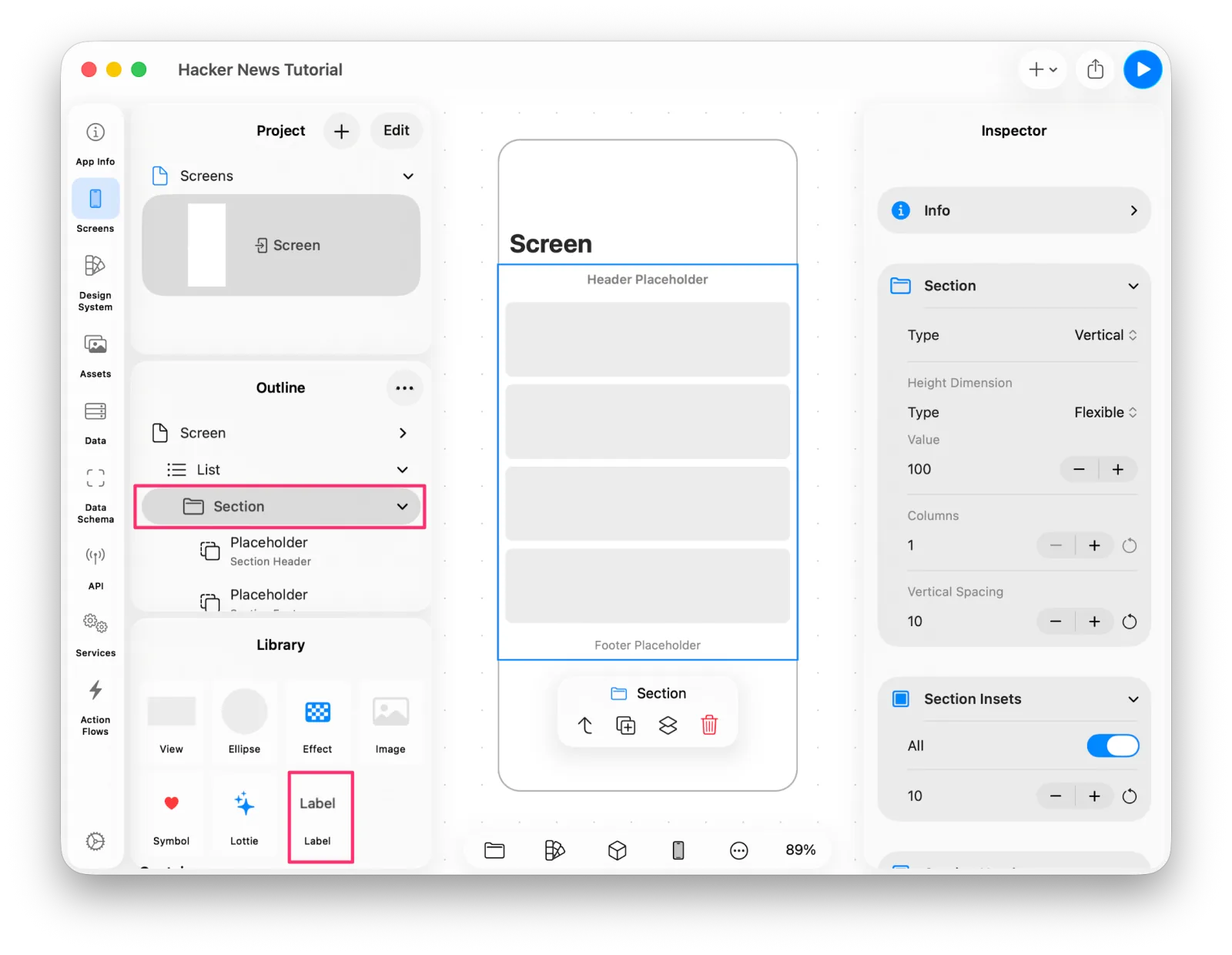 Adding a Label to the Section
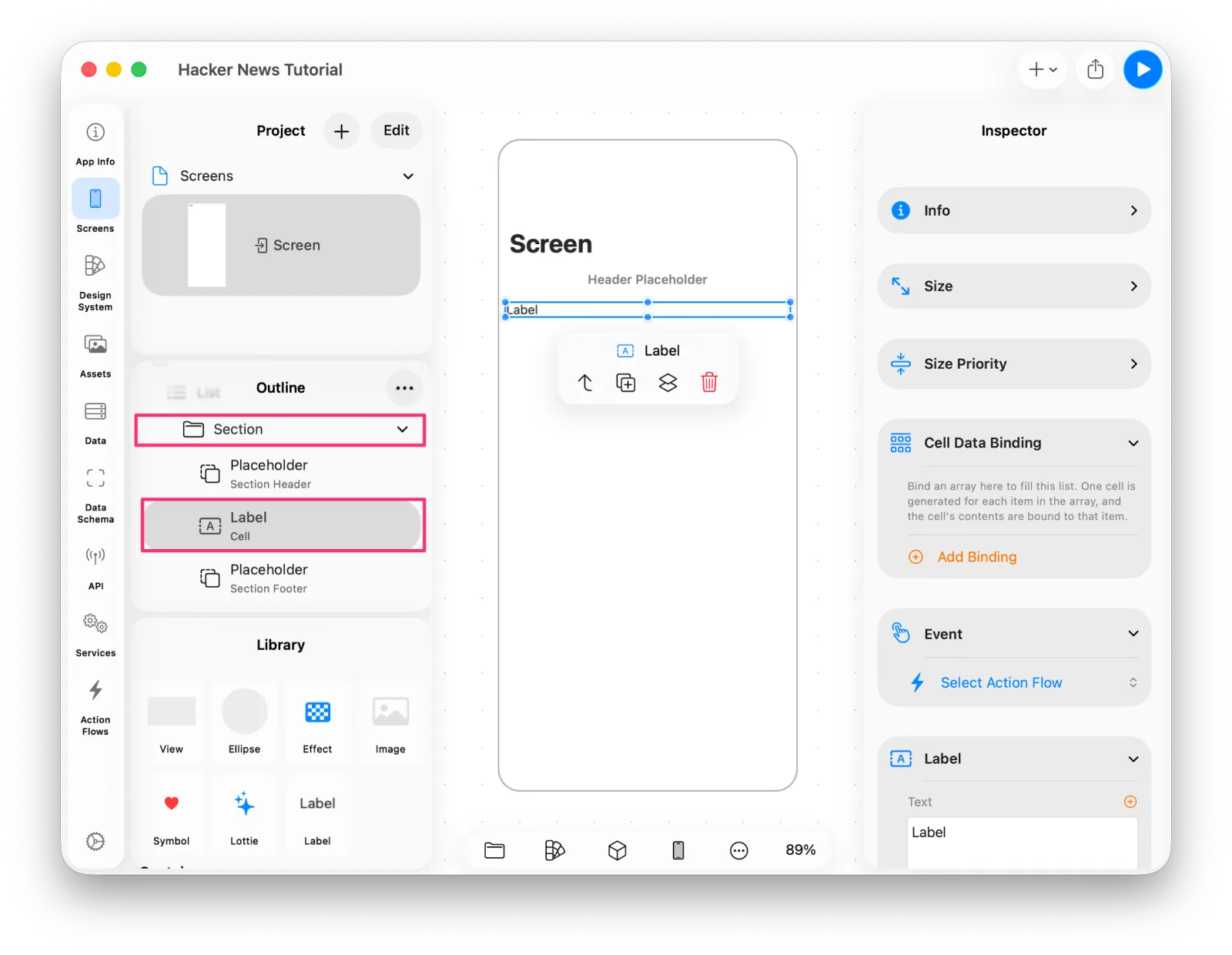 The Label added as a cell
Binding the data
The view component directly under a Section is the one that can have an array bound to it.
Select the Label, find Cell Data Binding in the Inspector, press Add Binding,
and choose New Stories.
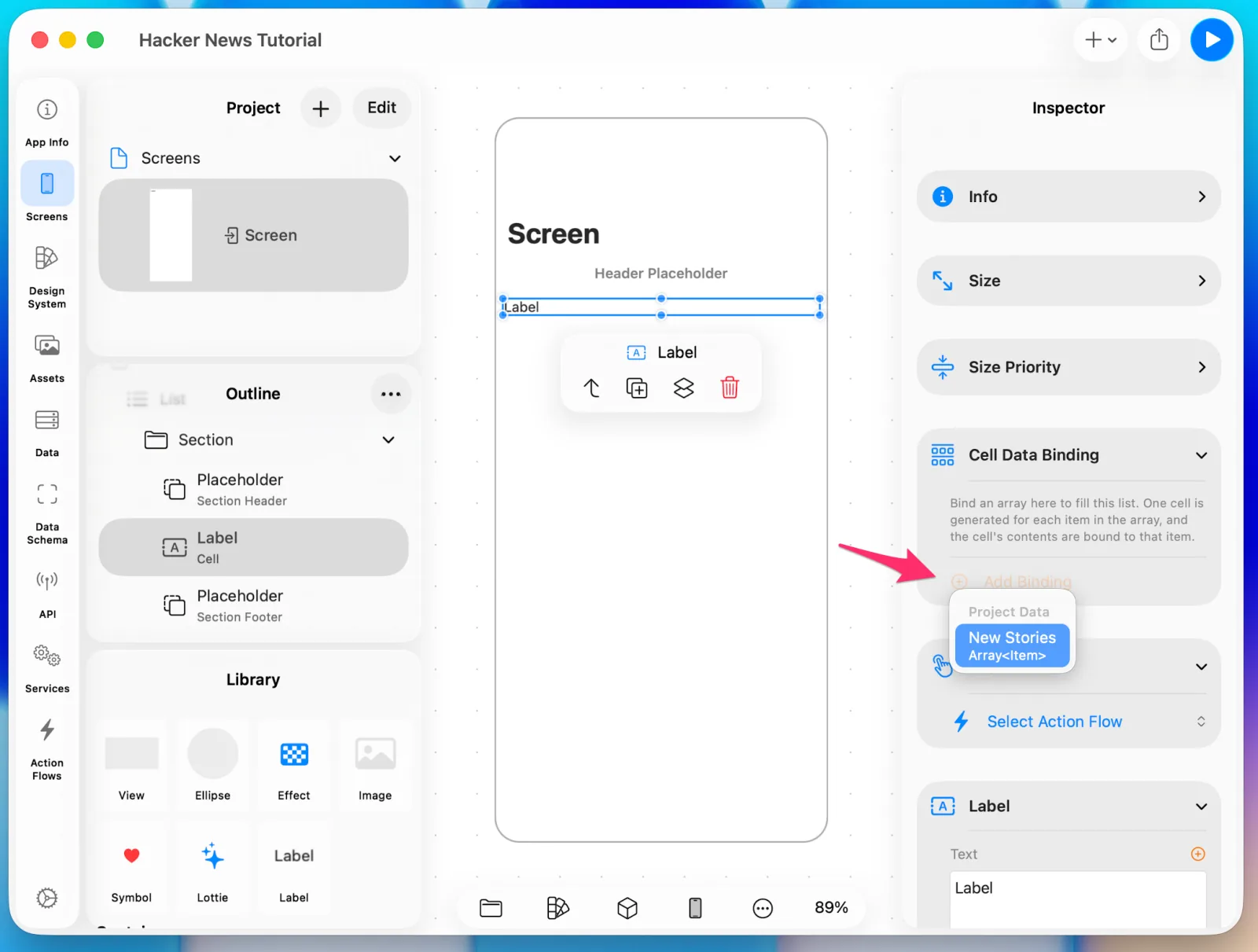 Binding New Stories to Cell Data
Just below that, in the Label section, bind the Text property. A Label's Text can
bind to any string defined in the project, and when Cell Data is bound, it can use that
too. Here we bind Item.title.
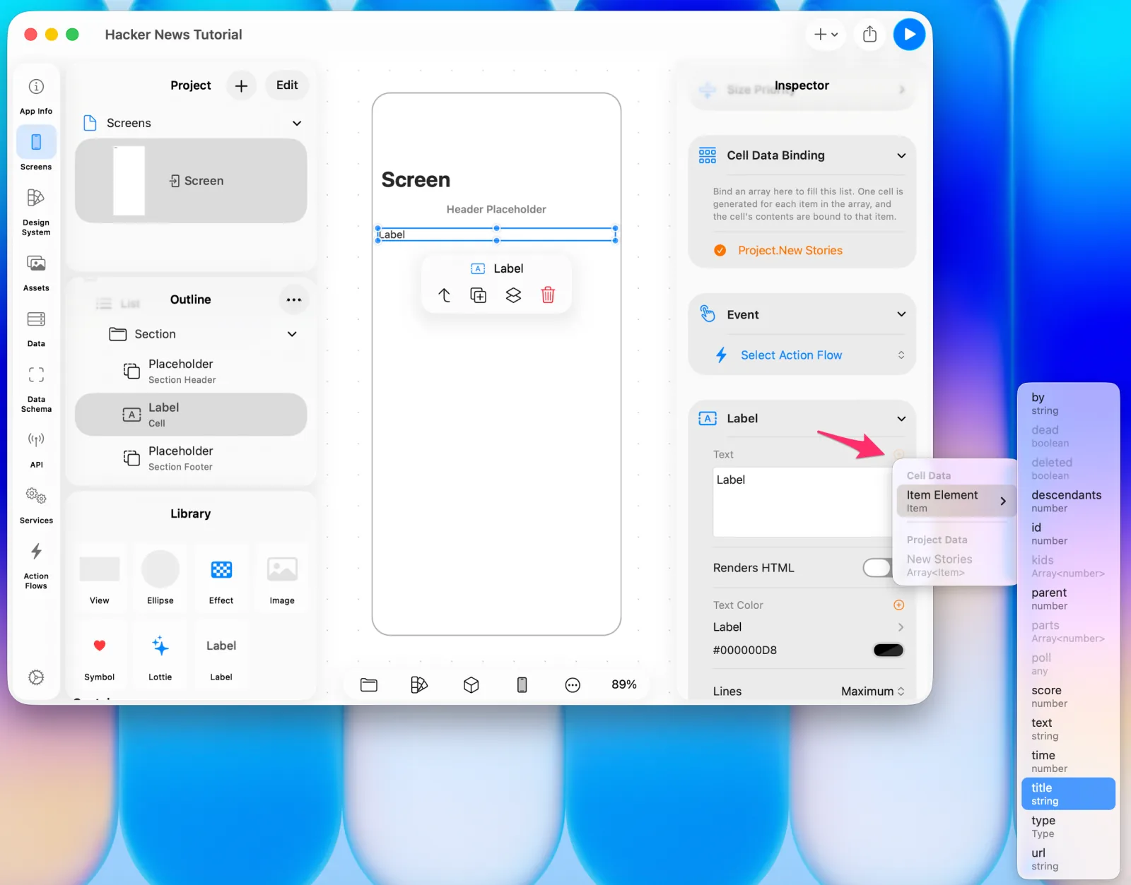 Binding Item.title to the Label's text
Running the Action Flow
Action Flows can be triggered from all sorts of events — pressing a button, selecting a cell, and so on. Here we want it to run once, automatically, when the screen first appears.
Select the Screen and set it under Event in the Inspector.
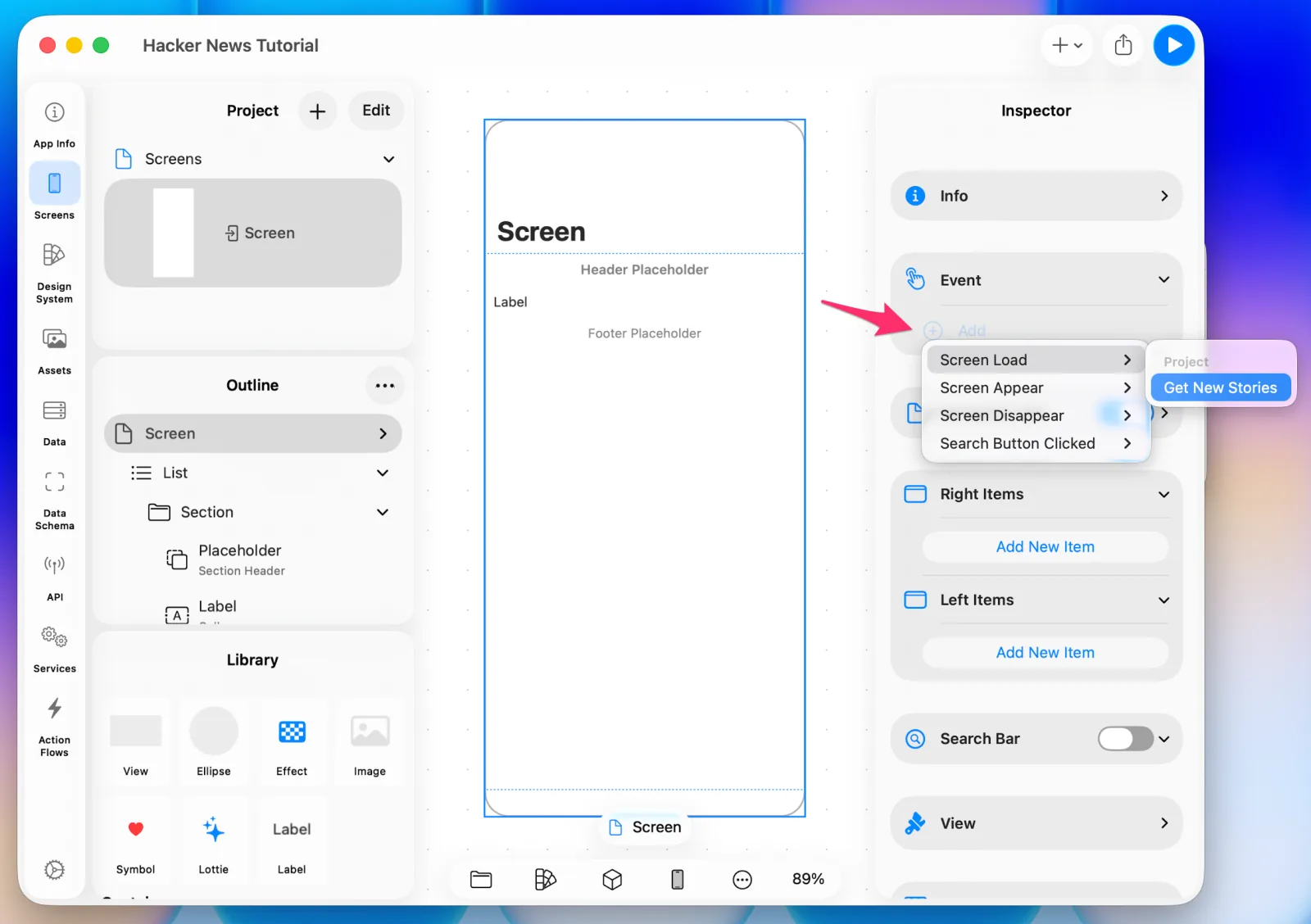 Wiring the Action Flow to the screen's event
Press the Preview ▶️ button in the top right.
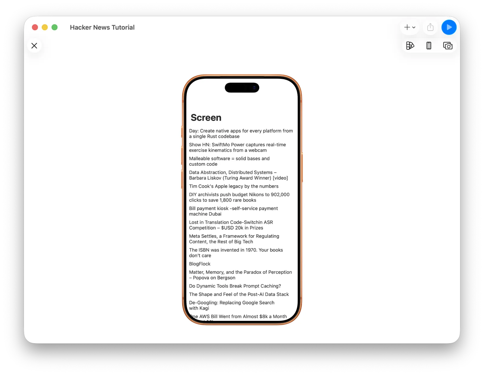 The first preview, showing only titles
Plain, since it's just titles — but the data is coming from the API and landing in the UI exactly as intended.
5. Designing the cell
A List's cell design matters, because it's the part of the app people look at most.
A cell can contain any design you like, but this one grows and shrinks with its content, so a Stack is the easiest way to get Auto Layout right. A Stack arranges components vertically or horizontally, and each component responds to size on its own according to its kind.
Delete the existing Label, select the Section, and choose V Stack from the Library.
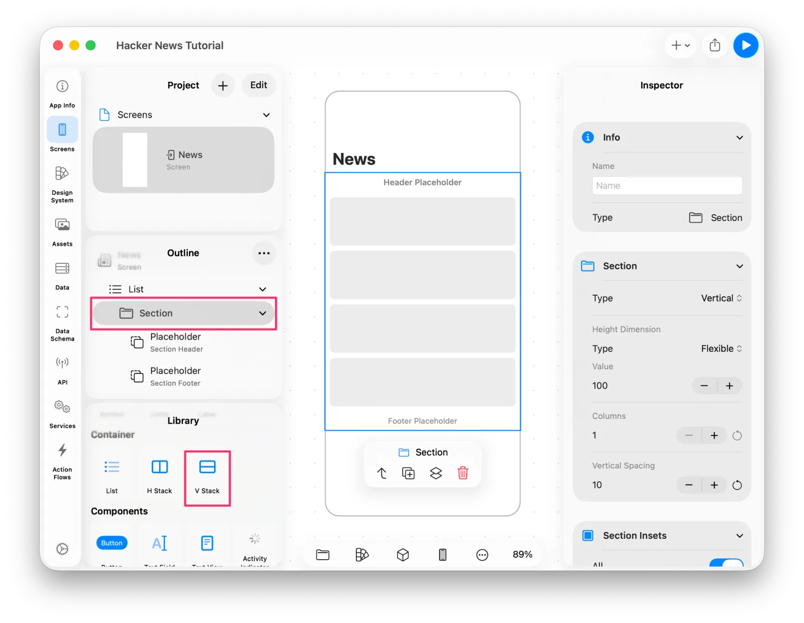 Adding a V Stack
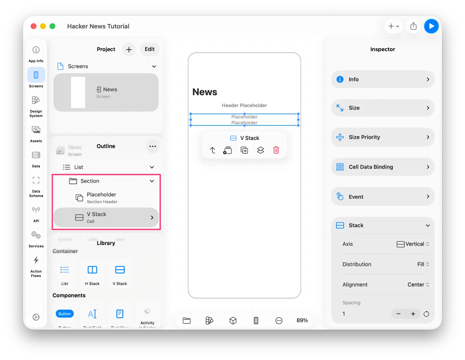 The stack's placeholders
The Stack shows placeholders. They're empty for now — drag something onto one, or select one and pick a component, and it takes that slot.
One thing to watch out for in a List: dragging a component onto a List always adds it as another cell. So when you're building up the inside of a cell, add components by selecting rather than by dragging.
We'll keep this cell simple: title, url, and author stacked in order. Select the V Stack and use Add Placeholder in the Component Toolbar until it has three.
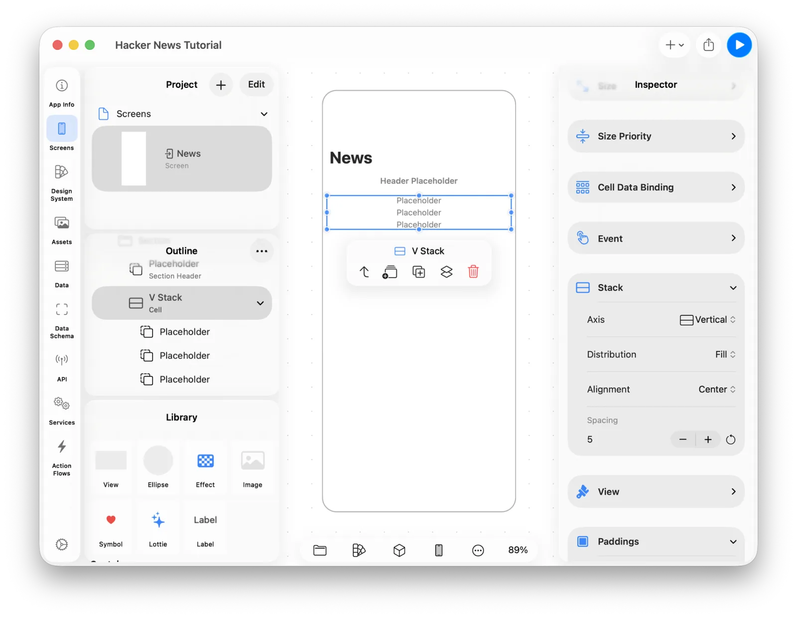 Three placeholders
Select each placeholder and choose Label from the Library, until all three are Labels.
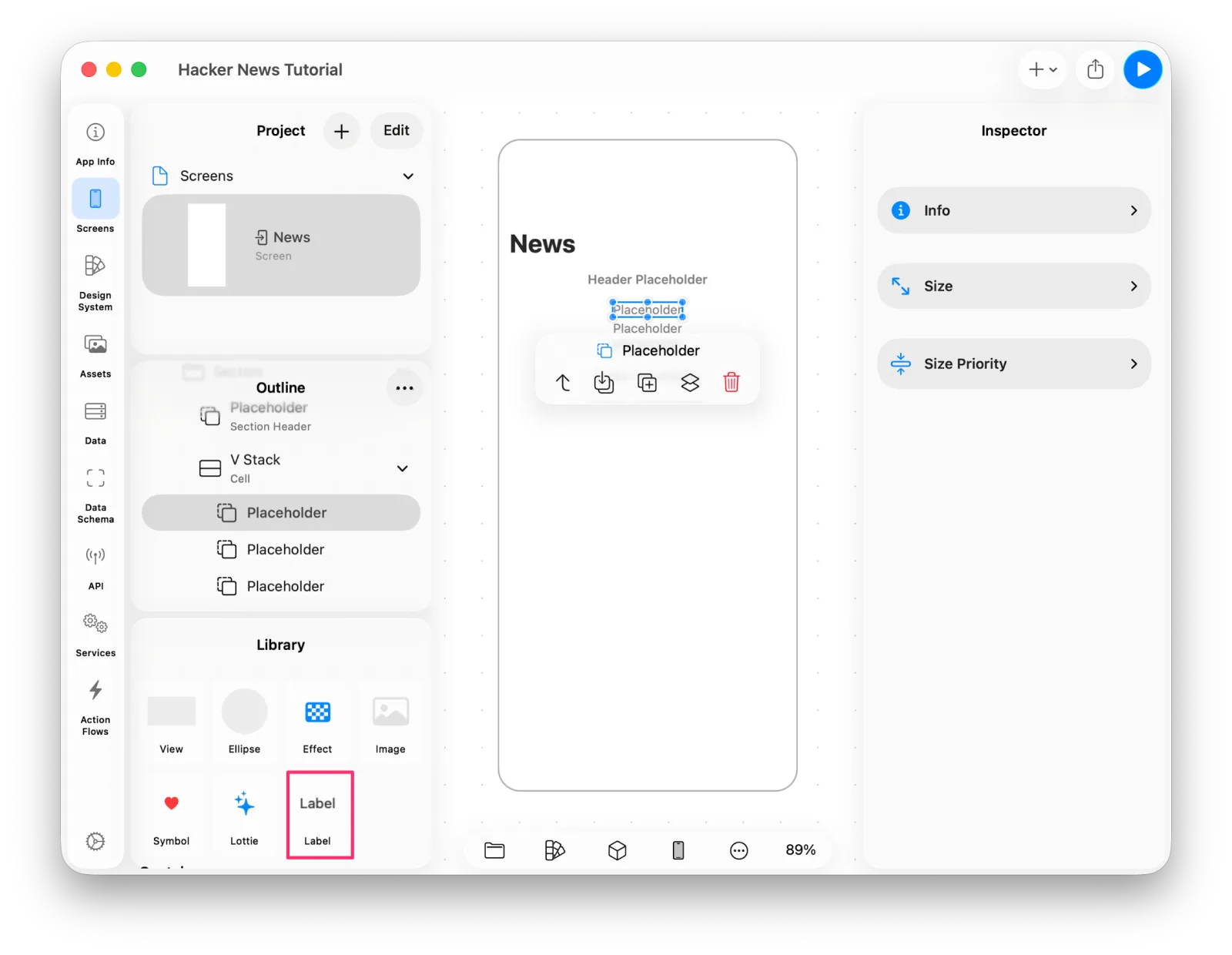 Replacing a placeholder with a Label
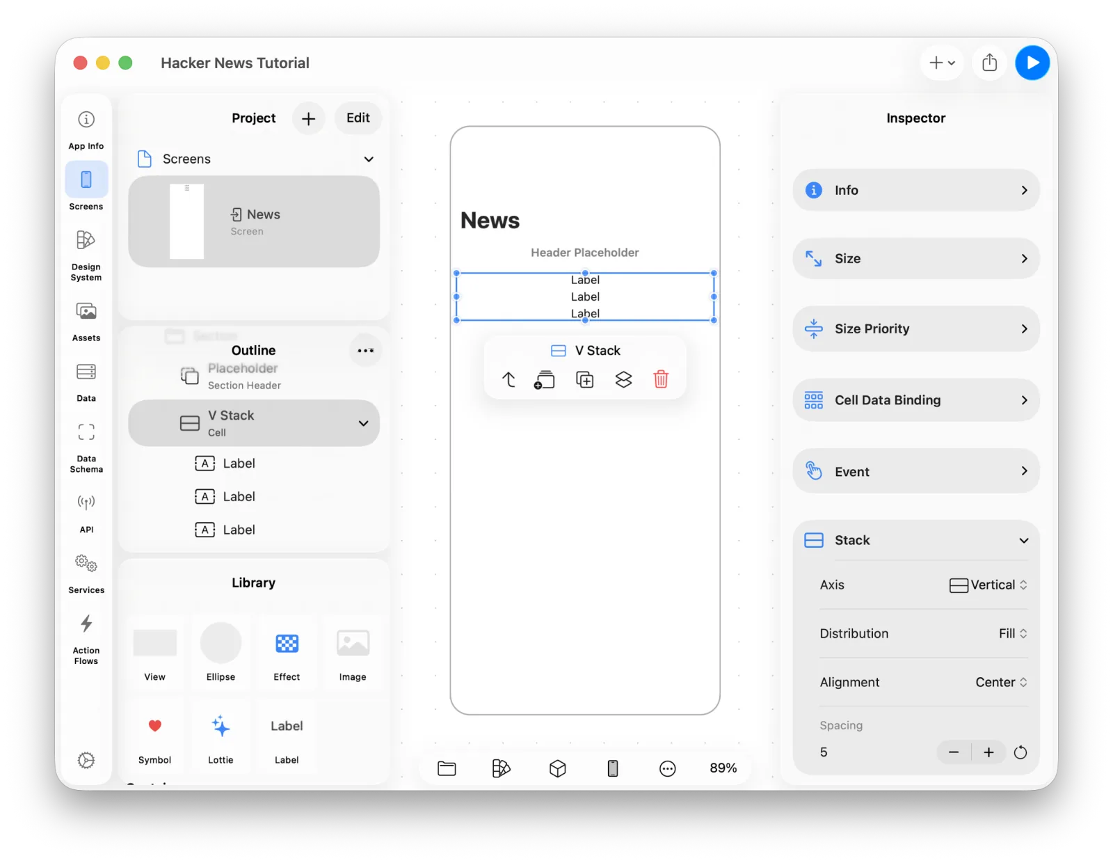 Three labels in the stack
The V Stack is the component added directly to the Section, so it's the one that gets Cell Data Binding. Bind the array to it.
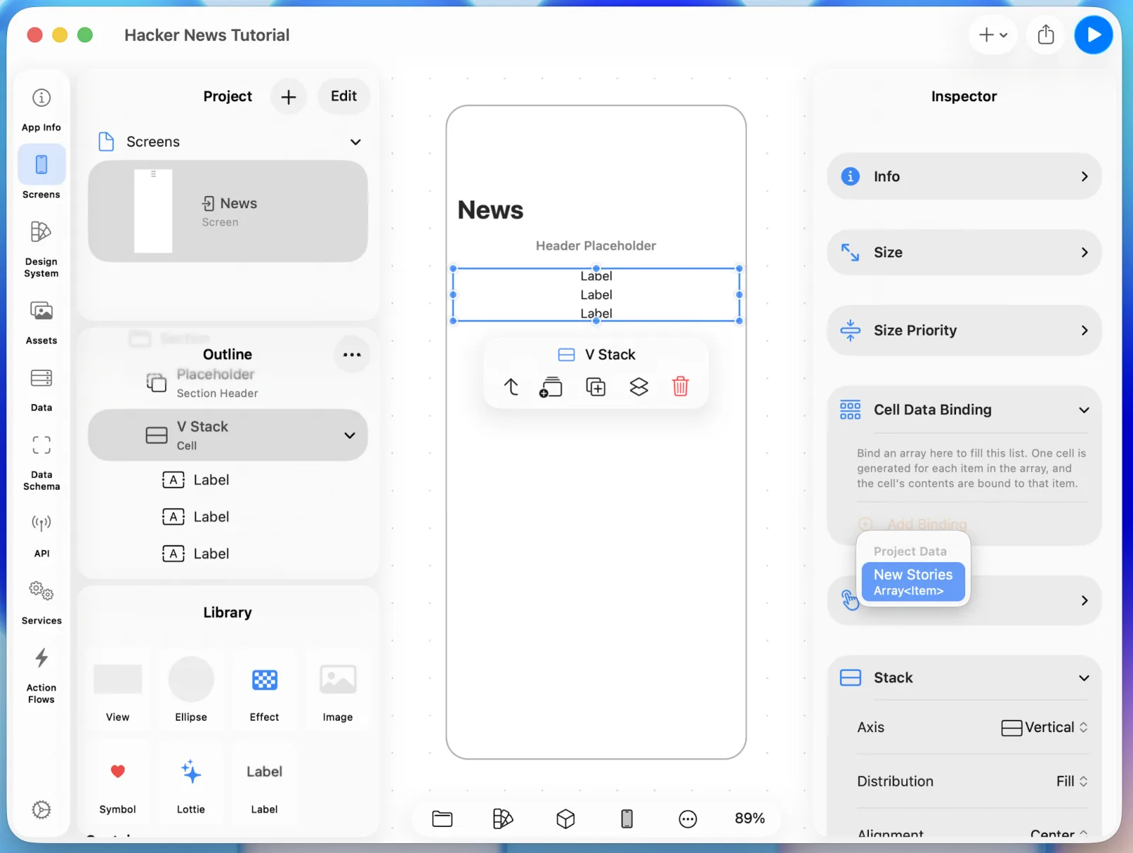 Binding cell data to the V Stack
Once the cell is bound, the V Stack and every component inside it can reach Item.
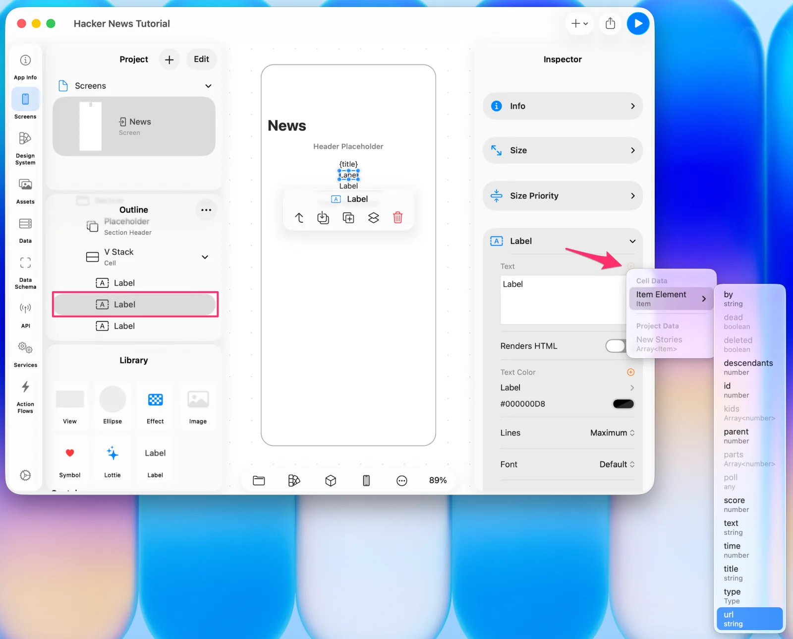
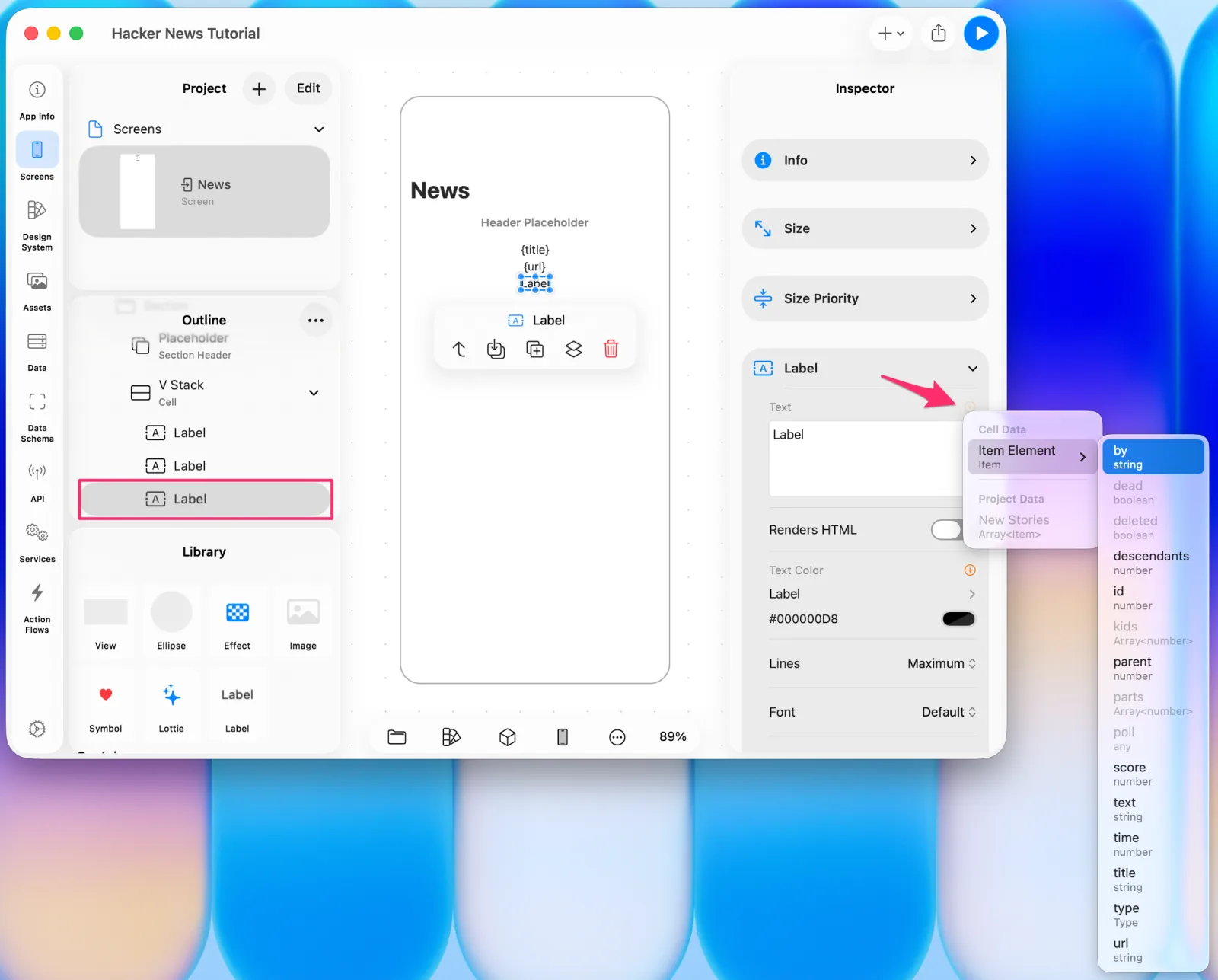
Bind the three labels to Item.title, Item.url, and Item.by.
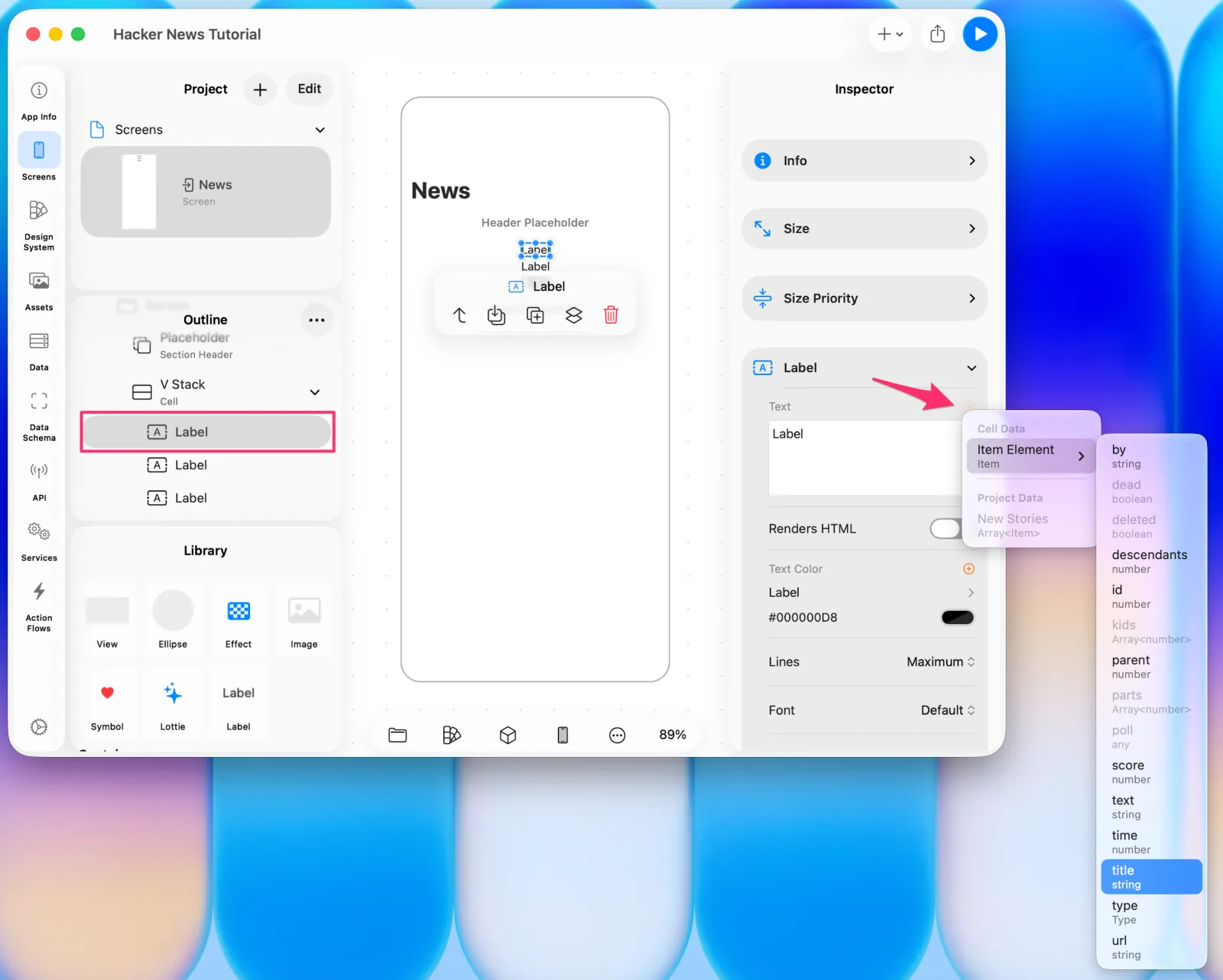 Binding the title
 Binding the url
 Binding the author
Run the preview again.
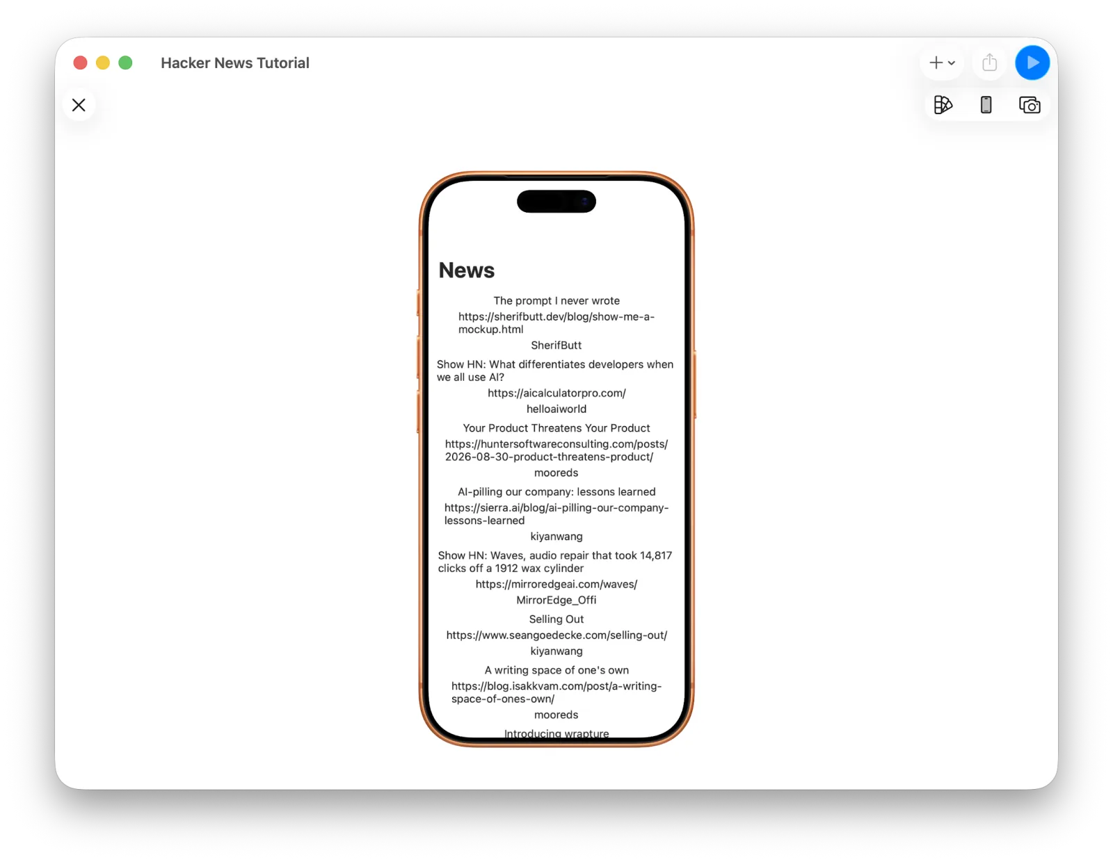 Title, url, and author together
Making it readable
The information doesn't land well yet, so let's fix the alignment and type.
The labels are bunched toward the middle because the Stack's alignment is Center. Change it to Leading.
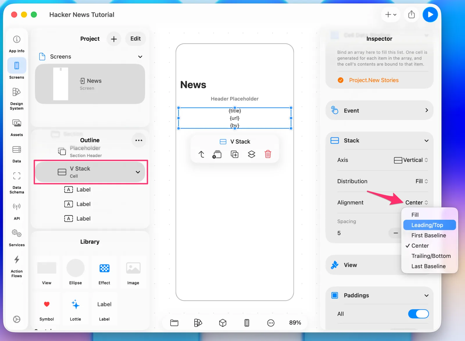 Changing the stack alignment to Leading
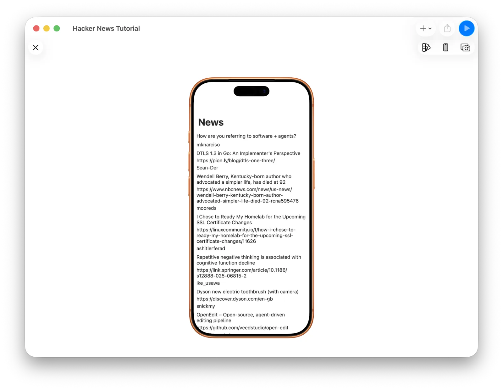 Left-aligned in the preview
Select a Label and the Inspector lets you change its font and color. Set them however you like.
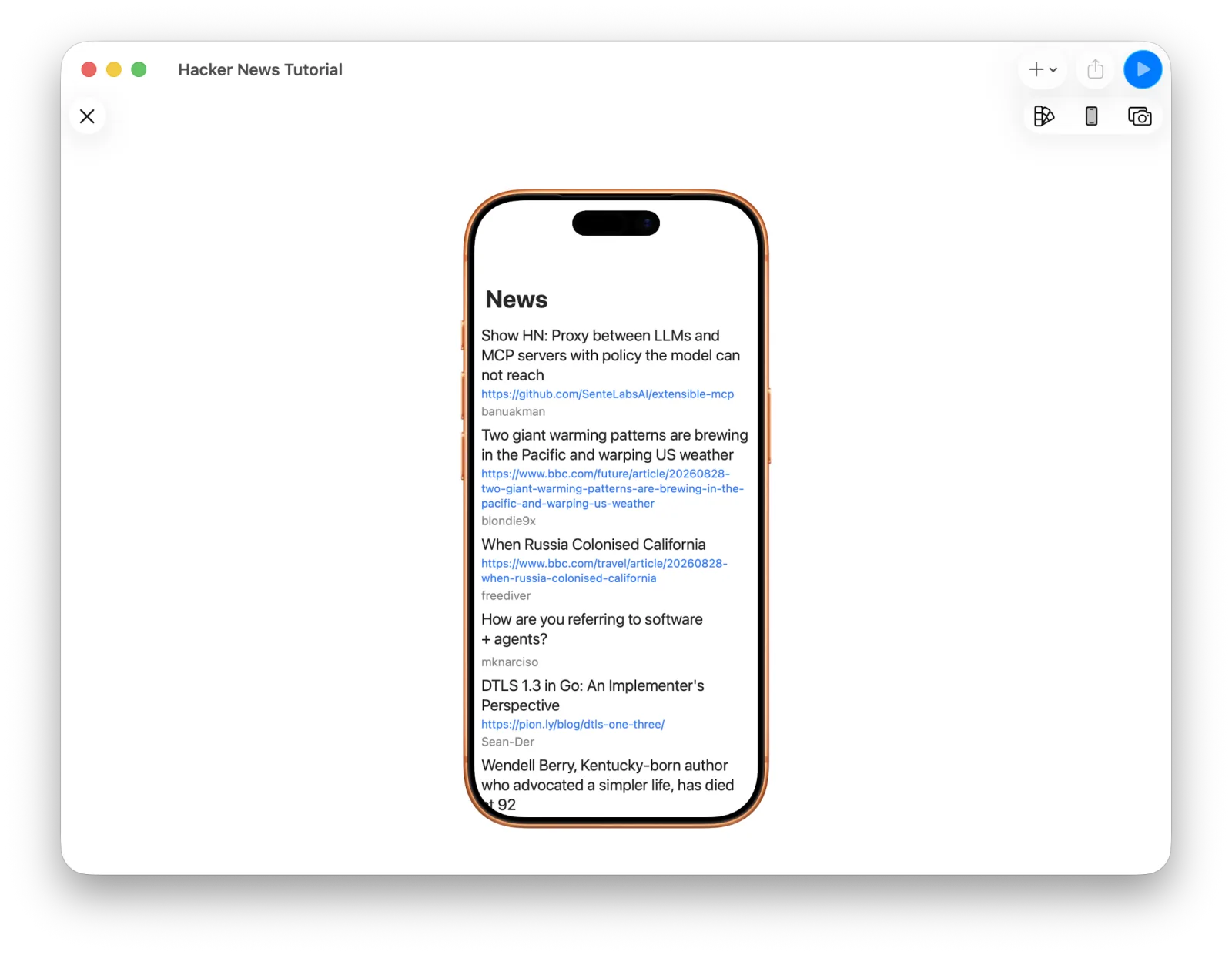 The preview after adjusting type
A little more room between cells would help too. Select the Section and change Vertical Spacing — 30 here.
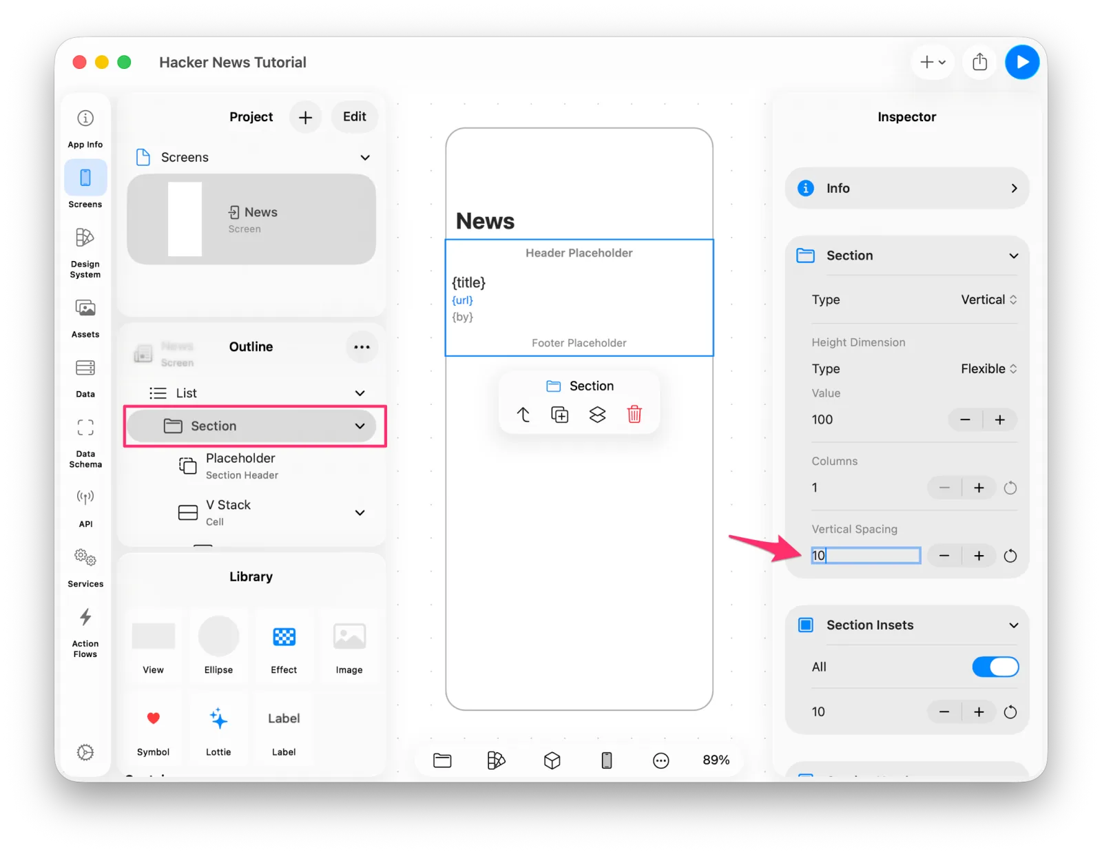 Adjusting the section's vertical spacing
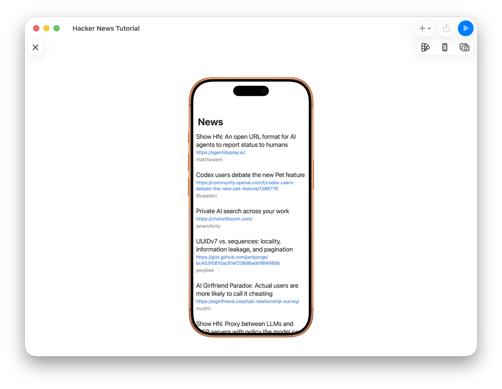 The preview with more breathing room
6. Building the story detail screen
Next, tapping a row should open a detail screen. That screen is also a list from top to bottom.
In the Screens tab, choose Add List Screen. A List Screen is just an empty screen with a List on it, so adding a List to an Empty Screen yourself gives the same result.
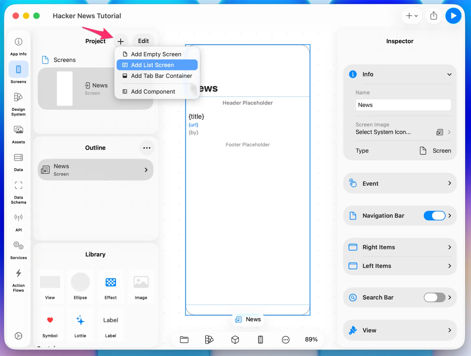 Add List Screen
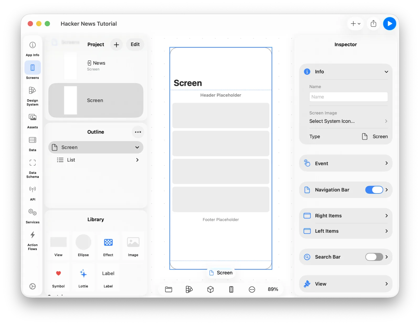 The new screen with its list
Rename the screen to Story and delete the Navigation Title — this screen doesn't need
one.
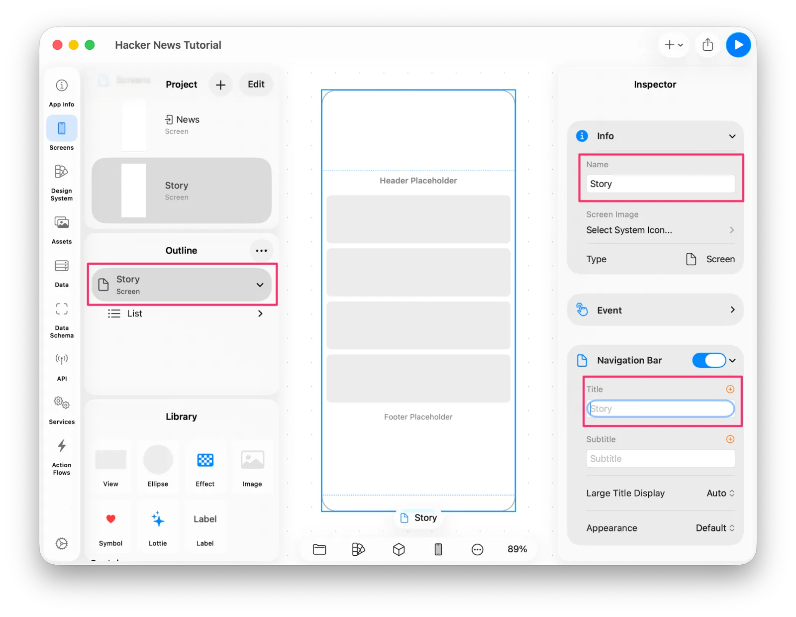 Renaming the screen to Story
This screen shows the title, the URL link, the body text, and the comments. Title, url, and text go in the first section; comments go in the second.
From the Library, drag a Label, a Link, and a Label into the List in that order. As you drag, you can see exactly where in the List it will land.
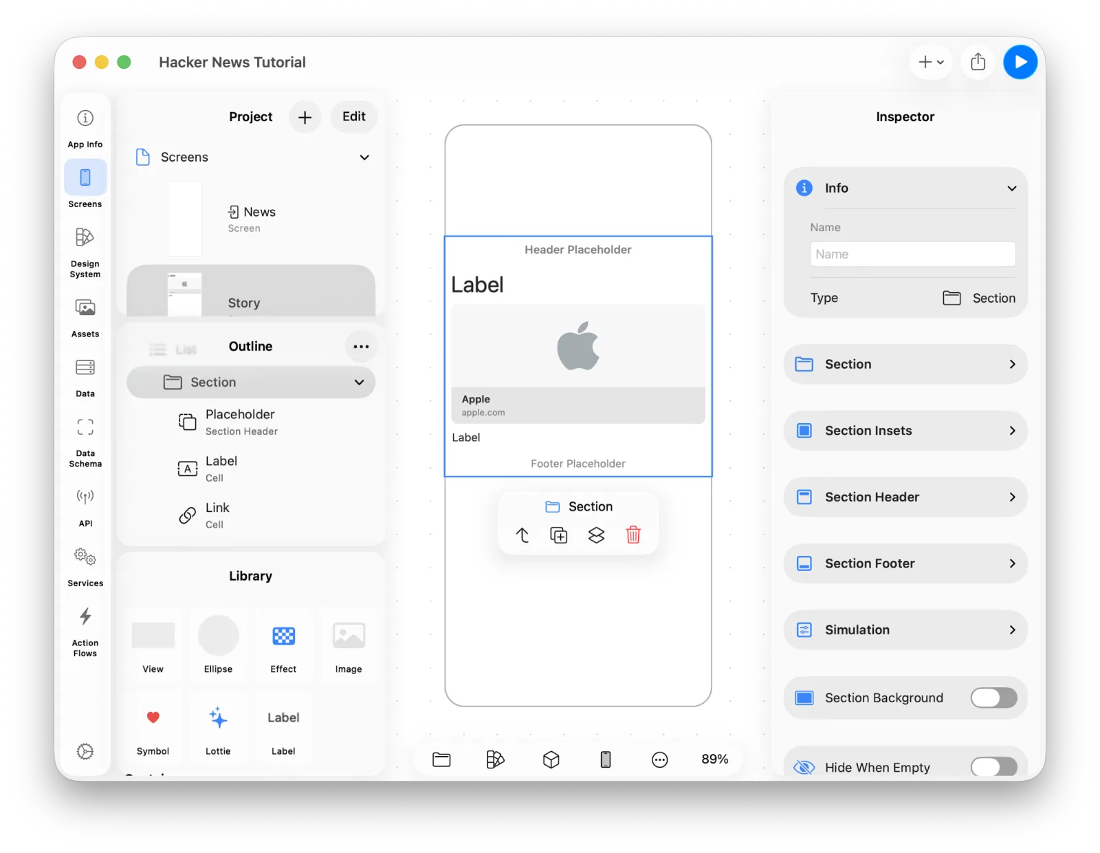 Placing a Label, Link, and Label
Adjust the fonts while you're here.
Receiving data with Screen Data
Now we need to bind those three components — but this screen is a different case. The News screen could use data defined on the Project; this one has to be handed the item that was selected in the list.
For a screen to receive data, you set up Screen Data. Press the third button at the bottom of the editor and choose Data.
Anything you define there is scoped to that screen, and it can be injected when you define navigation in an Action Flow.
Use Add Data > Add Field to add item: Item.
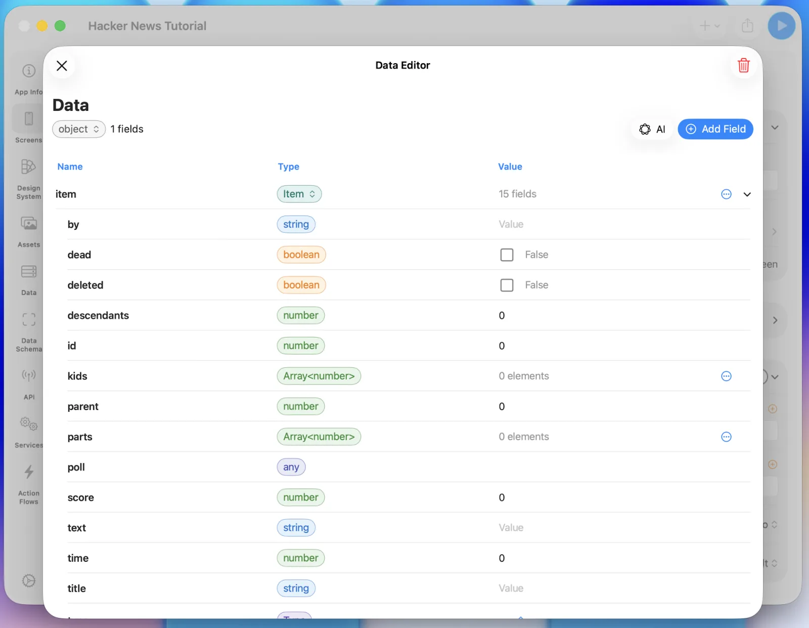 Adding item to Screen Data
You can now bind this data to the UI. Store a value on the screen and it shows up immediately; inject one from an Action Flow and the injected value shows instead. When injecting, you can pass the whole Item at once or just the fields you want.
Bind the three components in turn.
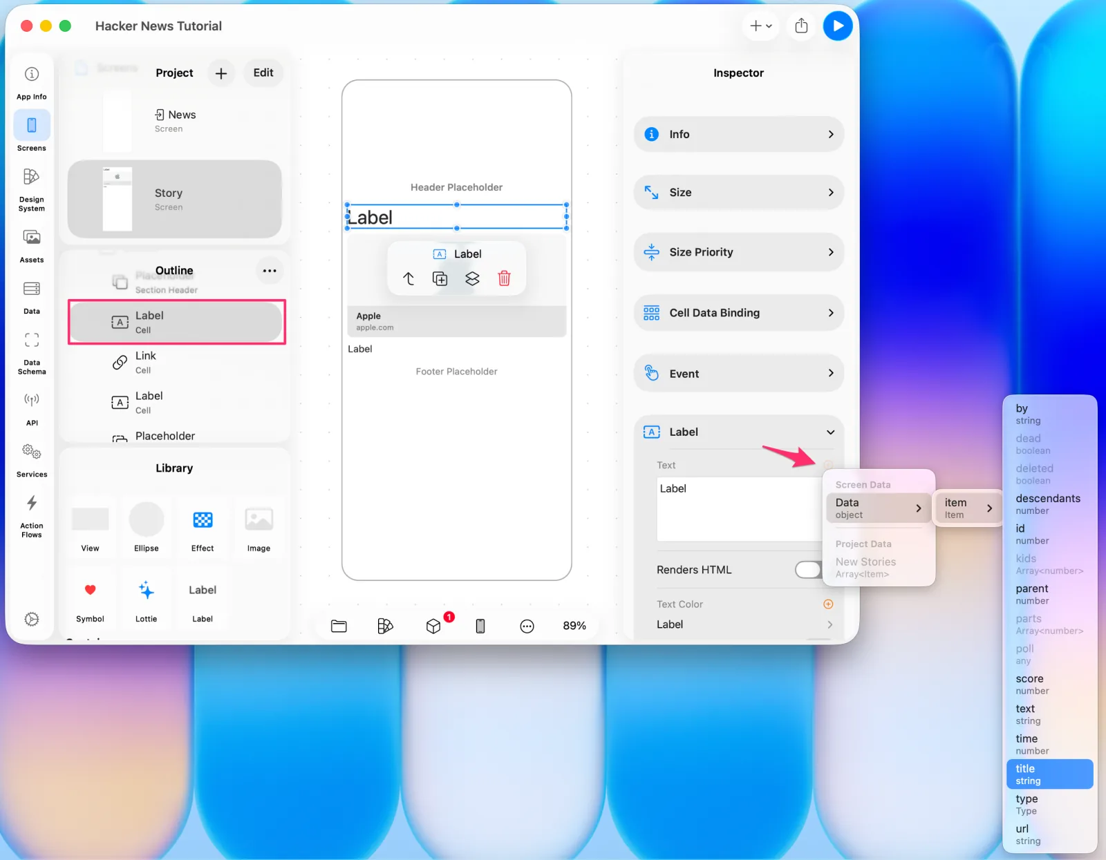 Binding the title
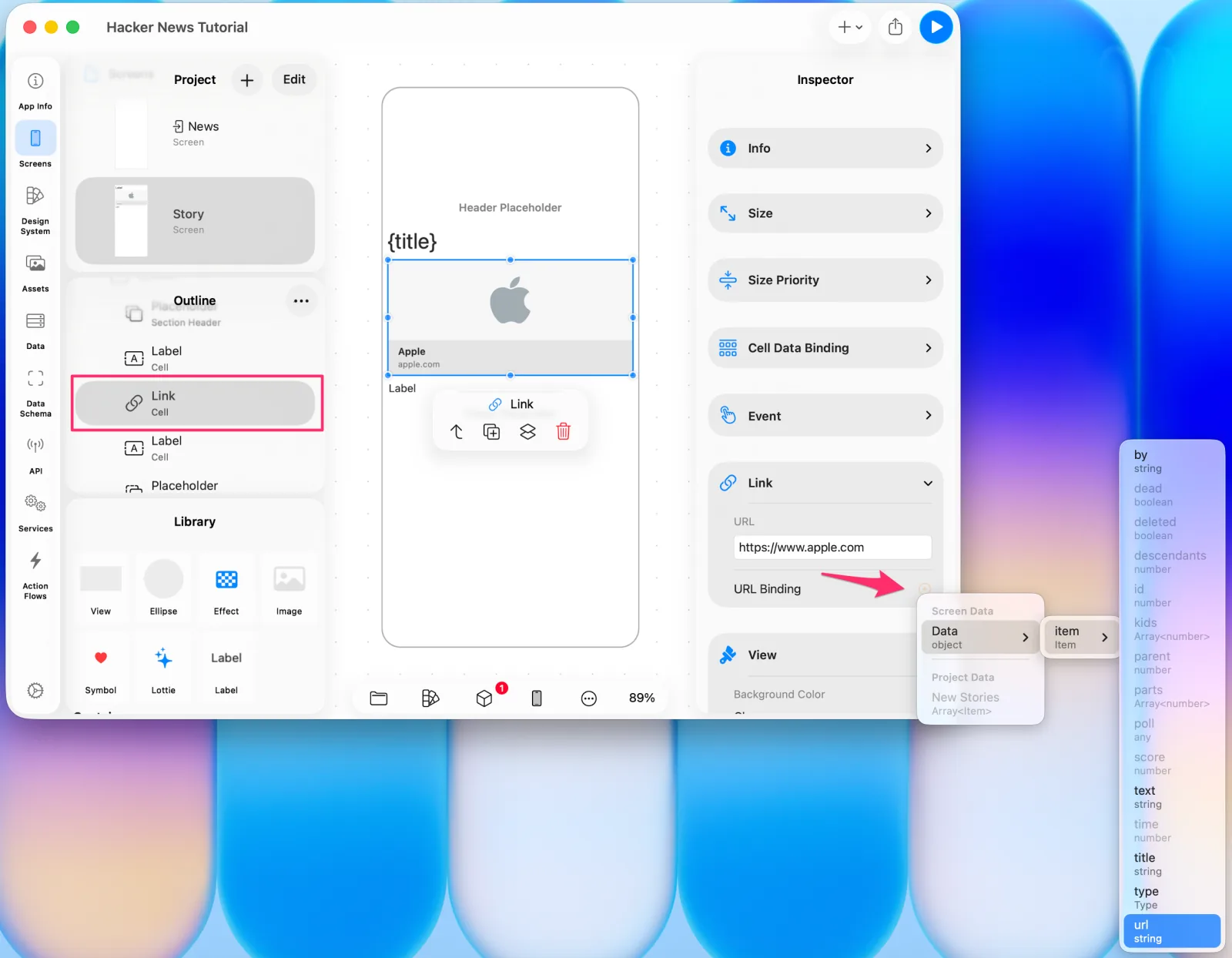 Binding the url to the Link
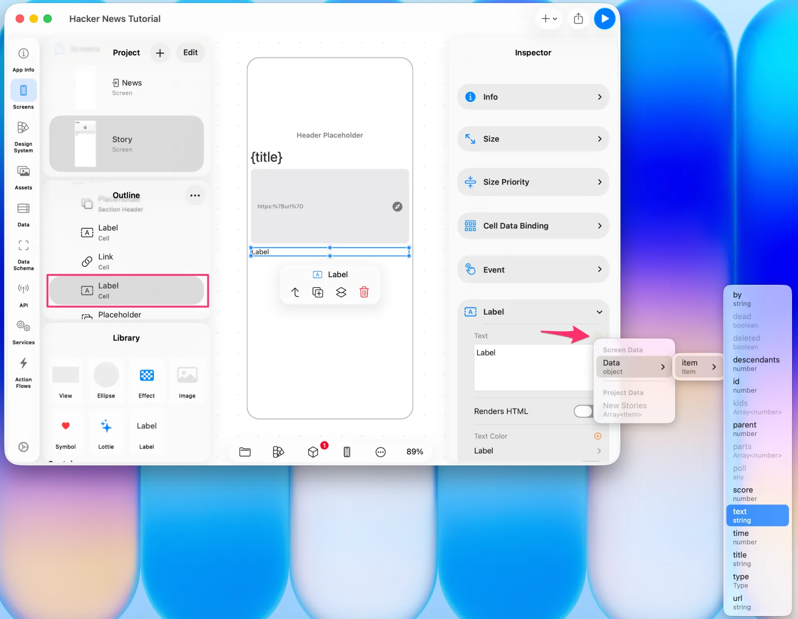 Binding the body text
7. Wiring up navigation
Go to the Action Flow tab, create a new flow, and name it Present Item.
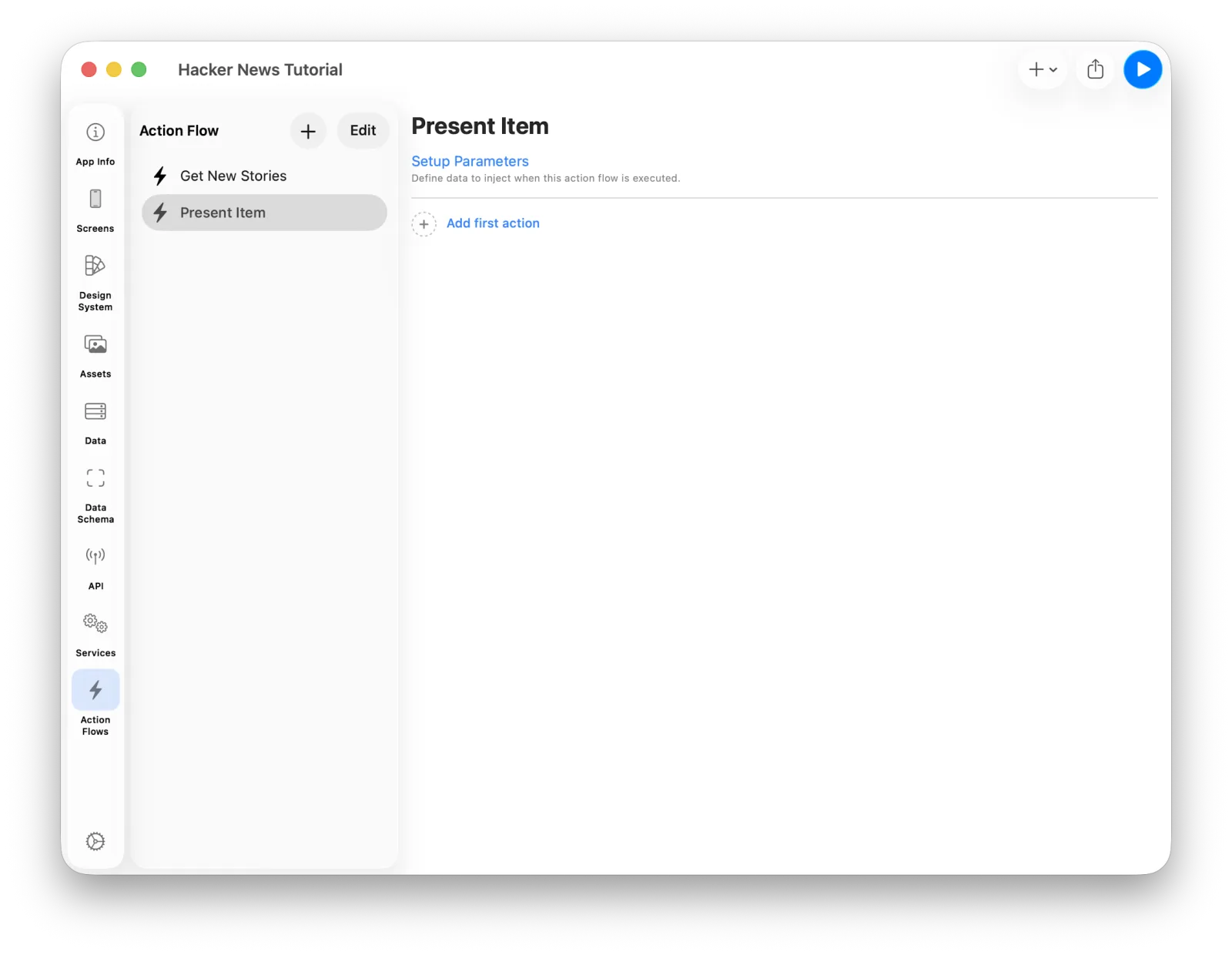 The Present Item action flow
This flow runs when a cell in the list is selected. The cell has to pass its Item along with the call, or the destination screen has nothing to show. Passing data into a flow is what Action Flow Parameters are for.
Press Setup Parameter and set item: Item. Parameters can be shaped however your
flow needs.
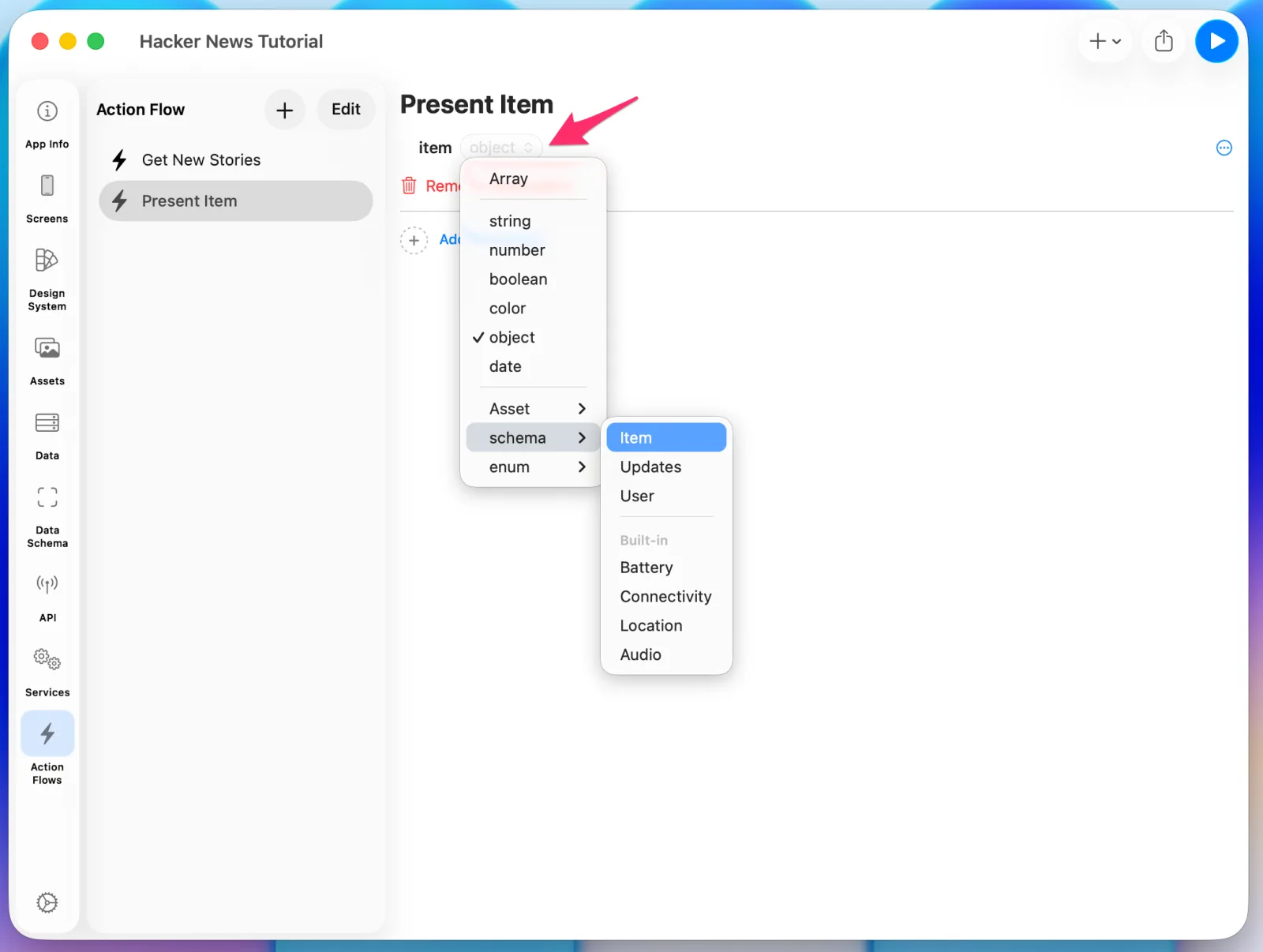 Setting up the action flow parameter
With that in place, every action you add below can use the value.
Choose Add first action > Navigation > Screen Navigation.
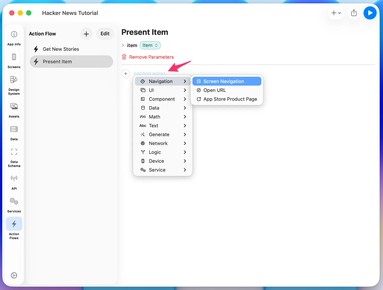 Adding a Screen Navigation
Set the Navigation Type to Push.
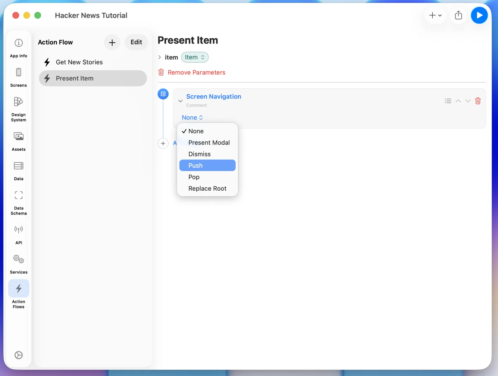 Setting the navigation type to Push
Select Story as the destination screen.
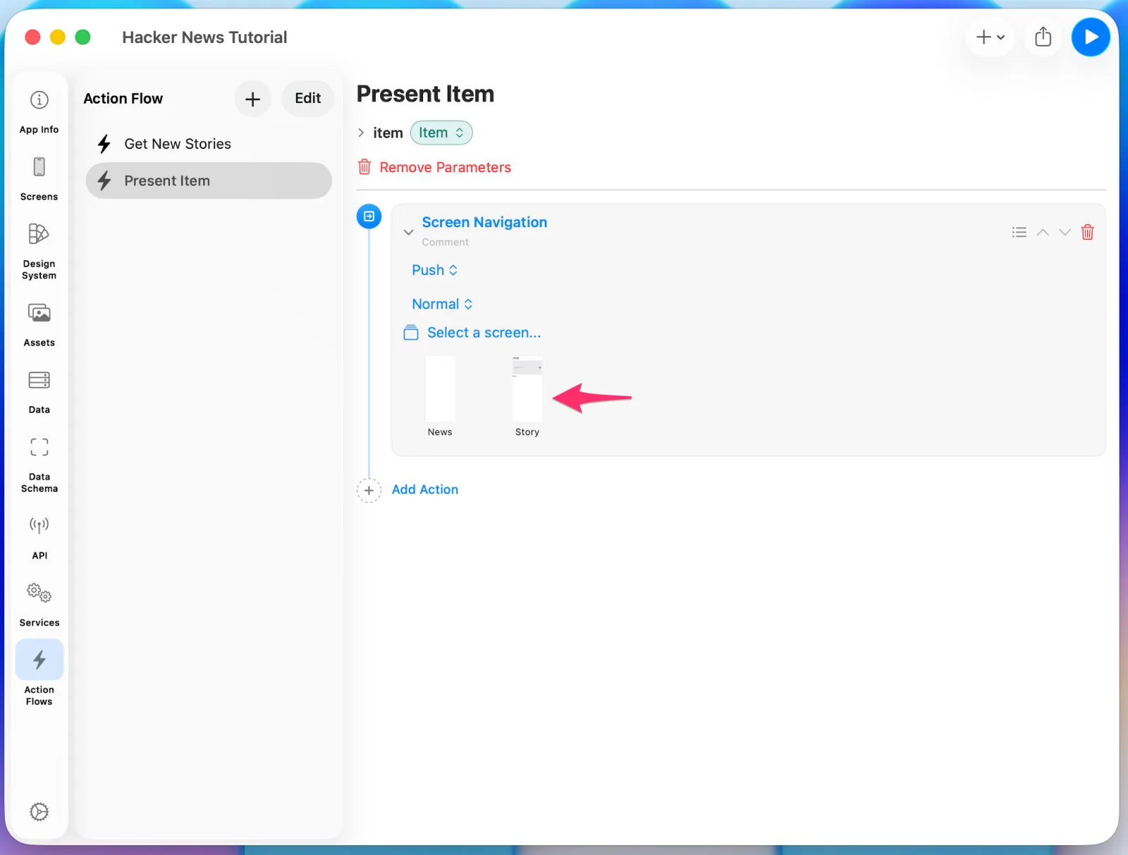 Selecting the Story screen
Choosing Story adds an Input section at the top — Layerz is telling you that this
screen has Screen Data and can be injected. Connect the flow's item parameter to it.
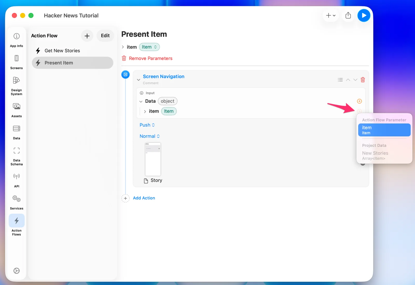 Injecting item into the screen's data
Triggering it from the cell
Back on the News screen, select the cell. In the Inspector's Event section, choose
the Present Item action flow you just built.
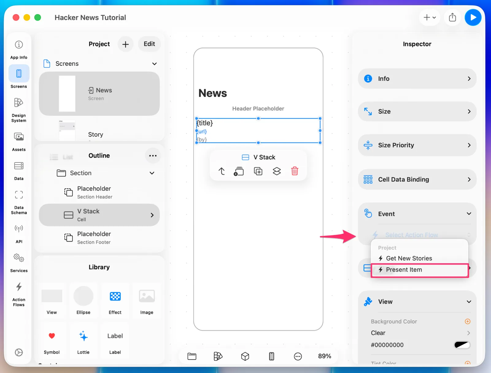 Wiring the action flow to the cell's event
Because that flow has a parameter, a binding UI appears for the data you're passing.
Give item the value Cell.Item. The cell has an Item list bound to it, so it can work
with the individual item — bind it into the cell's own UI, or hand it to an action flow
like this.
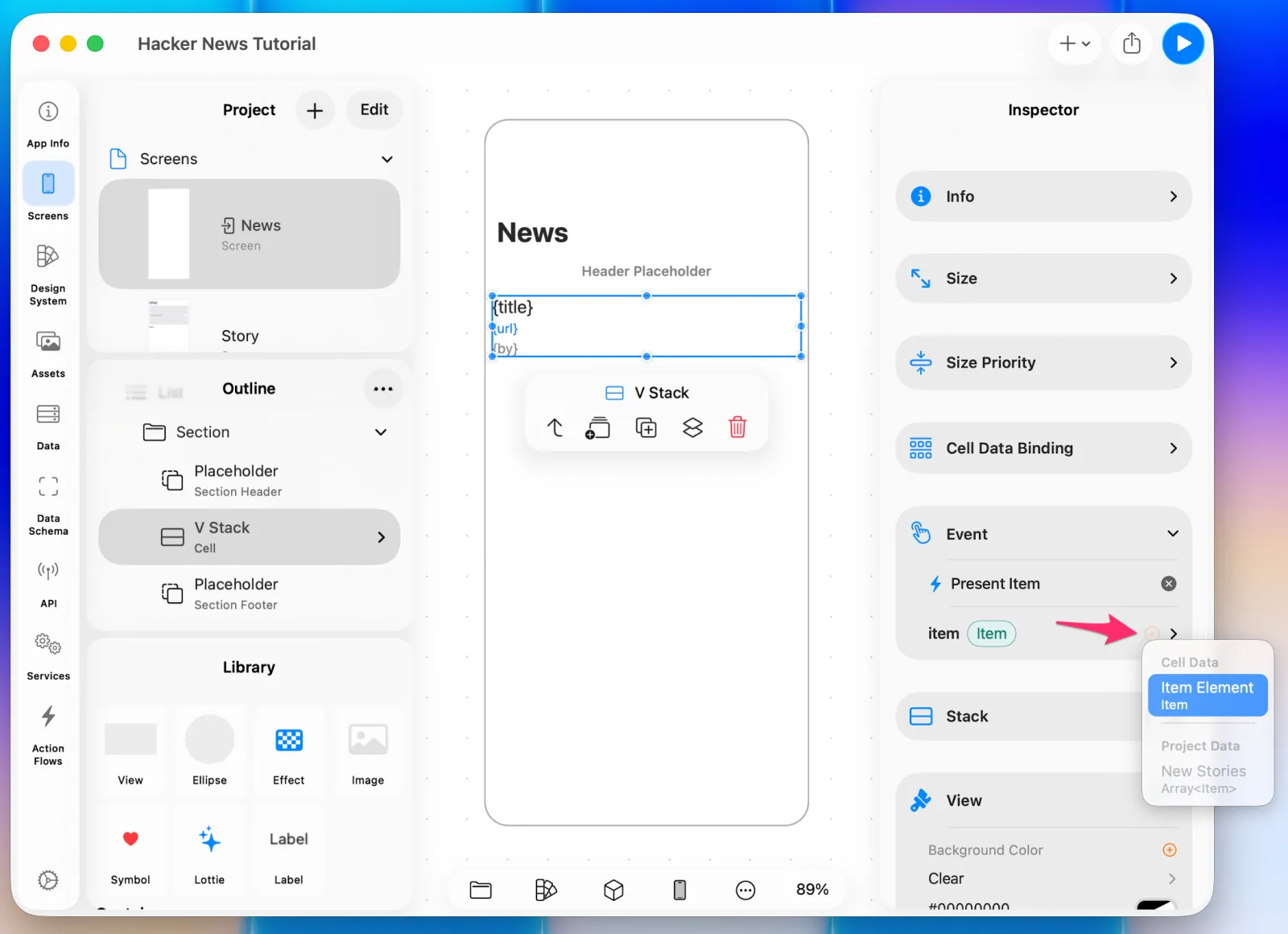 Passing Cell.Item into the parameter
Preview again and open a story from the list.
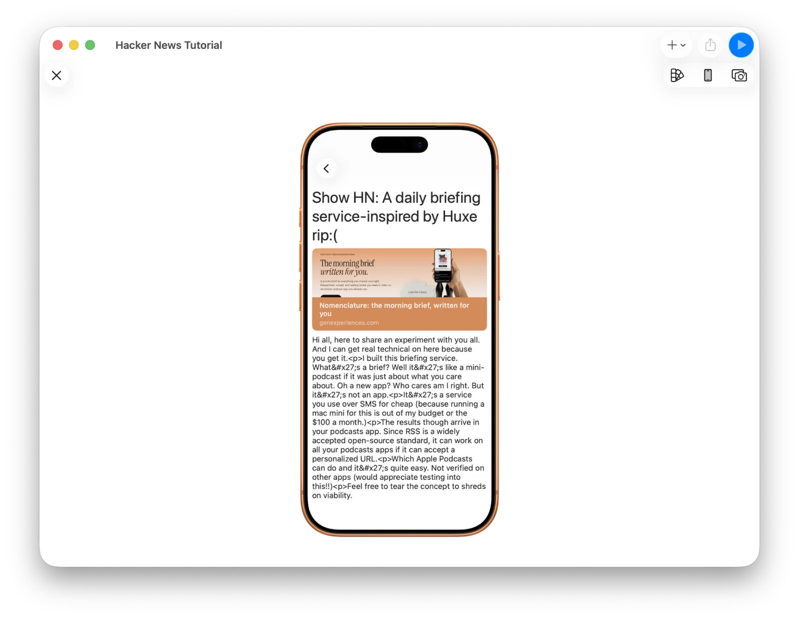 The detail screen, with raw HTML tags in the body
The data shows up, but the body has <p> tags in it — this API returns HTML in its
text field.
Turn on Renders HTML in that Label's properties.
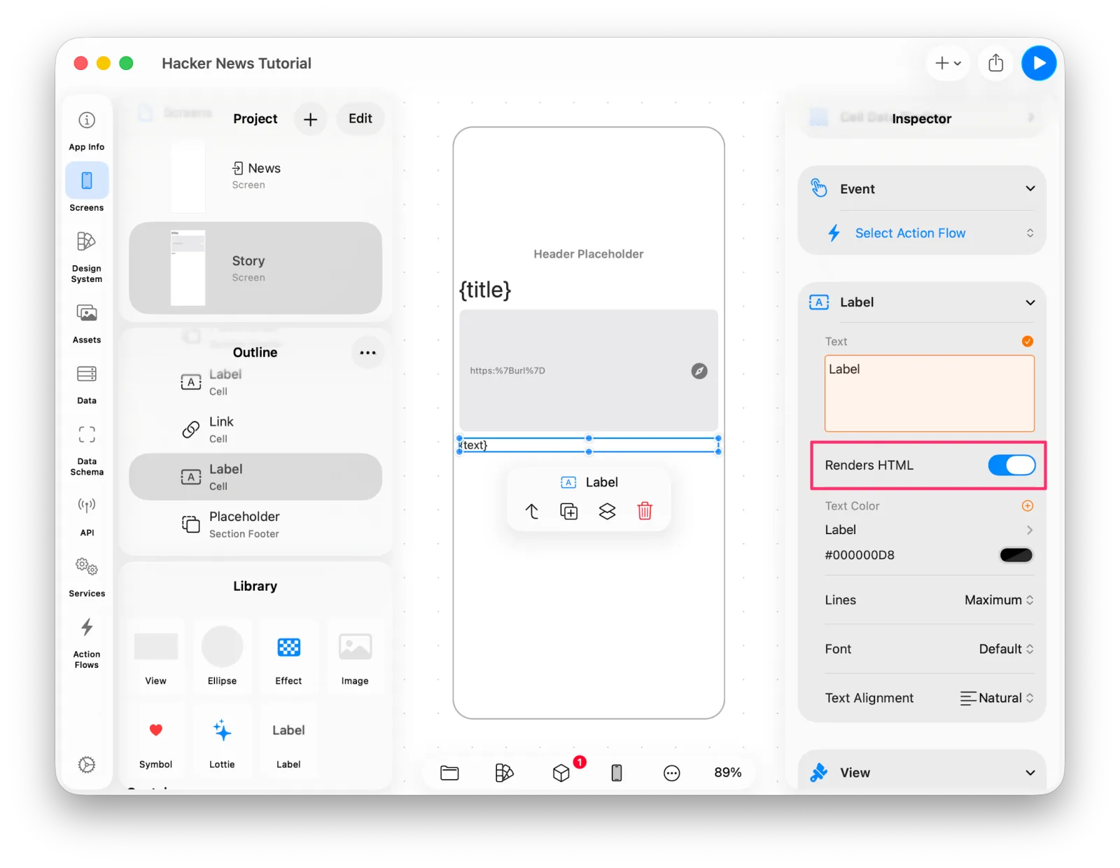 Turning on Renders HTML
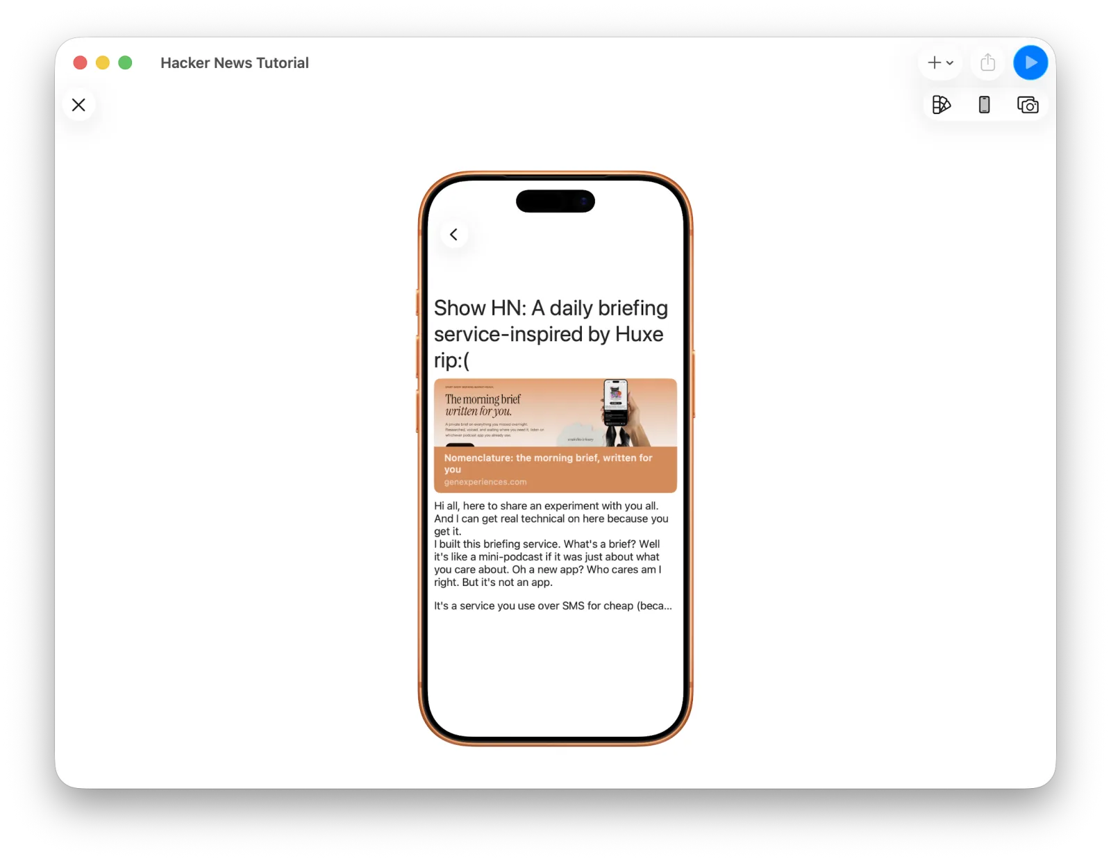 The body rendered properly
8. Loading the comments
Now for the comment list underneath.
So far the only API and Data we've built are for the New Stories list. To fetch
comments, you need to know how the API is shaped. In the Hacker News API, everything
about a post lives on Item — and Item has kids: Array<number>, which here is the
list of comment ids.
From here it's the same process as New Stories: fetch each id in kids through
Retrieve an item and show the results as comments.
With one difference. Just as we gave the Story screen its own Item data, we'll add the comments data and its loading flow as screen-scoped too.
Open Screen Data and add comments: Array<Item>.
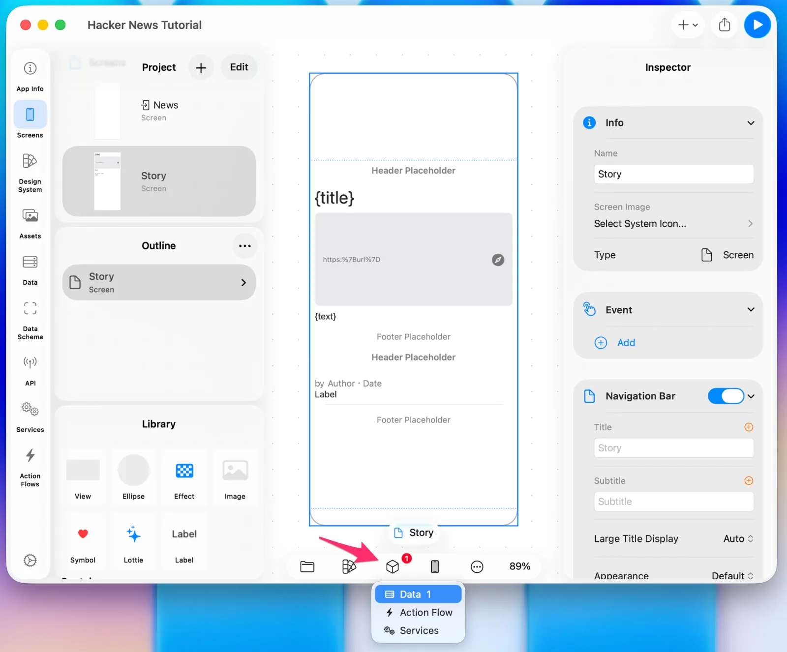 Adding comments to Screen Data
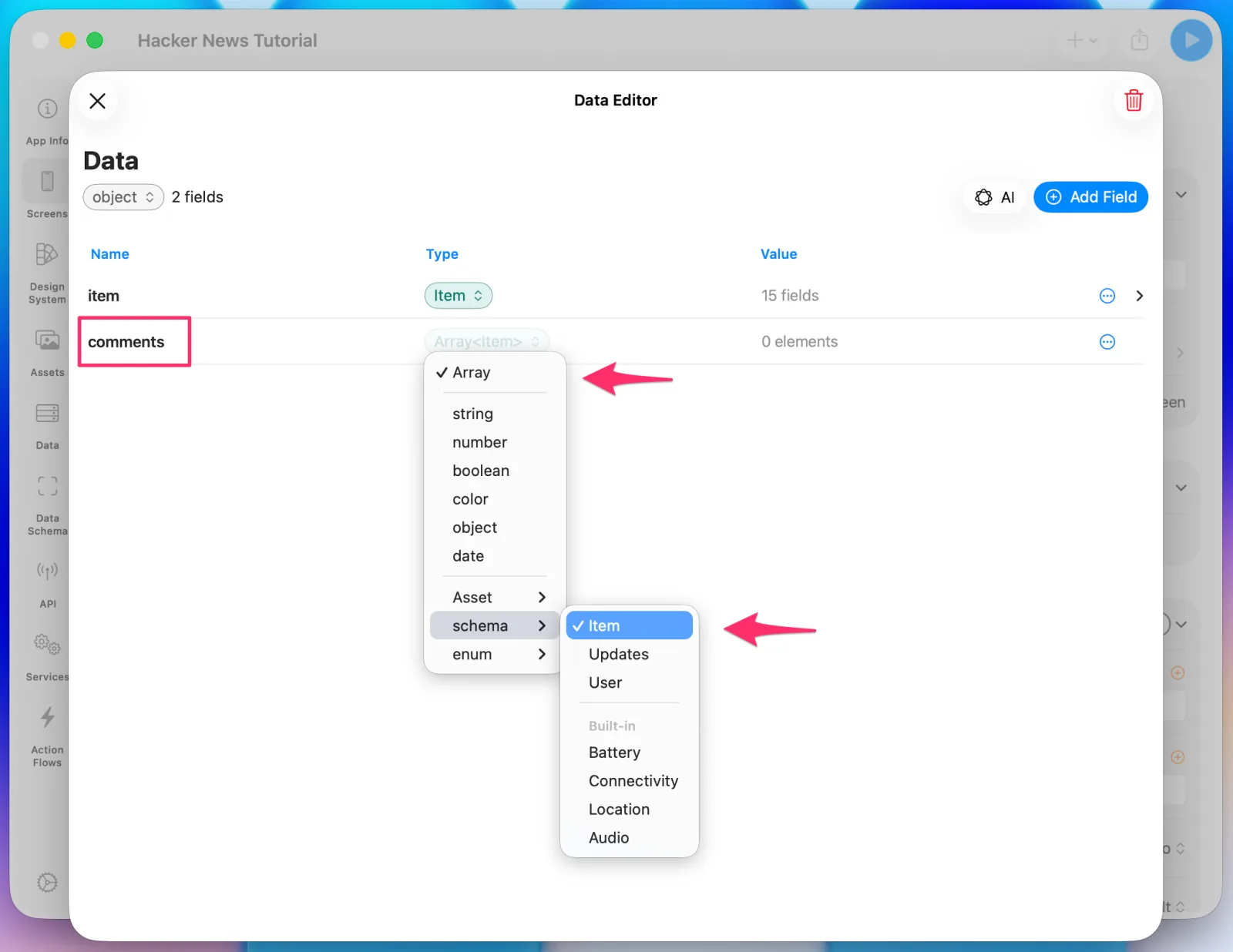 comments is an array of Item
Open the Screen Action Flow panel and add a Get Comments action flow.
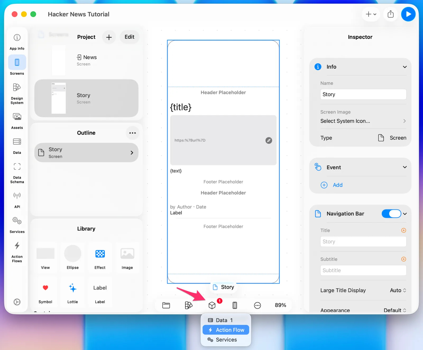 Adding a screen-scoped action flow
To call the API for each id, choose Add first action > Logic > For Each.
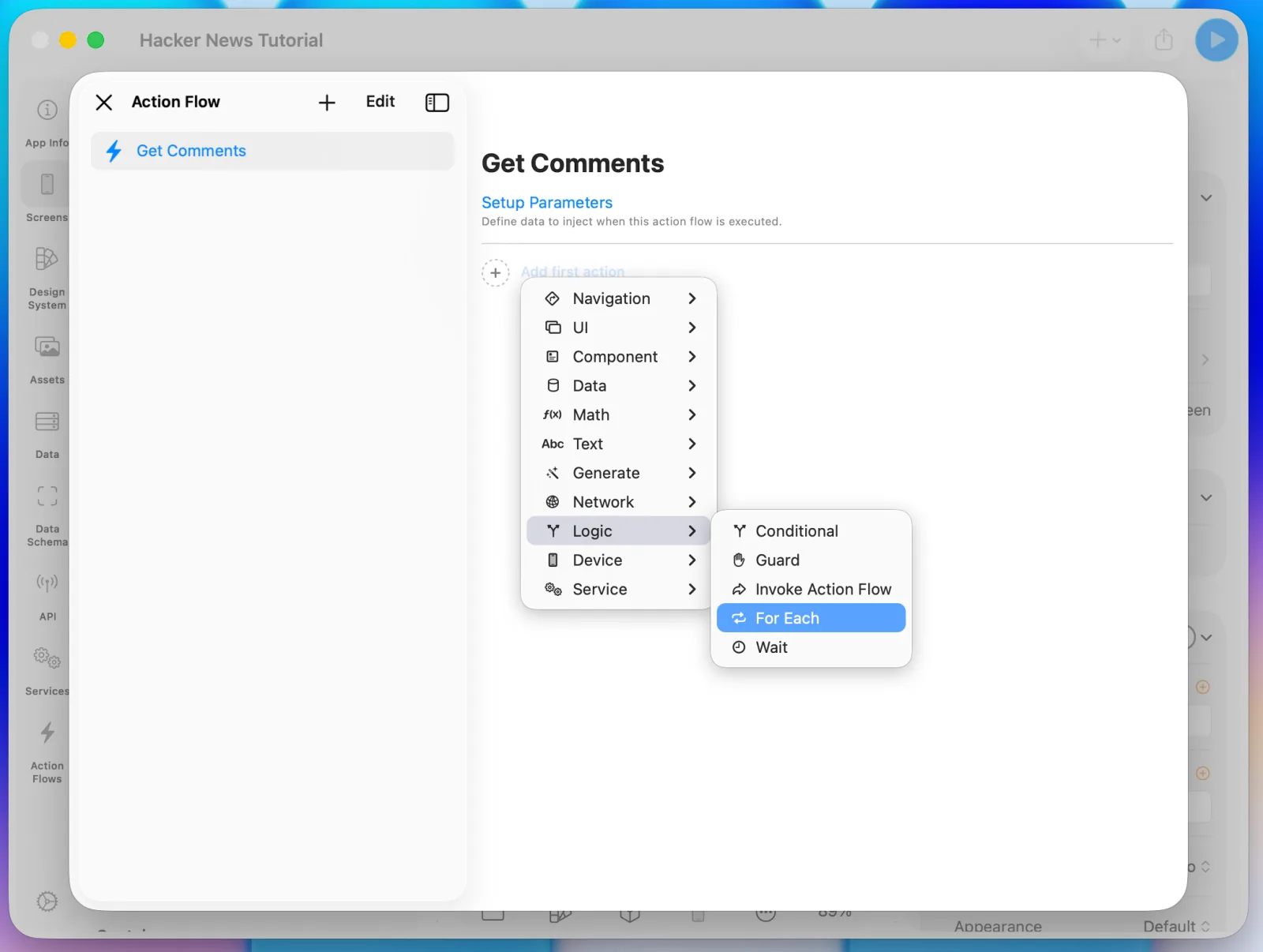 Adding a For Each
For the array to loop over, select View Local Data > item > kids.
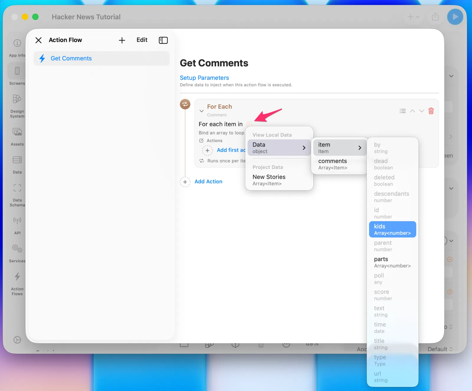 Looping over kids
Inside the loop, run an API Call followed by an Update Data.
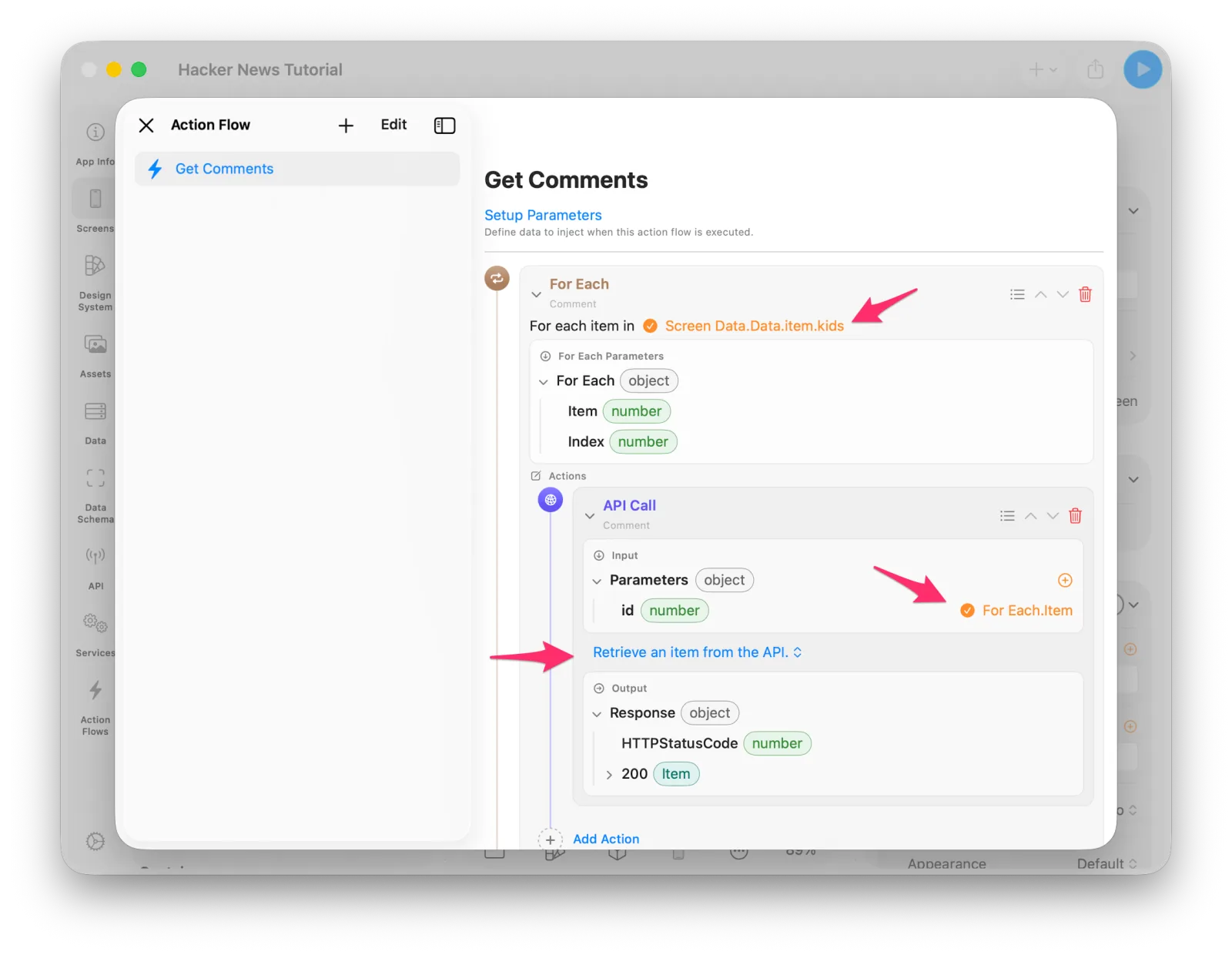 The API call inside the loop
Add the Update Data and set its Source to the output of the API call right above it.
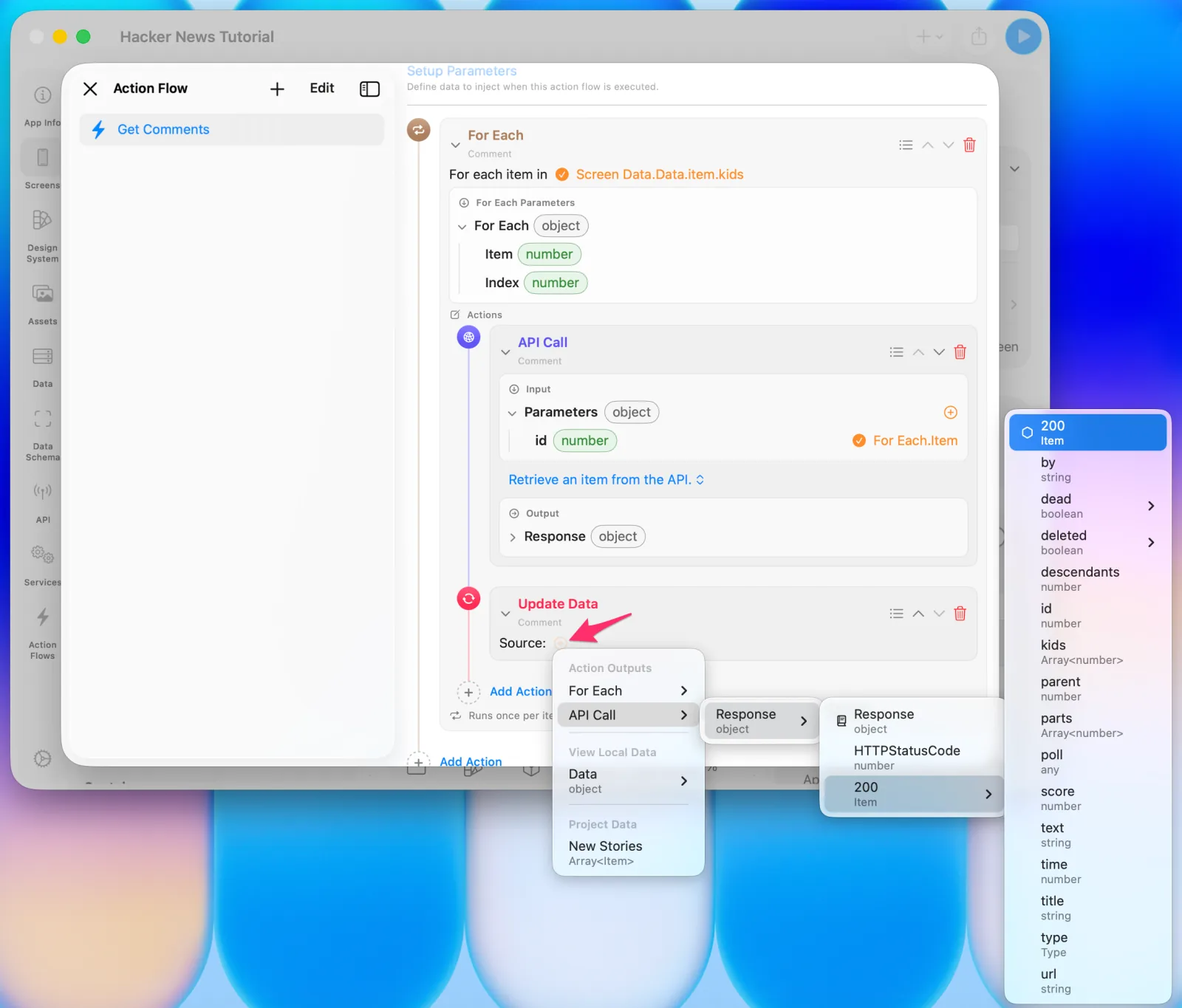 Setting the API call output as the Source
Set the Destination to the comments you defined in Screen Data.
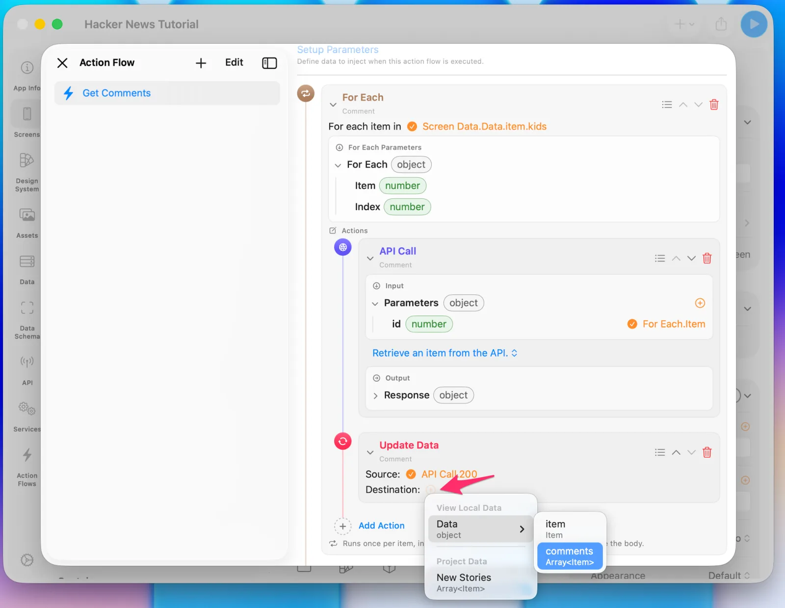 Setting comments as the Destination
That's it — calling this flow now loads every comment into comments.
9. Building the comment UI
Add a new Section and name it Comments.
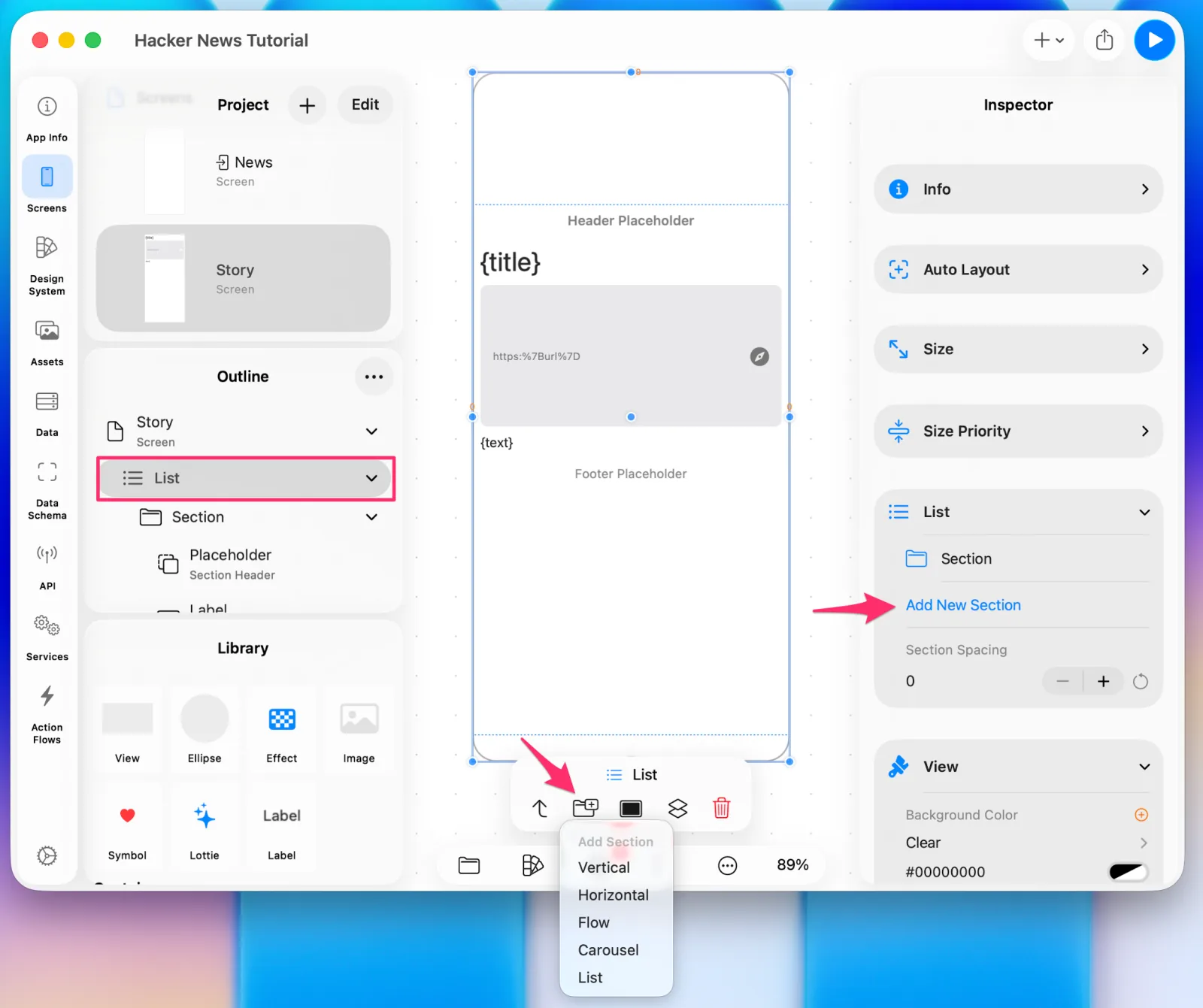 Adding the Comments section
Set its Type to List, which lays cells out vertically. It's close to the Vertical type, but Vertical can do more — adding columns to make a grid, for instance. Section types can be changed at any time while editing, so experiment later.
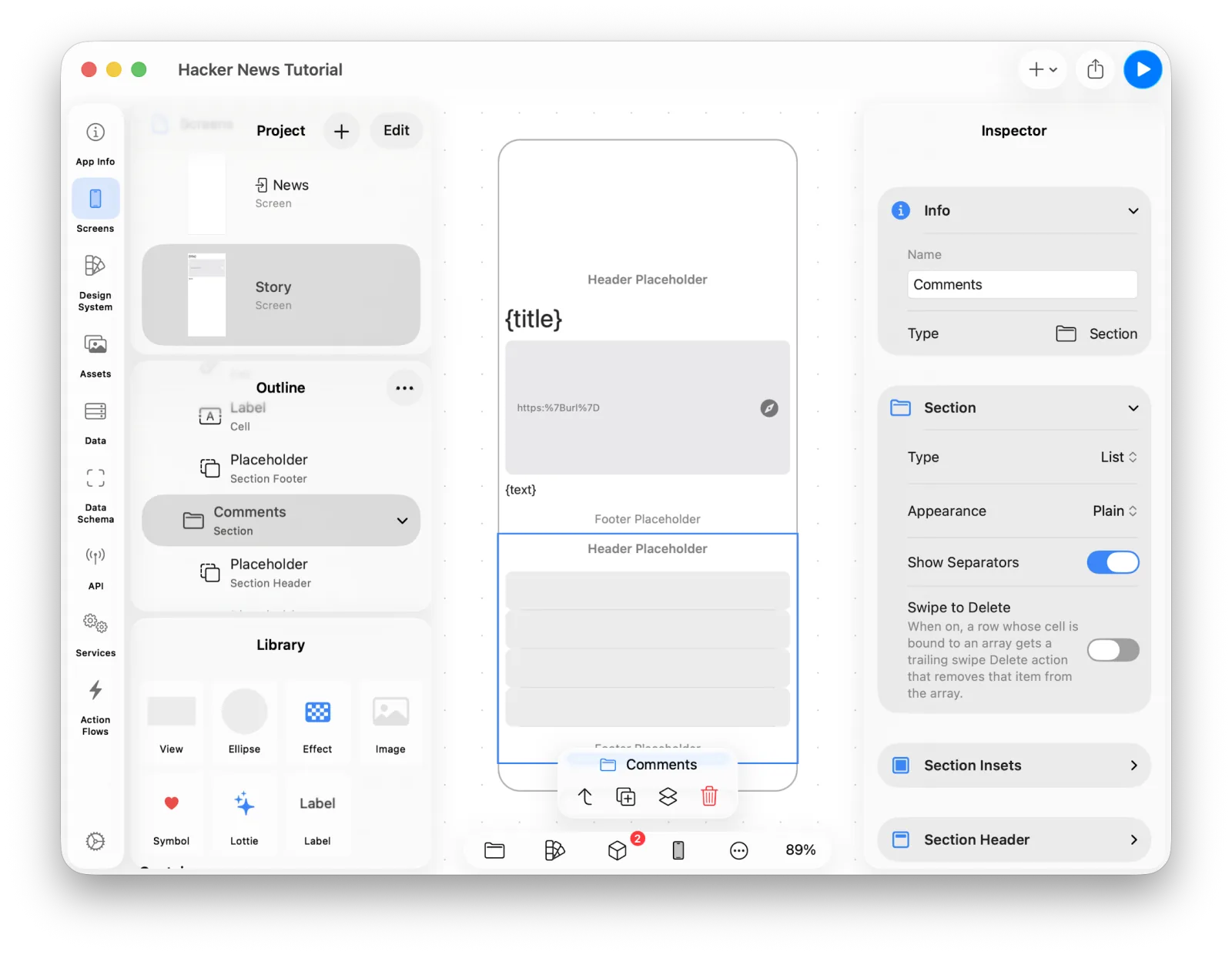 Setting the section type to List
The header
This time we'll start with the Header Placeholder. Select it and pick a component from the Library, the same way placeholders work in a Stack.
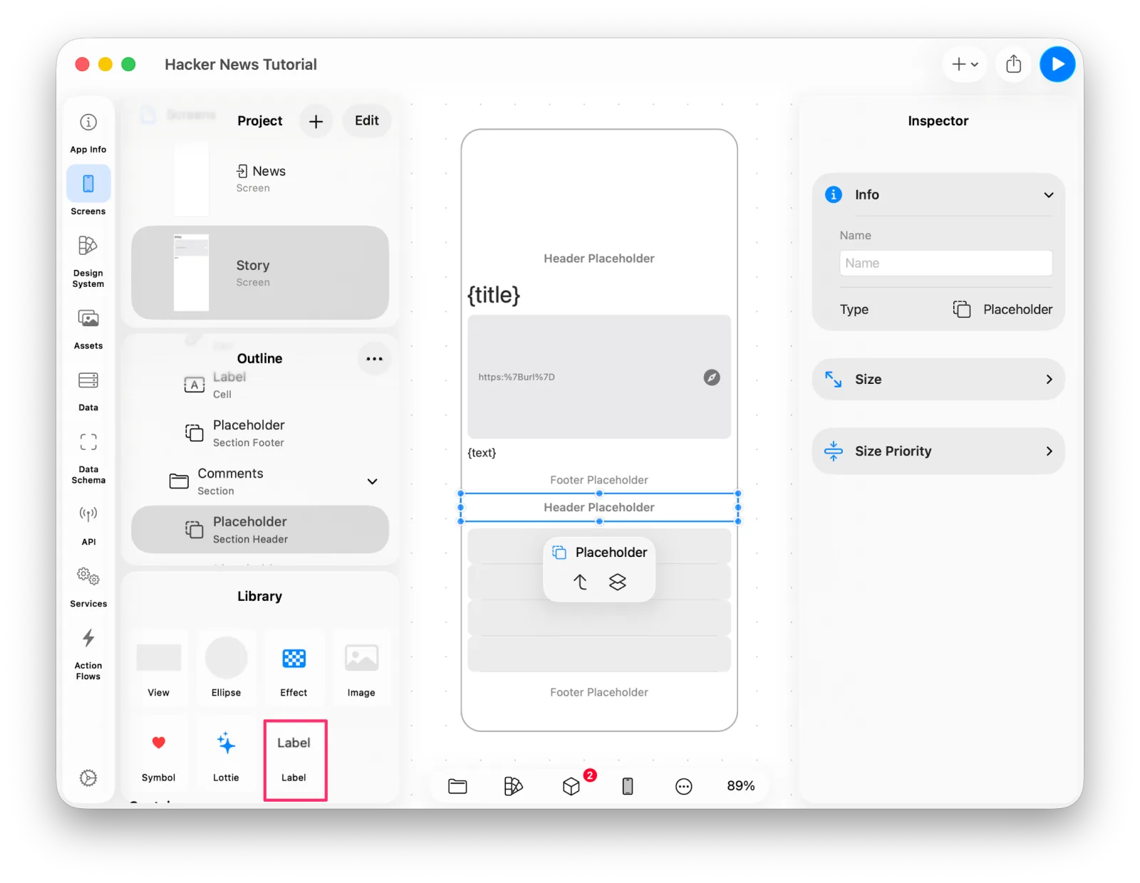 Selecting the header placeholder
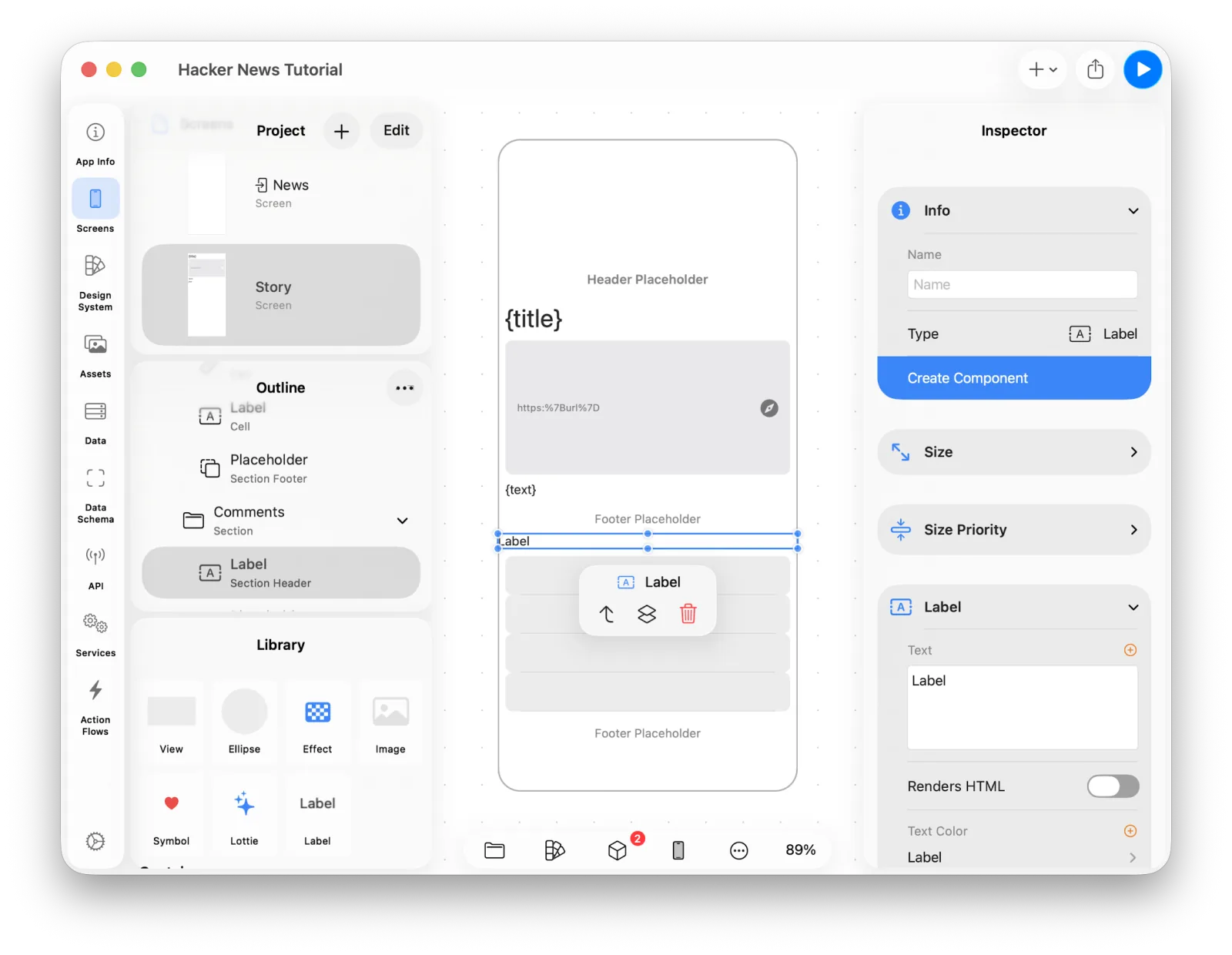 Adding a Label to the header
It looks a bit small, so adjust the font and padding.
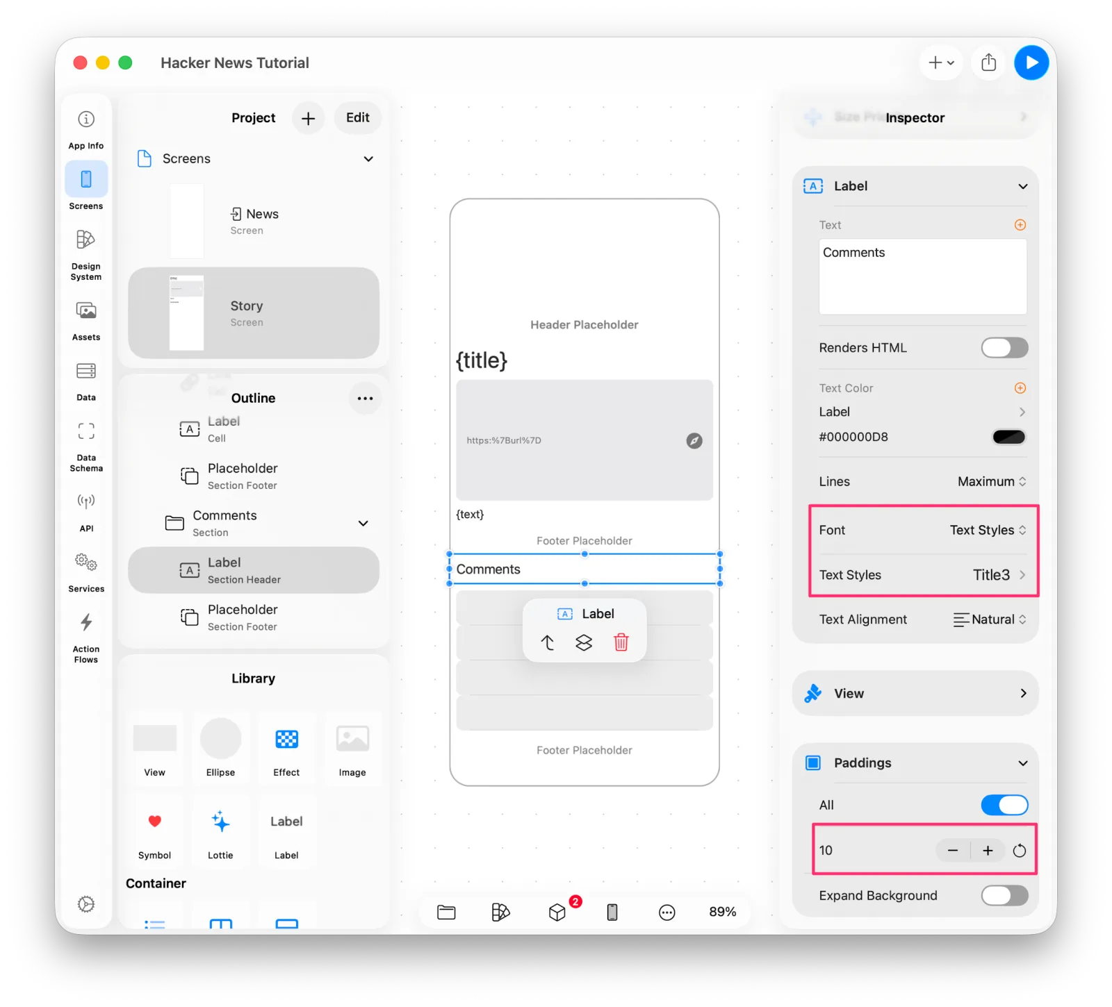 Adjusting the header's font and padding
The comment cell
Drag a V Stack from the Library into the Comments section and set its alignment to Leading.
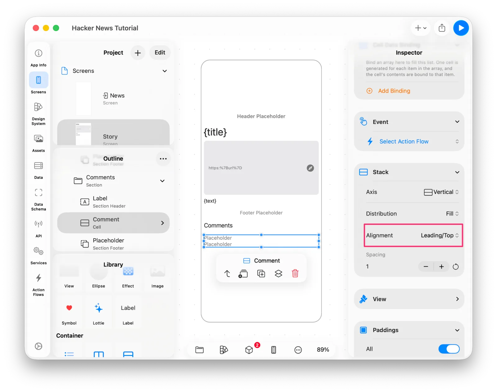 The V Stack for the comment cell
The first row shows who wrote the comment and when; the second shows the comment itself.
Select the first placeholder and choose H Stack from the Library.
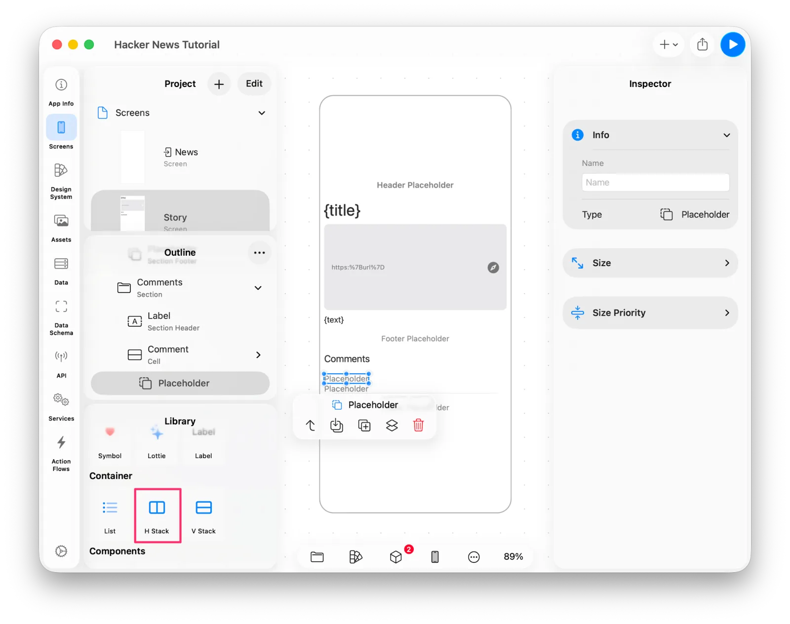 Adding an H Stack
That H Stack holds four labels. Turn the first placeholder into a Label, set its font and text color, then duplicate it until you have four. Delete the placeholder left over at the end.
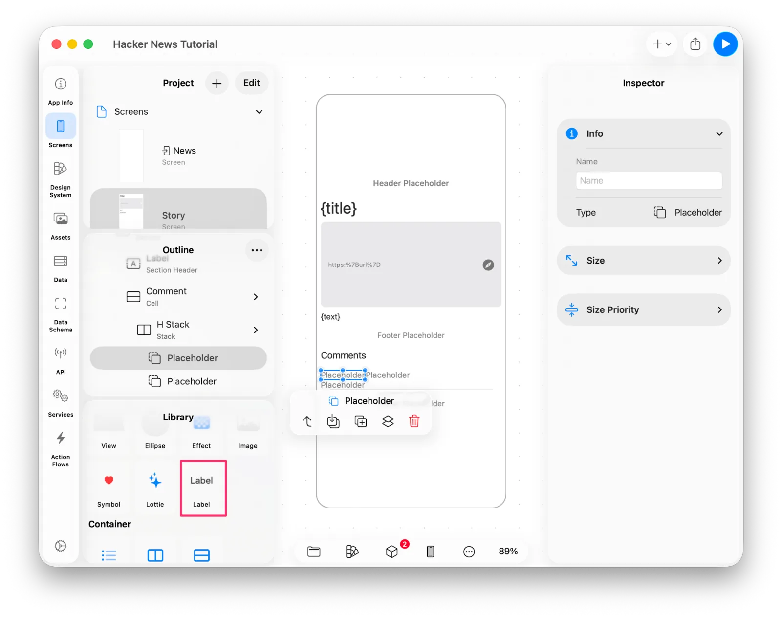 Styling the label
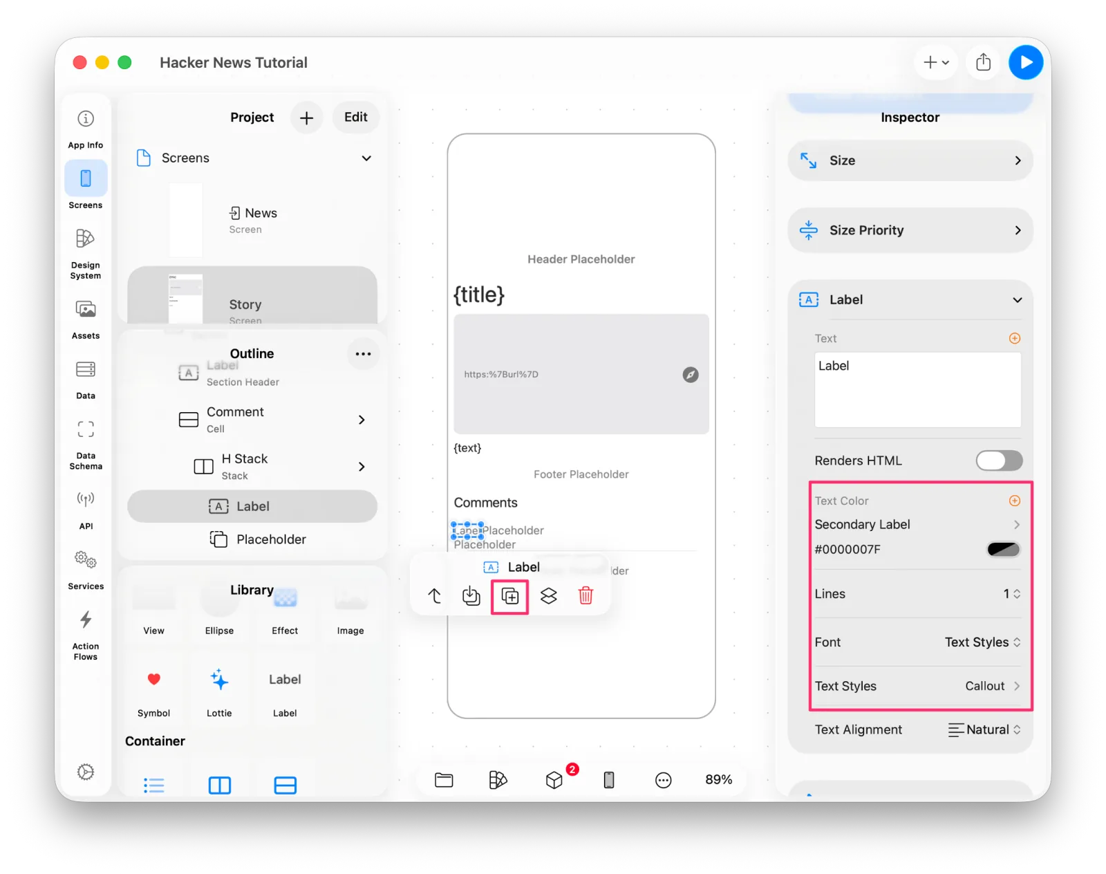 Four labels in place
Use the Stack's Spacing property to set the gaps between them.
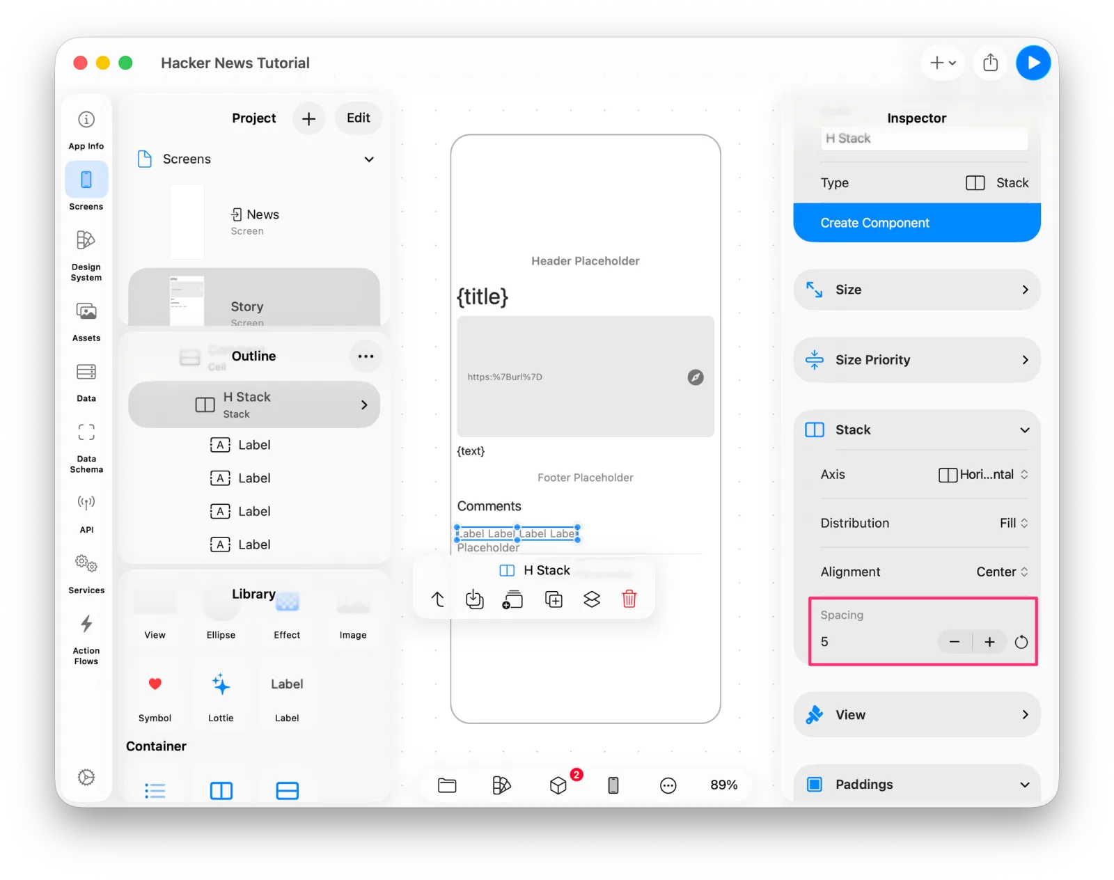 Adjusting the H Stack's spacing
The four labels read by, author, ・, date in order. We'll bind the author and date
in a moment.
Turn the lower placeholder into a Label as well.
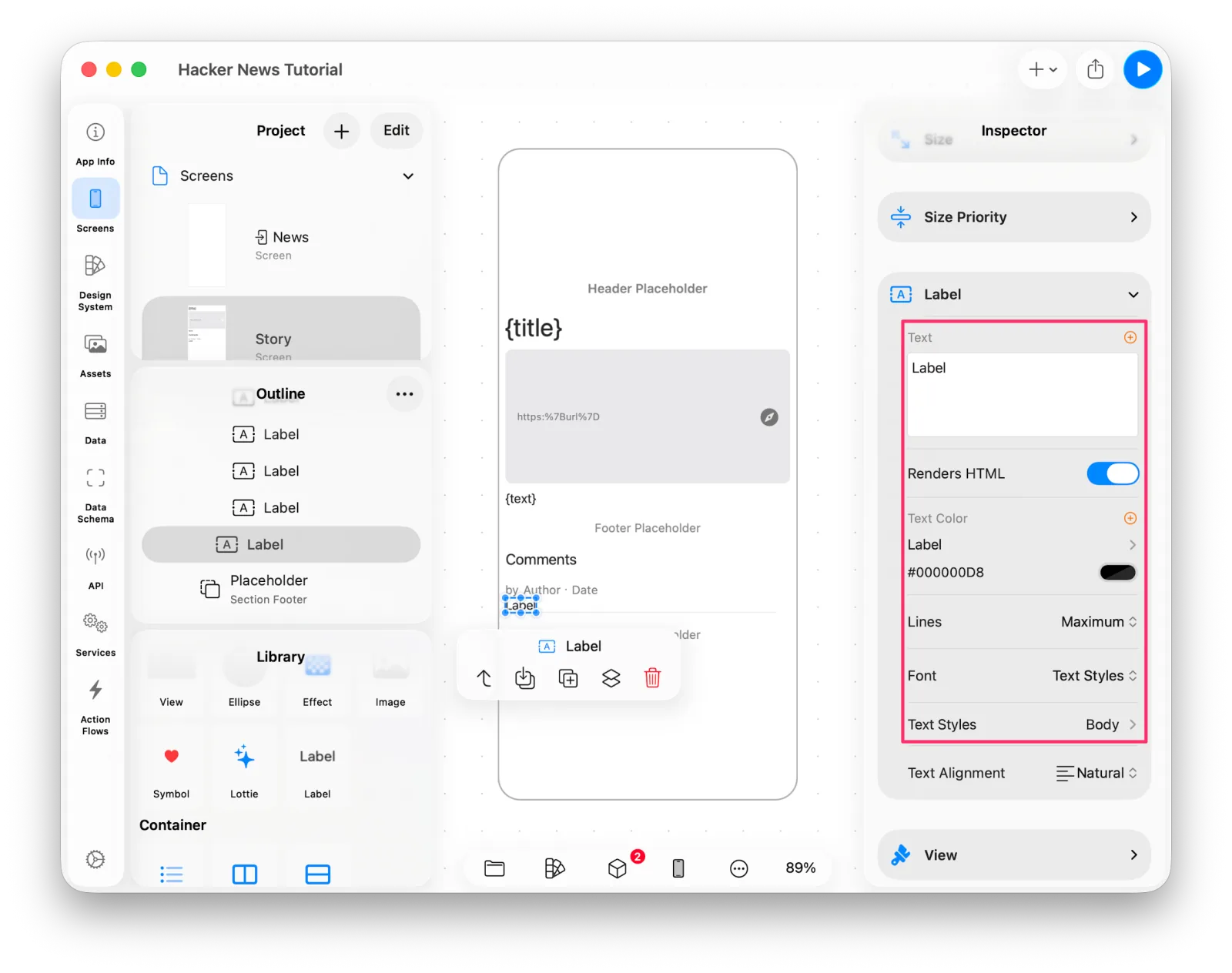 The comment body label
Connecting the bindings
Select the cell and bind the comments data to it.
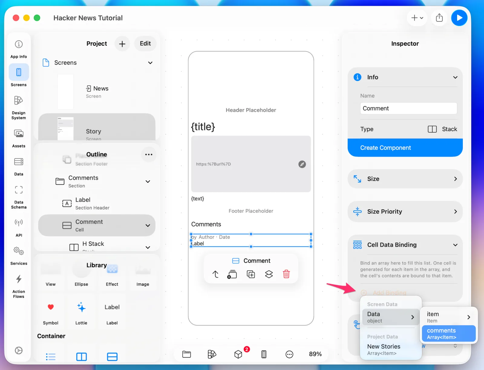 Binding comments to the cell
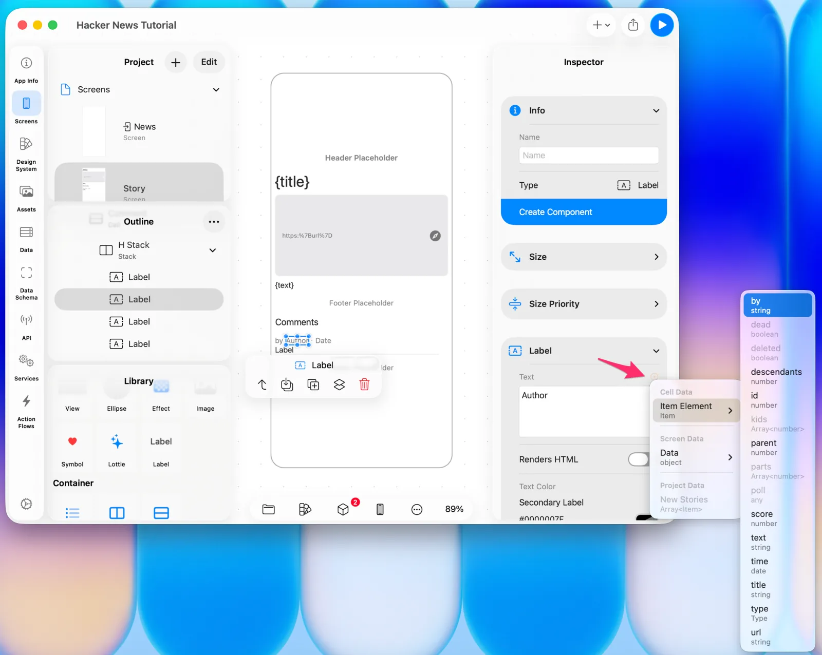 Binding the author
One thing before binding the date. In Data Schema, Item defines its timestamp as
time: number. A number can only ever be shown as a number, so change that type to
Date — Layerz then converts the number from the server into a Date for you.
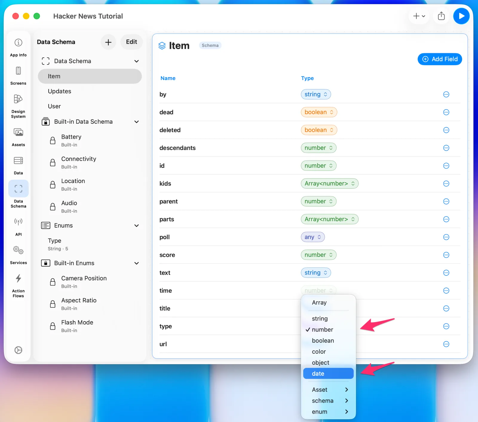 time is defined as a number
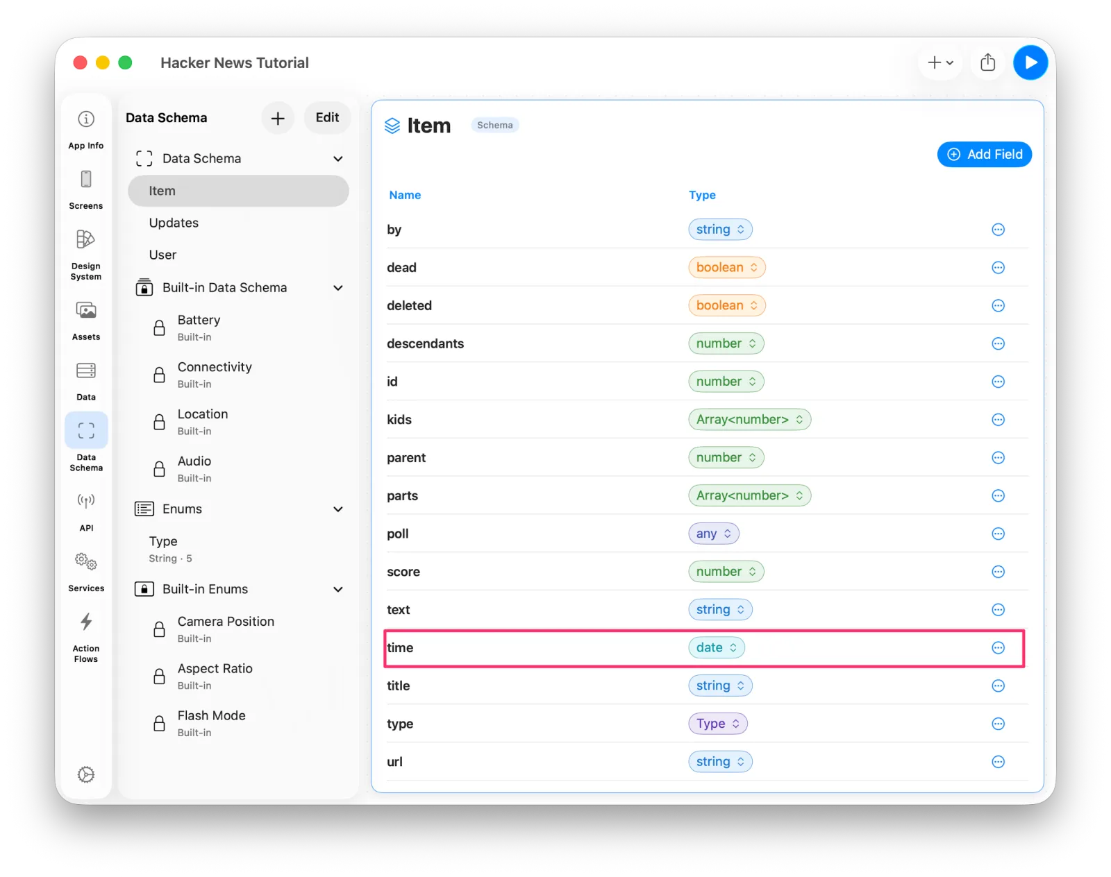 Changing time to a Date
Now bind the date label.
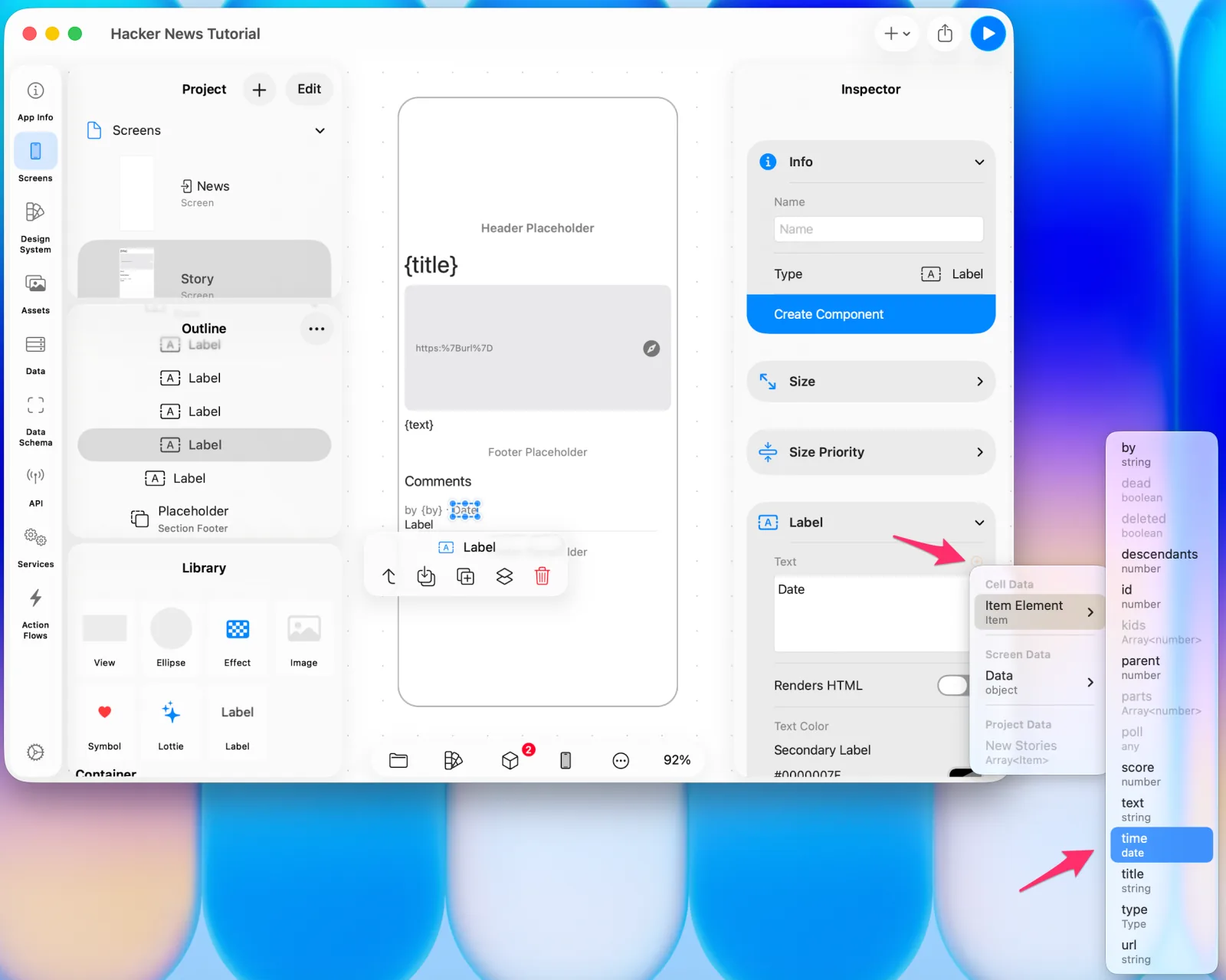 Binding the date label
Binding a Date to a Label gives you a Date Format setting. Press the binding UI once more to configure it.
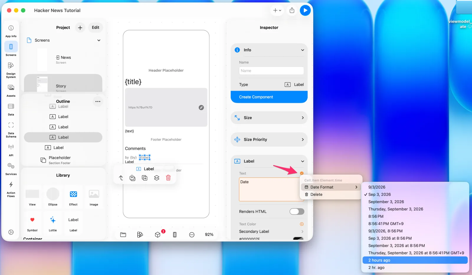 Setting the date format
Finally, bind the comment body.
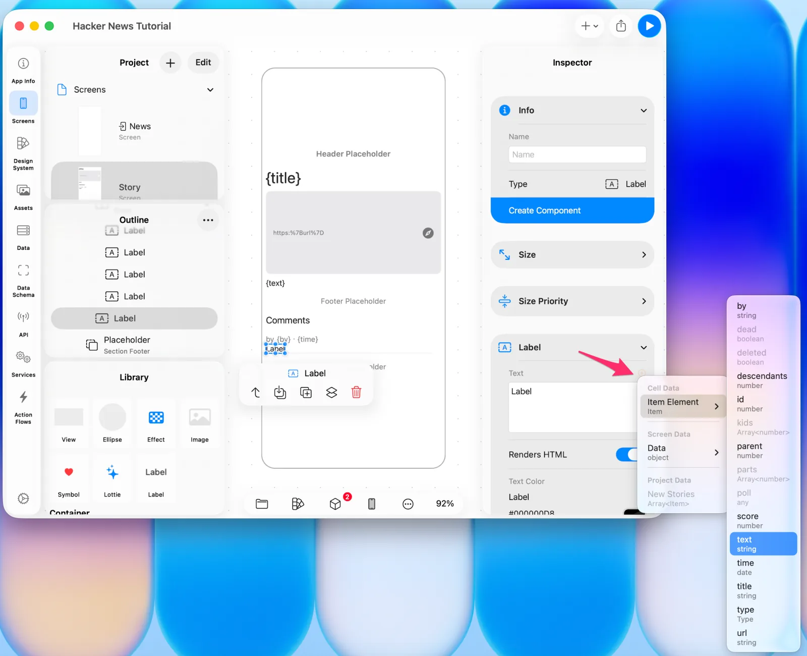 Binding the comment text
Run the flow once, when the Story screen first appears. Select the Story screen and choose Event > Screen Load > Get Comments.
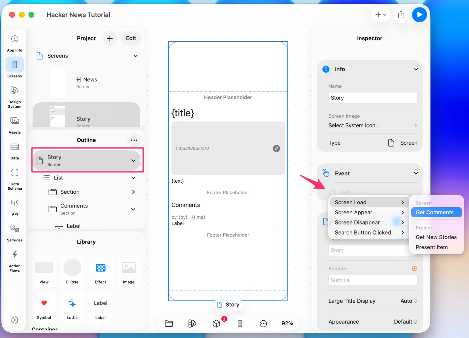 Wiring Get Comments to Screen Load
Check the preview.
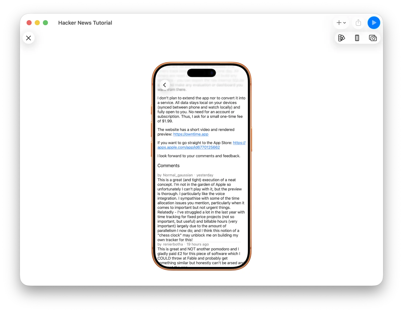 The detail screen with comments
The comments are cramped, so adjust the comment cell's padding.
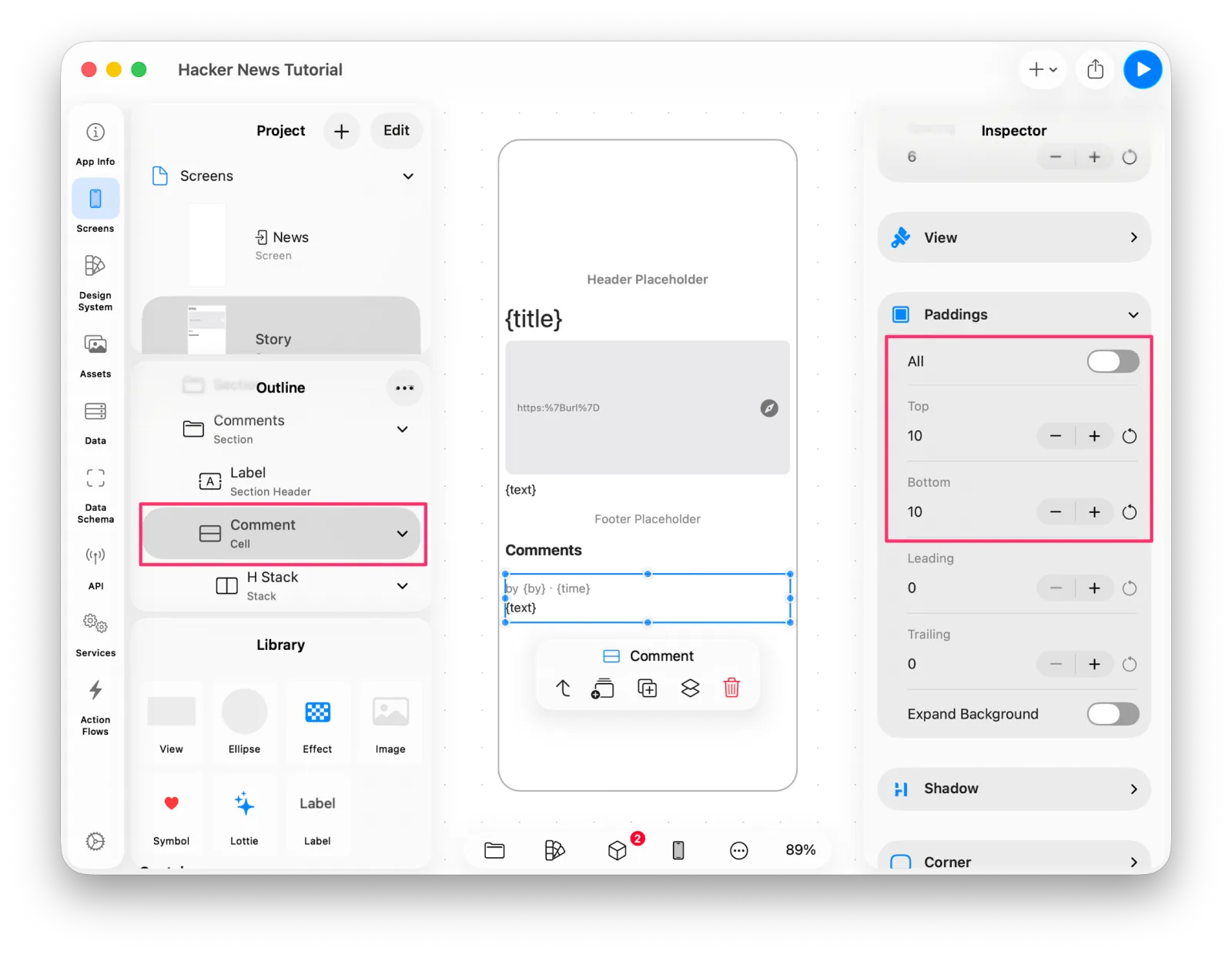 Adjusting the comment cell's padding
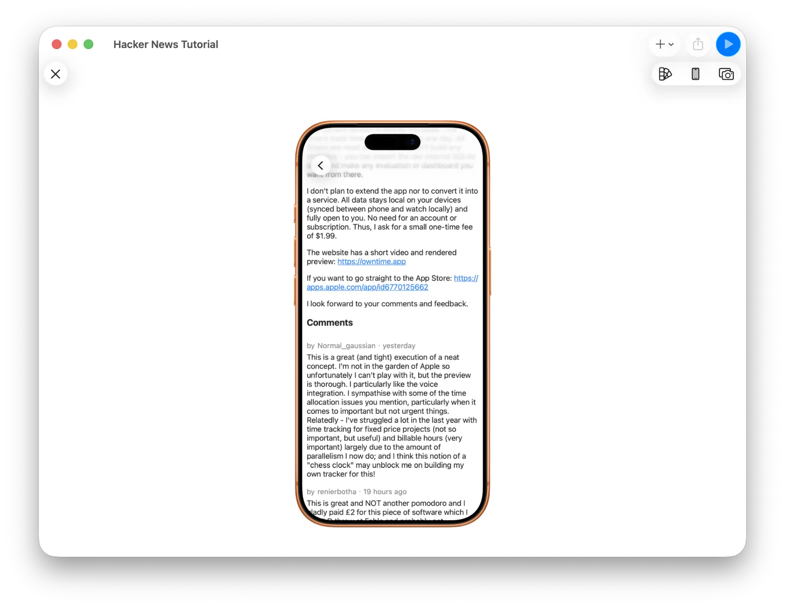 Comments with proper spacing
10. Reusing a design as a component
The News list is done. Now let's reuse something: the author-and-time row from the comment UI works just as well in the main list.
Select the part you want to reuse and choose Create Component in the Inspector. It's worth renaming it to something sensible first.
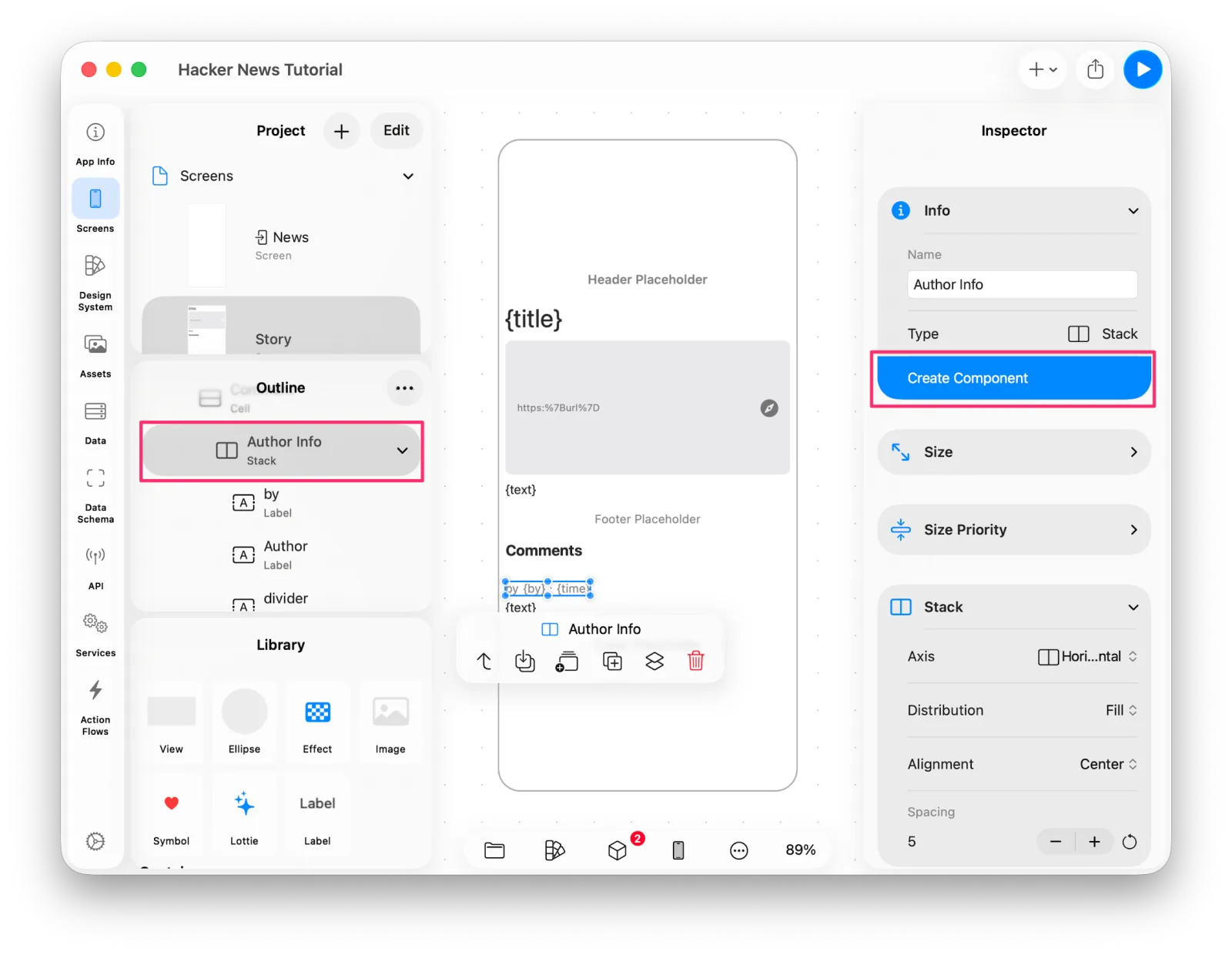 Create Component
The component is created immediately and appears in the Project list. Go to Component in the Inspector jumps straight to it.
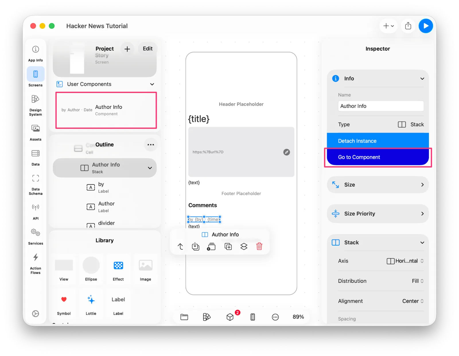 The Author Info component
A component is edited on its own, and your edits land everywhere it's used. Each place that uses it can still override properties as needed.
Let's put it in the list. Delete the Label that was showing the author.
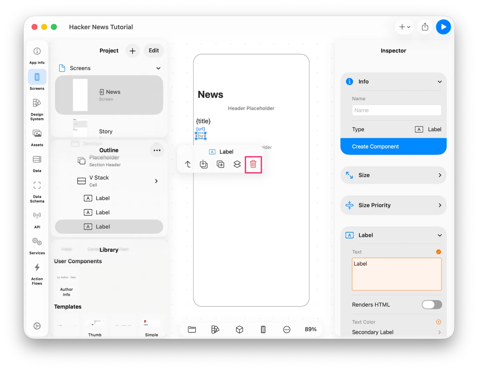 Deleting the old author label
Select the V Stack you want to add to, then pick Author Info from the Library.
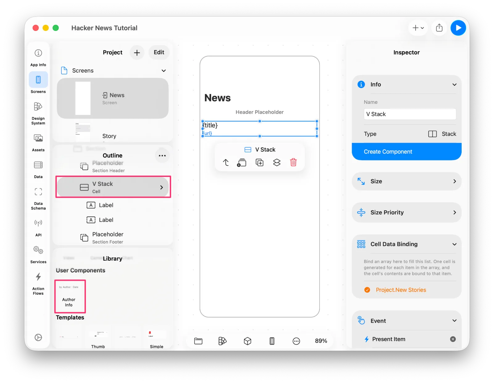 Choosing Author Info from the library
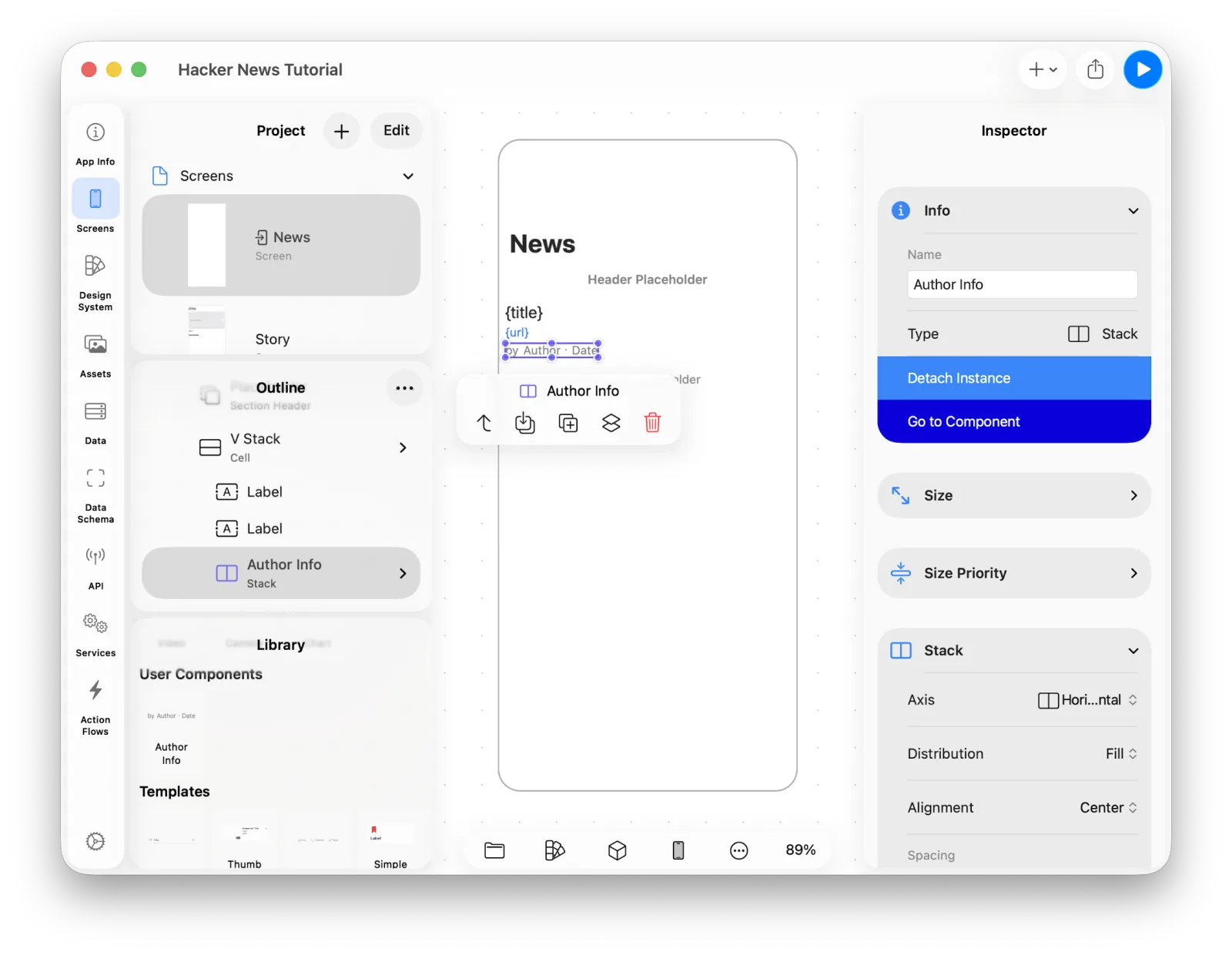 Author Info in the cell
Set up the author and date bindings again.
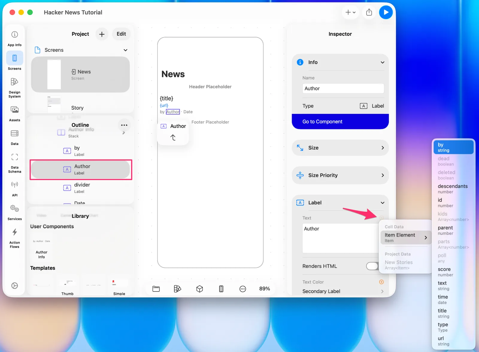 Binding the author
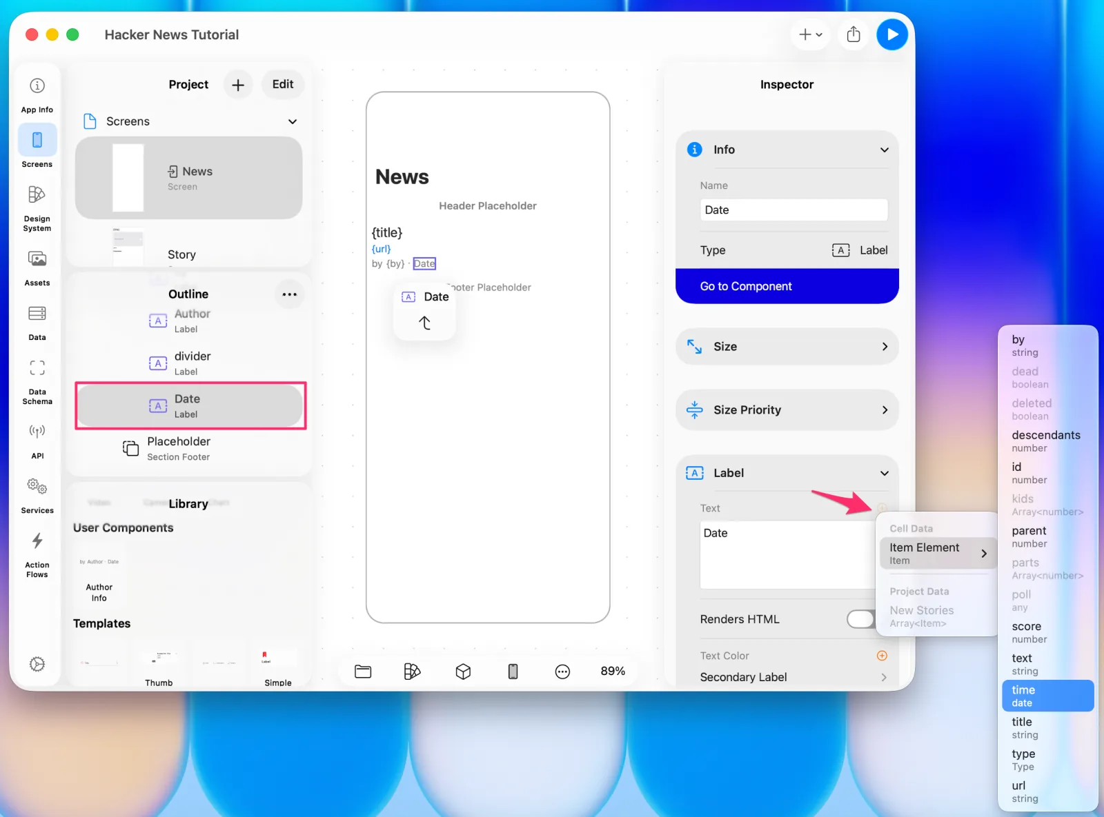 Binding the date
Preview, and the design is updated.
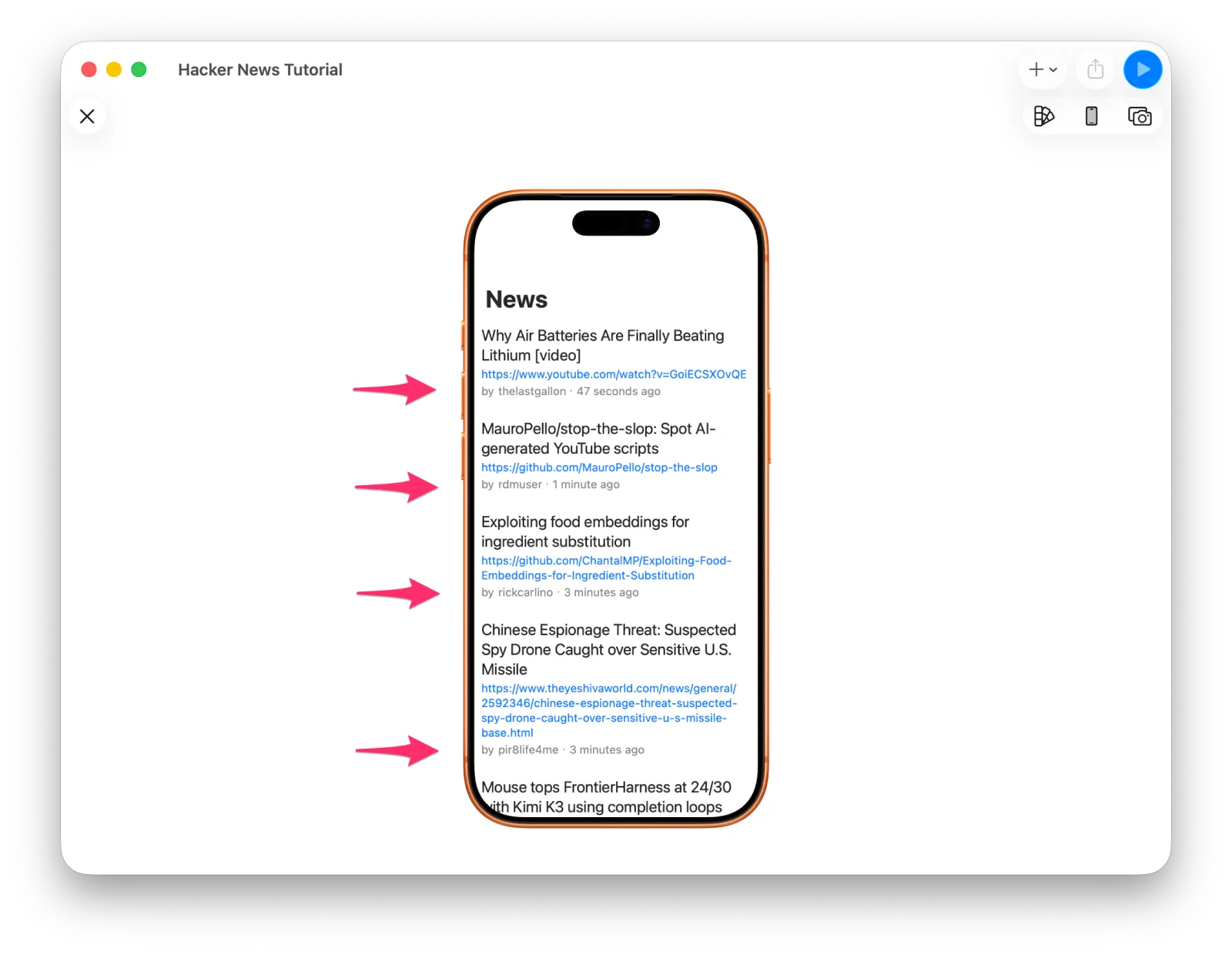 The list using the shared component
11. Hiding empty values
Browse a few stories and you'll find ones with no URL, or no comments. Right now an empty link still takes up space, and a story with no comments leaves the Comments header stranded on its own.
In UI that fills a container in order — Lists, Stacks — setting a view's hidden property removes its space entirely. And hidden can be bound to values that aren't booleans, by attaching a condition to the binding.
On the Story screen, select the link and bind the view's hidden property to url.
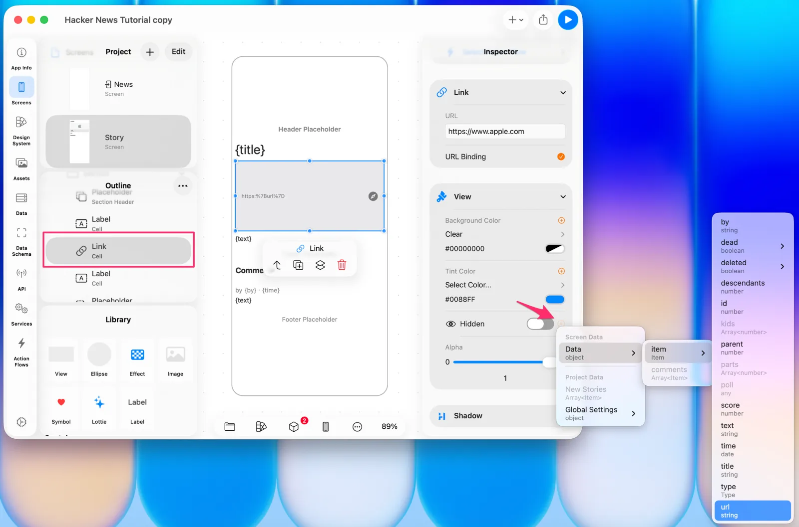 Binding hidden to url
Since url isn't a boolean, the condition picker appears right away. We want hidden to
be on when there's no url, so choose is Empty.
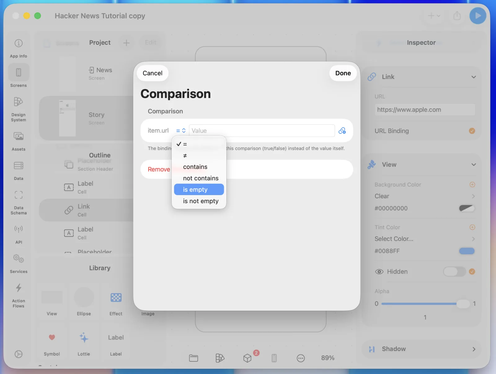 Choosing the is Empty condition
Sections are simpler: turn on Hide When Empty and a section with no cells hides itself.
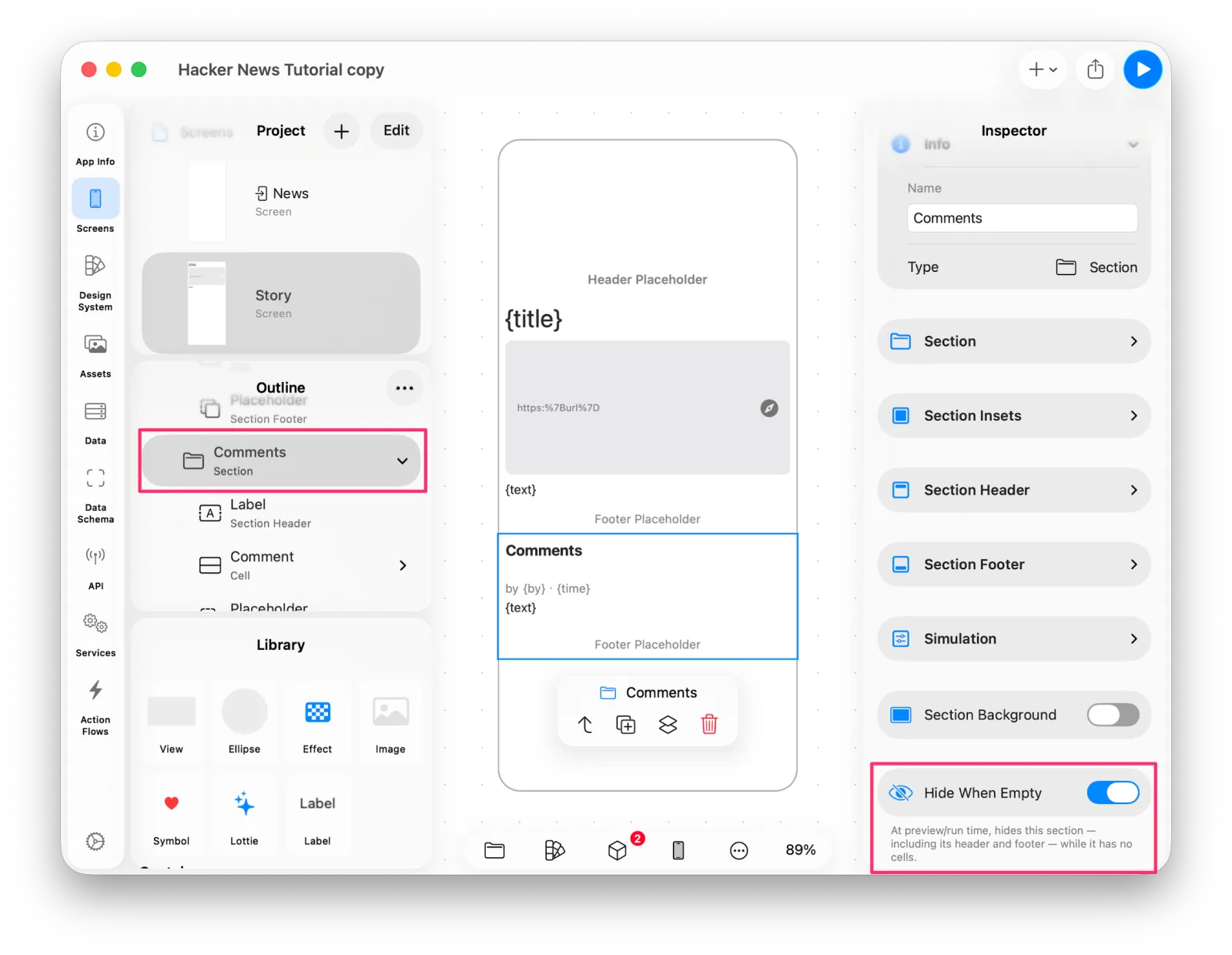 The Hide When Empty option
12. Finishing the design
Last, let's make it look like Hacker News. The site is built around orange, so we'll change the Accent Color that applies across the whole app.
In the Design System tab, select Accent Color to edit it. Use Choose Built-in Color and pick System Orange.
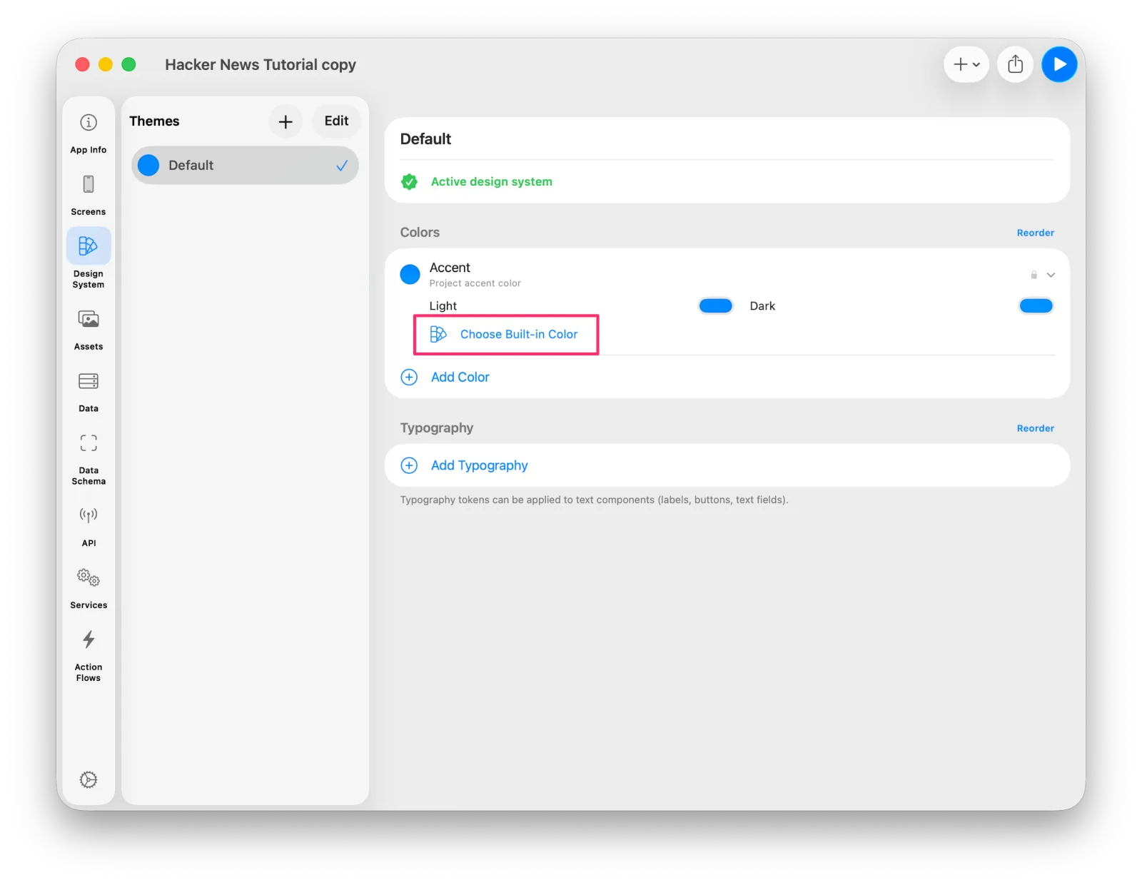 Accent Color in the Design System
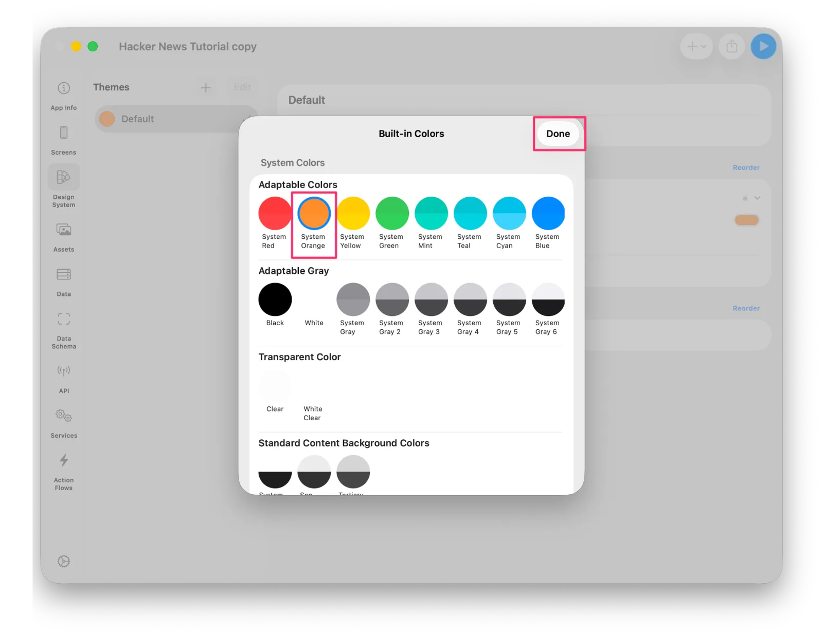 Picking orange from the built-in colors
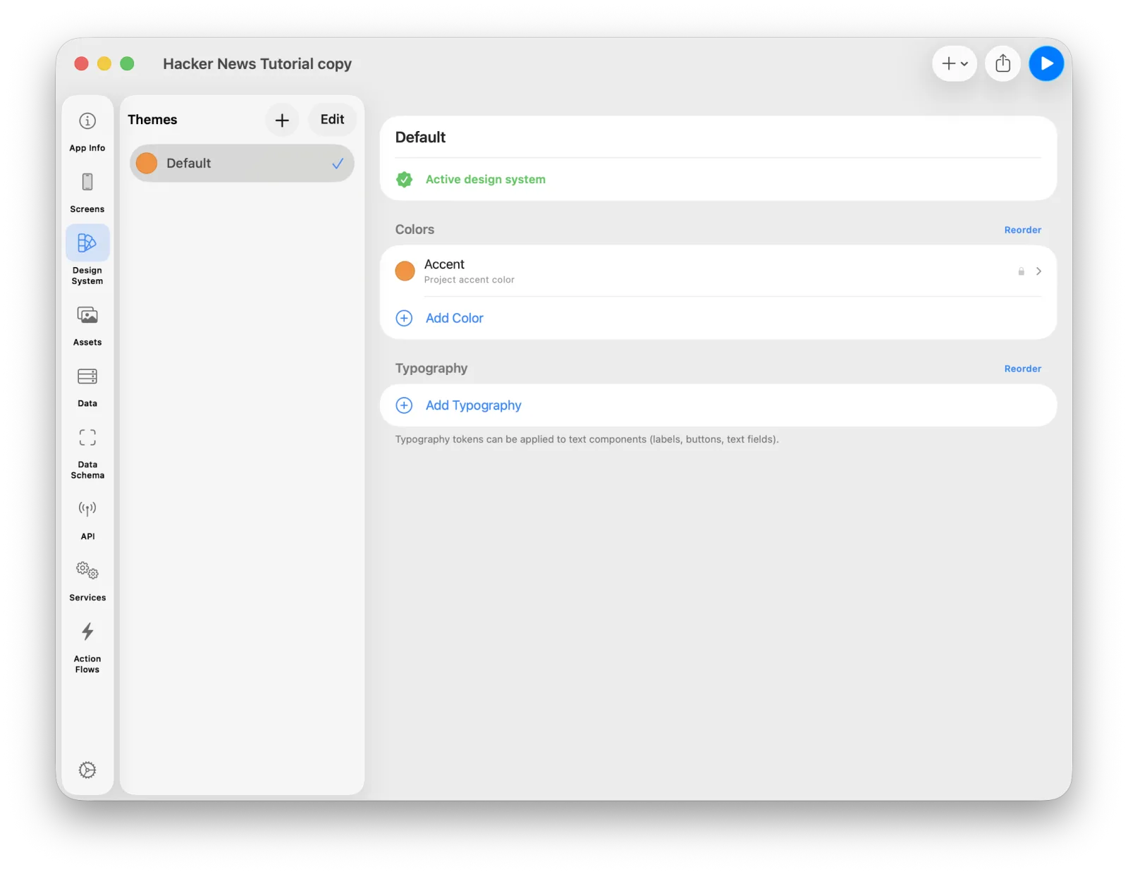 The updated accent color
Select the News screen and update its Navigation Bar settings too.
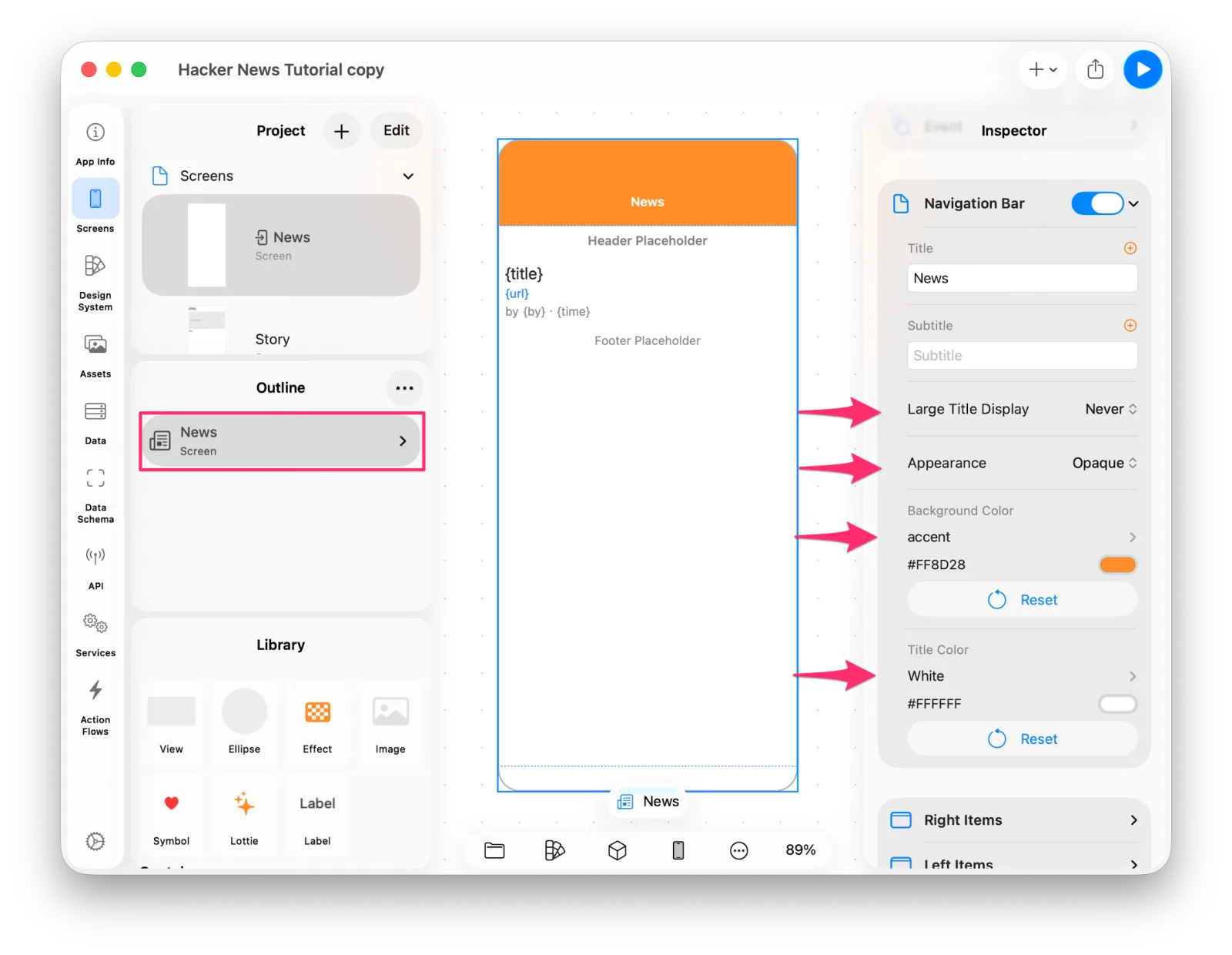 Navigation bar settings
Preview, and the app finally looks like itself.
The finished News screenWrapping up
Thanks for following along. In one pass we went from defining an API to storing data, building action flows, laying out a list and a detail screen, and reusing a design as a component — the whole arc of building an app.
In the next post we'll extend it beyond News to Ask, Show, and Jobs, and build the tab bar that ties them together.