Interface Overview
A guide to the layout of the Layerz editor
2 min read
When you open a new project, the editor appears. The editor consists of three main areas: the left panel, the center canvas, and the right Inspector.
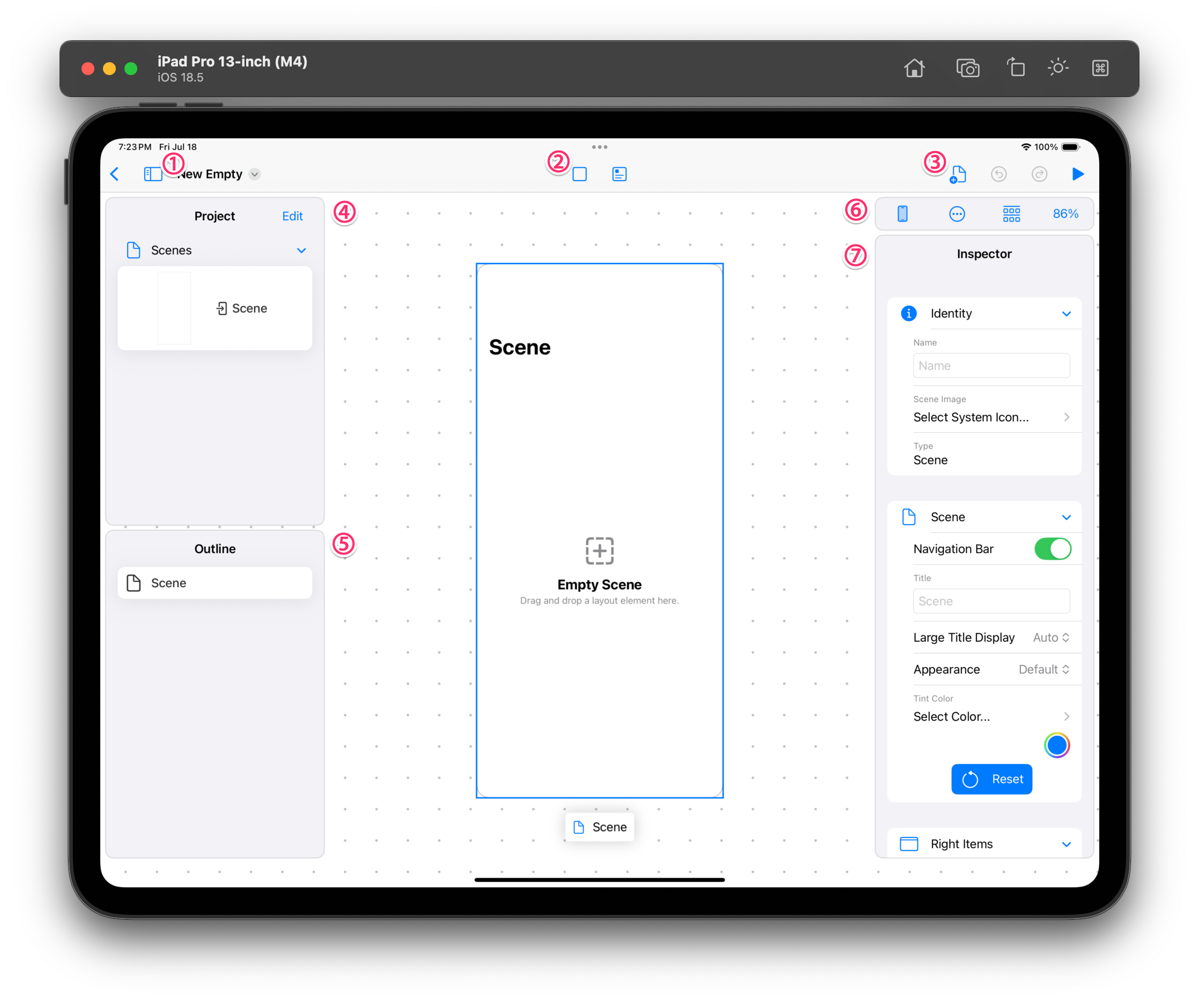 Editor layout
Left Panel
This is where you manage the elements that make up your app.
- Project — Browse the entire project.
- UI Library / Component — Pick the UI elements to place on the screen. From here, you Drag and Drop the component you want onto the center canvas.
- Add menu — Create a new Page or a new custom component.
- Page / Component list — Shows all the Pages and custom components you've created. Select one to edit it.
- Outline — Shows the Layer structure of the selected Page as a tree. It helps you understand the overall structure and quickly access any element you want.
In this panel you manage not only the design but also the Data, API, and Action Flow your app uses.
Center Canvas
This is where the design takes place. You place components on an iPhone-sized Page. You can freely explore the screen by zooming and scrolling.
The top toolbar lets you do the following:
- Device selection — Change the Page's size between iPhone, iPad, and landscape/portrait.
- Set Starting Point / Preview — Set the current Page as the app's Starting Point, or preview it instantly.
- Current zoom level display
Right Inspector
Edit the properties (position, size, color, font, and so on) of the selected component. For details, see Editing Properties (Inspector).
You start at iPhone size, but you can change the device at any time to design for iPad or a landscape screen.