Stack
Creating structured layouts with Stack
3 min read
A Stack arranges Views consistently, either vertically or horizontally.
There are Vertical Stacks and Horizontal Stacks, and you can freely nest Stacks to build a single design element.
A View placed inside a Stack follows the Auto Layout Size property and takes on the size of its default content. A typical example is a Label, whose View size adjusts automatically based on its text content.
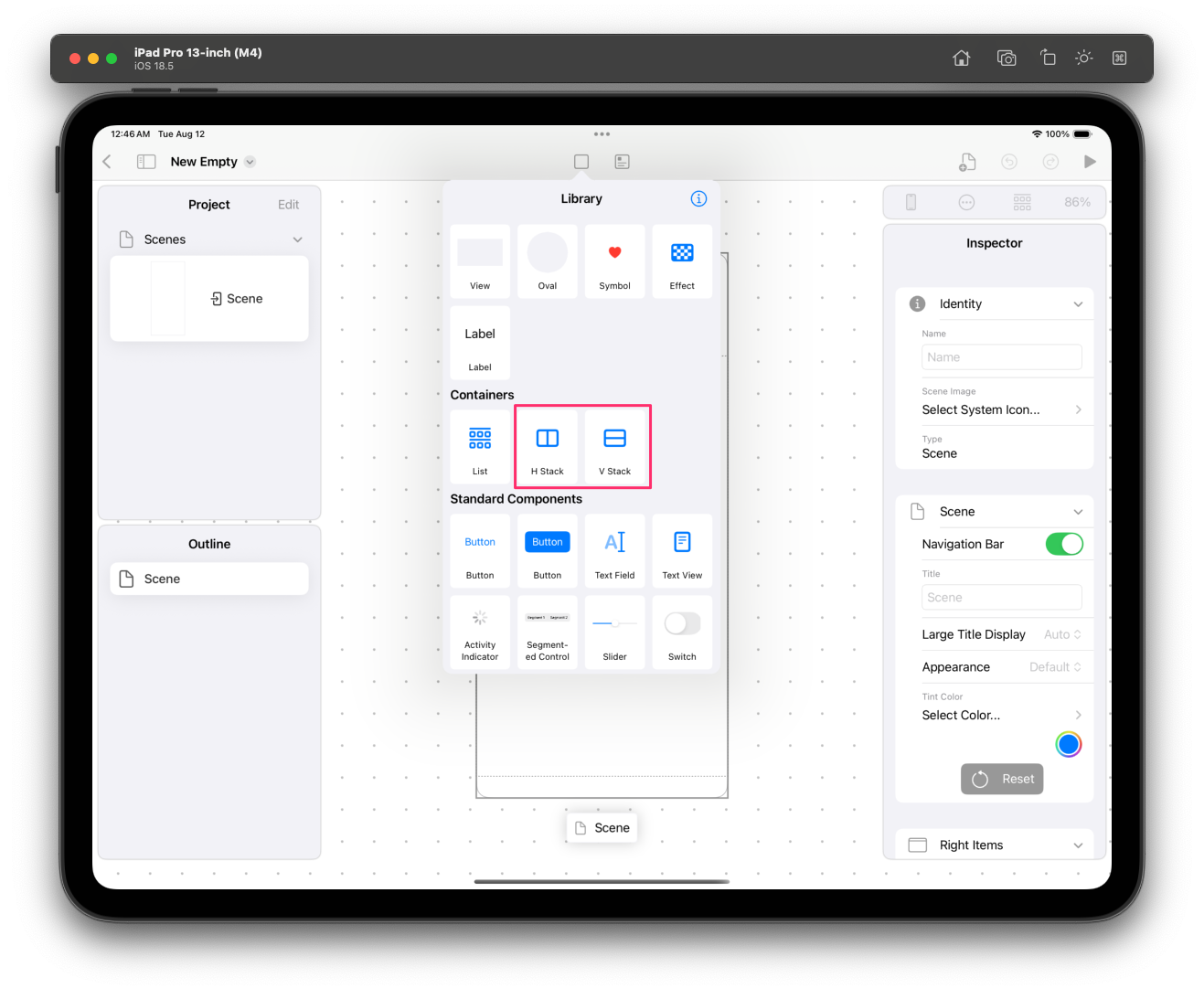
To create a Stack, open the UI Library and select H Stack or V Stack.
 붙여넣은_이미지_2025__8__12__오전_12_47.png
H Stack means Horizontal Stack, and V Stack means Vertical Stack.
You can choose whichever Stack you want, but you can switch between Horizontal and Vertical at any time in the Inspector, so there's no need to worry much about which one to pick.
When you place a Stack on the Page, you'll see a Stack containing two Placeholder Views.
In Layerz App Designer, you'll occasionally see a Placeholder View used to temporarily fill an empty spot.
Because a Placeholder View is a temporary View, it cannot have Subviews; its only role is to be replaced by another View. Until it's replaced by another View, it is not shown in Preview Mode.
To replace a Placeholder View with another View, drag and drop the View you want from the UI Library. Instead of being added as a Subview, the selected View replaces the View that was in the Placeholder View's spot.
Working with a Stack in the Floating Toolbar
You use the Floating Toolbar to build a Stack.
Adding a Subview inside a Stack
Select the Stack. To select the Stack all at once, choose the element you want from the Outline view.
In the Floating Toolbar, select the fourth icon, which has a + button drawn on it.
You'll see two menu items: 'Add from Library' and 'Add Placeholder'.
Selecting 'Add from Library' lets you add the View you want directly from the UI Library, and selecting 'Add Placeholder' adds a Placeholder.
Embed in Stack
While you can build a Stack by expanding from the Stack itself, there's another way.
Regardless of any existing Stack, most Views can be wrapped into a Stack via the Embed in Stack menu, making them part of a Stack UI.
Not only ordinary UI elements but also Stacks themselves can be Embedded in another Stack, so you can easily build complex UIs.
Finally, you'll notice that you can conveniently edit a Stack using the Duplicate button and the delete button in the Floating Toolbar as well.
Adjusting a Stack
Simply stacking UI elements one after another into a Stack isn't enough to build the UI you want.
With the Stack selected, take a look at the Inspector.
In the Stack section, you can change various properties of that Stack.
- Axis: You can switch between Vertical and Horizontal directly.
- Distribution: Lets you decide how space is allocated among the UI elements inside the Stack. There are the following options, so try changing them to find the right value.
- Fill
- Fill Equally
- Fill Proportionally
- Equal Spacing
- Equal Centering
- Alignment: Lets you set the Alignment of the UI elements inside the Stack.
- Fill
- Leading/Top
- First Baseline
- Center
- Trailing/Bottom
- Last Baseline
- Spacing: Lets you set the spacing between the UI elements inside the Stack.